



Change your whole shop’s header, footer and pages — no code
Don’t like the theme’s header, want an order form on the product page, or need a different design for one category — this used to need a developer. In Theme Builder, pick a ready design or build your own, then tell it where to go.
🧱 Theme Builder — all templates
Theme Builder lists all your templates — what each one replaces and where it’s running.
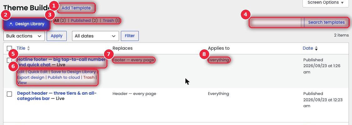
- 1Add Template Build a new template from scratch.
- 2Design Library Start from a ready design (next section).
- 3Status All, Published, Trash.
- 4Search templates Search by name.
- 5Name and Live The template name — Live means it’s running on the site now.
- 6Action linksEdit, Quick Edit, Save to Design Library (keep it as your own design), Export design (download as a file to import on another site), Publish to cloud, Trash, View.
- 7Replaces What it replaces — e.g. “Header — every page” or “Footer — every page”.
- 8Applies to Where — everywhere, or only certain categories or products.
✨ Design Library — ready headers, footers and pages
Pick one and it opens in the editor already filled with your shop name, phone and a product — then change it your way.
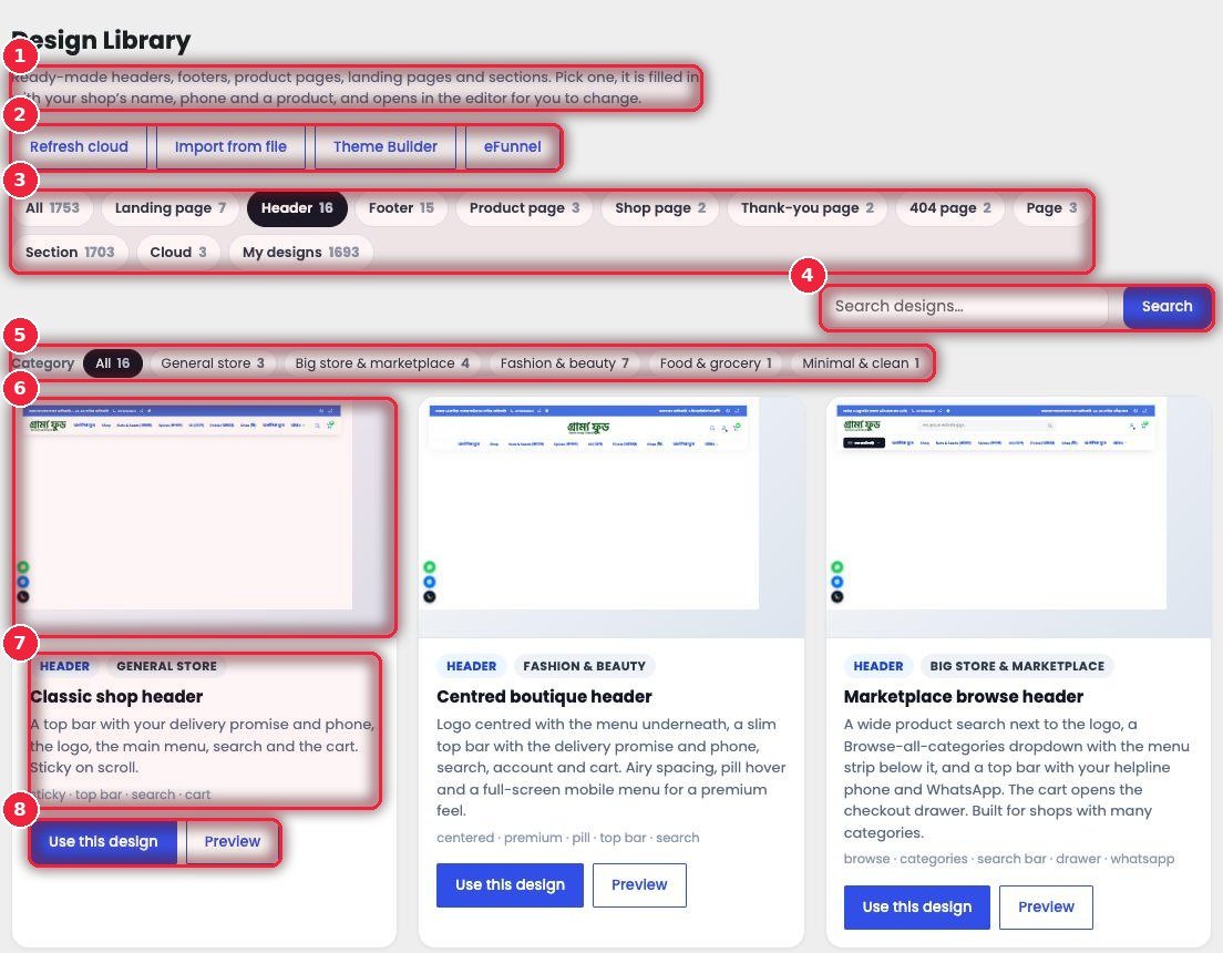
- 1What’s inside Headers, footers, product pages, landing pages and sections.
- 2Refresh cloud · Import from file Pull new designs from the cloud, or import an exported file. Next to it are buttons to go to Theme Builder and eFunnel.
- 3Types Landing page (7), Header (16), Footer (15), Product page (3), Shop page, Thank-you page, 404 page, Page, Section, Cloud, My designs.
- 4Search By name.
- 5Shop type General store, Big store & marketplace, Fashion & beauty, Food & grocery, Minimal & clean.
- 6Live preview A small preview with your own logo, menu and products — the real design, not a picture.
- 7Description What’s included, with tags below (sticky, top bar, search…).
- 8Use this design · Preview See it bigger, and take it in one click if you like it.
🖥️ Preview — look before you use it
Click Preview to see it full screen, with your shop’s real details.
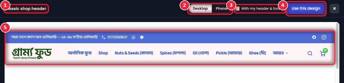
- 1Design name Which one you’re looking at.
- 2Desktop · Phone How it looks on a computer and on mobile.
- 3With my header & footer See it together with your current header and footer — especially useful for section or page designs.
- 4Use this design Take it from right here if you like it.
- 5Preview With your logo, menu, phone number and cart.
📱 How it looks on mobile
Most orders in Bangladesh come from mobiles, so check the mobile preview separately.
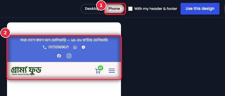
- 1Phone Switch to mobile view.
- 2Mobile header How the top bar, logo, cart and menu button are arranged on mobile.
🎯 Where it goes — Replaces and Apply to
Where this template is used sits on the right of the template editor. This is where you decide what the template replaces.
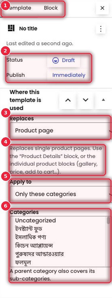
- 1Template · Block Template settings and settings for the selected block.
- 2Status · Publish Work on it as a Draft, then Publish when ready — that’s when it goes live on the site.
- 3Replaces Header, Footer, Product page, Shop / category page, Thank you (order received) or 404 page.
- 4Which blocks to build with A short hint for each — e.g. for the product page, the “Product Details” block or separate gallery, price and add to cart blocks; for the Thank you page, the “Thank You” block so it shows the real order.
- 5Apply to Everywhere, only certain categories, or only certain products.
- 6Categories Which categories — pick a parent category and its sub-categories are included.
🛠️ Template editor — changing the header
The familiar WordPress block editor. Click a block to see all its settings on the right.
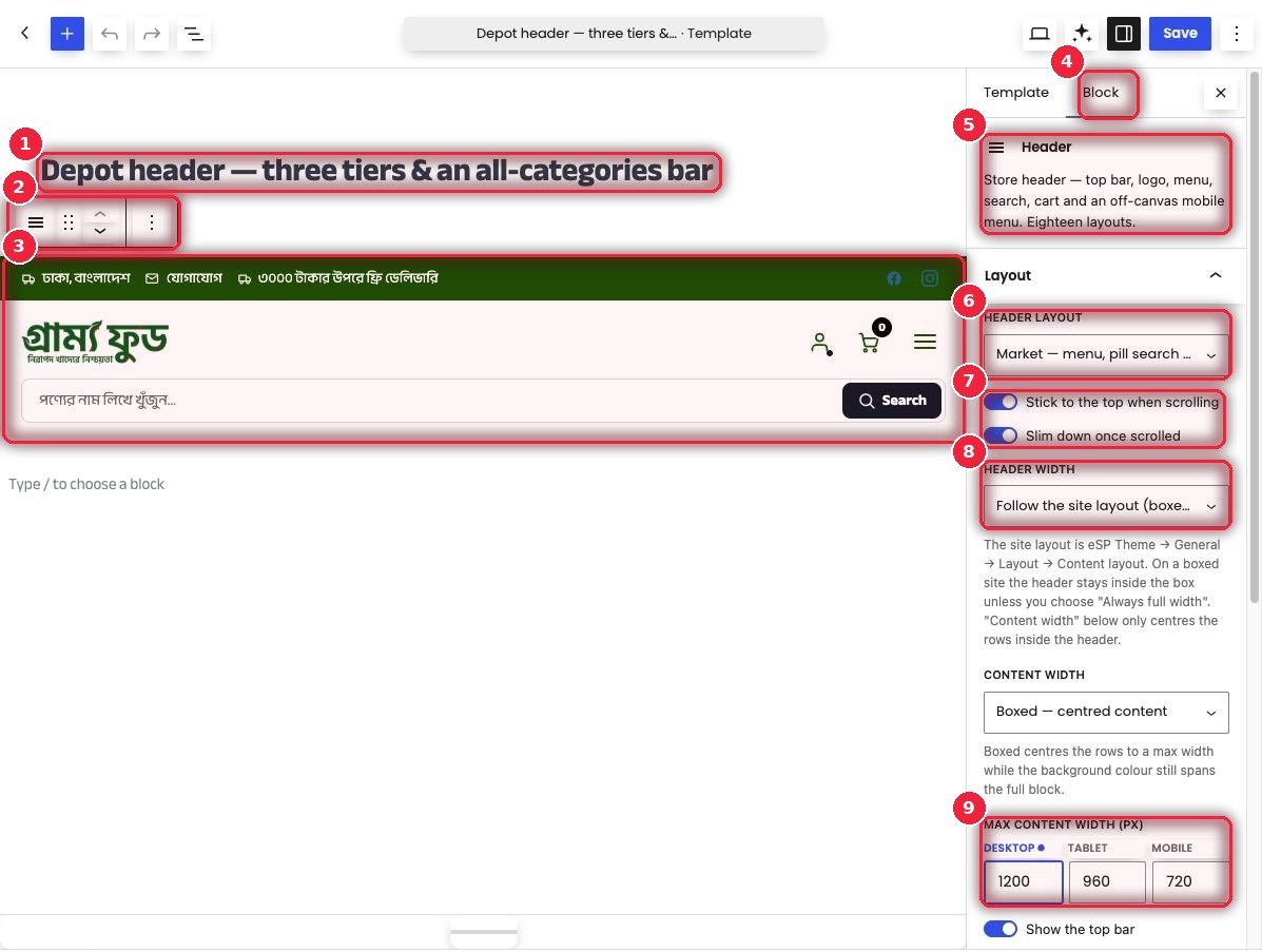
- 1Template name Only you see this.
- 2Block toolbar Move, shift up or down, copy or delete.
- 3Header block What shows on the site — top bar, logo, icons, search.
- 4Block Settings for the selected block.
- 5Header block Top bar, logo, menu, search, cart and mobile menu — eighteen layouts.
- 6Header layout Choose from 18 layouts, including Minimal, Market, Depot, Megastore, Grocer and Bazaar.
- 7On scroll Whether it sticks to the top, and whether it shrinks when scrolling.
- 8Header width Follow the site layout, or always full width.
- 9Max content width Separately for desktop, tablet and mobile.
🎛️ All Header block settings
Each part has its own panel, so you only open what you need.
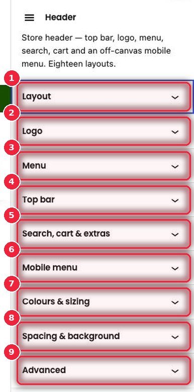
- 1Layout Layout, sticky, width.
- 2Logo The logo and its size.
- 3Menu Which menu and how it looks.
- 4Top bar The thin bar at the top — delivery info, phone, social icons.
- 5Search, cart & extras Search, cart, account and extra buttons.
- 6Mobile menu The menu that slides in from the side on mobile.
- 7Colours & sizing Colors and sizes.
- 8Spacing & background Spacing and background.
- 9Advanced Extra settings.
⚙️ How it works
- In Theme Builder → Design Library, pick a design and click Use this design, or click Add Template.
- Set Replaces and Apply to on the right.
- Click blocks to change text, colors and layout.
- Click Publish — it goes live on the site right away. To go back to the old one, set the template to Draft or Trash.