

DESIGN 01 / 16GridClassicPlain

Product Grid — Classic Cards

Products in a classic grid with a plain section title.

Best forHome page product sections.
Where to place itHome page, below the hero.

How to use: add the Products block and choose grid · classic · plain in its style settings

What you can customize in this widget
ColorsSec background, Heading color, Subtitle color, Accent, Count color, Count background, Card background, Tool background, Tool line, Box background, Box border color
Font & text sizeHead size
Size & spacingColumns, Gap, Card radius, Box margin, Box background size, Box radius
Layout & styleHead style, Layout, Text align, Arrows position, Card design, Button mode
Animation & effectsShow count, Count format, Animation, Autoplay, Loop, Card hover
Show / hide optionsCat children, Hide oos, Pagination, Show header, Show sort, Arrows, Dots, Peek, Card lift, On, Orig
Text, images & linksSource, Category, Related product, Trending days, Limit, Orderby, Empty text, Heading, Subheading, Heading tag, More text, More link, Card ratio, Title lines, Card rating, Card swatches, Card buttons, Cart label, Buy label, Badge, Flag oos, Flag low, Low threshold, Sec padding, Card ink, Box padding, Box background image, Box overlay, Box overlay o, Box border, Key, Product, W0

প্রিমিয়াম বাদাম কালেকশন

15টি বাদাম

হাতে বাছাই এ-গ্রেড দানা, সরাসরি আপনার ঘরে

DESIGN 02 / 16SliderBorderedBar

Product Slider — Bordered Cards with Bar Title

Swipeable product slider with bordered cards.

Best for“Best sellers” or “New arrivals” rows.
Where to place itHome page or below a product page.

How to use: add the Products block and choose slider · bordered · bar in its style settings

What you can customize in this widget
ColorsSec background, Heading color, Subtitle color, Accent, Count color, Count background, Card background, Tool background, Tool line, Box background, Box border color
Font & text sizeHead size
Size & spacingColumns, Gap, Card radius, Box margin, Box background size, Box radius
Layout & styleHead style, Layout, Text align, Arrows position, Card design, Button mode
Animation & effectsShow count, Count format, Animation, Autoplay, Loop, Card hover
Show / hide optionsCat children, Hide oos, Pagination, Show header, Show sort, Arrows, Dots, Peek, Card lift, On, Orig
Text, images & linksSource, Category, Related product, Trending days, Limit, Orderby, Empty text, Heading, Subheading, Heading tag, More text, More link, Card ratio, Title lines, Card rating, Card swatches, Card buttons, Cart label, Buy label, Badge, Flag oos, Flag low, Low threshold, Sec padding, Card ink, Box padding, Box background image, Box overlay, Box overlay o, Box border, Key, Product, W0
DESIGN 03 / 16GridMinimalUnderline

Product Grid — Minimal Underline Title

Minimal cards with an underlined section title.

Best forClean stores with good photos.
Where to place itHome or category sections.

How to use: add the Products block and choose grid · minimal · underline in its style settings

What you can customize in this widget
ColorsSec background, Heading color, Subtitle color, Accent, Count color, Count background, Card background, Tool background, Tool line, Box background, Box border color
Font & text sizeHead size
Size & spacingColumns, Gap, Card radius, Box margin, Box background size, Box radius
Layout & styleHead style, Layout, Text align, Arrows position, Card design, Button mode
Animation & effectsShow count, Count format, Animation, Autoplay, Loop, Card hover
Show / hide optionsCat children, Hide oos, Pagination, Show header, Show sort, Arrows, Dots, Peek, Card lift, On, Orig
Text, images & linksSource, Category, Related product, Trending days, Limit, Orderby, Empty text, Heading, Subheading, Heading tag, More text, More link, Card ratio, Title lines, Card rating, Card swatches, Card buttons, Cart label, Buy label, Badge, Flag oos, Flag low, Low threshold, Sec padding, Card ink, Box padding, Box background image, Box overlay, Box overlay o, Box border, Key, Product, W0

খাঁটি গুঁড়া মশলা

14টি মশলা

আস্ত মশলা ধুয়ে, শুকিয়ে, তারপর গুঁড়া

DESIGN 04 / 16GridDarkCenter

Product Grid — Dark Centered

Dark product cards with a centered title.

Best forPremium collections.
Where to place itHome page feature section.

How to use: add the Products block and choose grid · dark · center in its style settings

What you can customize in this widget
ColorsSec background, Heading color, Subtitle color, Accent, Count color, Count background, Card background, Tool background, Tool line, Box background, Box border color
Font & text sizeHead size
Size & spacingColumns, Gap, Card radius, Box margin, Box background size, Box radius
Layout & styleHead style, Layout, Text align, Arrows position, Card design, Button mode
Animation & effectsShow count, Count format, Animation, Autoplay, Loop, Card hover
Show / hide optionsCat children, Hide oos, Pagination, Show header, Show sort, Arrows, Dots, Peek, Card lift, On, Orig
Text, images & linksSource, Category, Related product, Trending days, Limit, Orderby, Empty text, Heading, Subheading, Heading tag, More text, More link, Card ratio, Title lines, Card rating, Card swatches, Card buttons, Cart label, Buy label, Badge, Flag oos, Flag low, Low threshold, Sec padding, Card ink, Box padding, Box background image, Box overlay, Box overlay o, Box border, Key, Product, W0

খাঁটি মধুর দোকান

4টি মধু

ল্যাব টেস্টেড, চাক থেকে সরাসরি

DESIGN 05 / 16SliderModernBoxed

Product Slider — Modern Boxed Title

Modern slider with a boxed title.

Best forShowing a category in one swipe row.
Where to place itHome page.

How to use: add the Products block and choose slider · modern · boxed in its style settings

What you can customize in this widget
ColorsSec background, Heading color, Subtitle color, Accent, Count color, Count background, Card background, Tool background, Tool line, Box background, Box border color
Font & text sizeHead size
Size & spacingColumns, Gap, Card radius, Box margin, Box background size, Box radius
Layout & styleHead style, Layout, Text align, Arrows position, Card design, Button mode
Animation & effectsShow count, Count format, Animation, Autoplay, Loop, Card hover
Show / hide optionsCat children, Hide oos, Pagination, Show header, Show sort, Arrows, Dots, Peek, Card lift, On, Orig
Text, images & linksSource, Category, Related product, Trending days, Limit, Orderby, Empty text, Heading, Subheading, Heading tag, More text, More link, Card ratio, Title lines, Card rating, Card swatches, Card buttons, Cart label, Buy label, Badge, Flag oos, Flag low, Low threshold, Sec padding, Card ink, Box padding, Box background image, Box overlay, Box overlay o, Box border, Key, Product, W0
DESIGN 06 / 16GridSplitRibbon

Product Grid — Split Cards with Ribbon

Split-style cards with a ribbon title.

Best forOffers and featured products.
Where to place itHome page offer section.

How to use: add the Products block and choose grid · split · ribbon in its style settings

What you can customize in this widget
ColorsSec background, Heading color, Subtitle color, Accent, Count color, Count background, Card background, Tool background, Tool line, Box background, Box border color
Font & text sizeHead size
Size & spacingColumns, Gap, Card radius, Box margin, Box background size, Box radius
Layout & styleHead style, Layout, Text align, Arrows position, Card design, Button mode
Animation & effectsShow count, Count format, Animation, Autoplay, Loop, Card hover
Show / hide optionsCat children, Hide oos, Pagination, Show header, Show sort, Arrows, Dots, Peek, Card lift, On, Orig
Text, images & linksSource, Category, Related product, Trending days, Limit, Orderby, Empty text, Heading, Subheading, Heading tag, More text, More link, Card ratio, Title lines, Card rating, Card swatches, Card buttons, Cart label, Buy label, Badge, Flag oos, Flag low, Low threshold, Sec padding, Card ink, Box padding, Box background image, Box overlay, Box overlay o, Box border, Key, Product, W0

টিফিনের জন্য বাদাম

6টি বাদাম

বাচ্চাদের স্বাস্থ্যকর স্ন্যাকস

DESIGN 07 / 16GridFloatPlain

Product Grid — Floating Cards

Cards lift on hover for a lively feel.

Best forSnack and pickle shops.
Where to place itHome or category pages.

How to use: add the Products block and choose grid · float · plain in its style settings

What you can customize in this widget
ColorsSec background, Heading color, Subtitle color, Accent, Count color, Count background, Card background, Tool background, Tool line, Box background, Box border color
Font & text sizeHead size
Size & spacingColumns, Gap, Card radius, Box margin, Box background size, Box radius
Layout & styleHead style, Layout, Text align, Arrows position, Card design, Button mode
Animation & effectsShow count, Count format, Animation, Autoplay, Loop, Card hover
Show / hide optionsCat children, Hide oos, Pagination, Show header, Show sort, Arrows, Dots, Peek, Card lift, On, Orig
Text, images & linksSource, Category, Related product, Trending days, Limit, Orderby, Empty text, Heading, Subheading, Heading tag, More text, More link, Card ratio, Title lines, Card rating, Card swatches, Card buttons, Cart label, Buy label, Badge, Flag oos, Flag low, Low threshold, Sec padding, Card ink, Box padding, Box background image, Box overlay, Box overlay o, Box border, Key, Product, W0

খিচুড়ির সঙ্গী

8টি আচার

বৃষ্টির দিনের আচার কালেকশন

DESIGN 08 / 16SliderCompactBar

Product Slider — Compact Cards

Compact slider to show more items at once.

Best forSpice and grocery items.
Where to place itBelow the hero or in a sidebar area.

How to use: add the Products block and choose slider · compact · bar in its style settings

What you can customize in this widget
ColorsSec background, Heading color, Subtitle color, Accent, Count color, Count background, Card background, Tool background, Tool line, Box background, Box border color
Font & text sizeHead size
Size & spacingColumns, Gap, Card radius, Box margin, Box background size, Box radius
Layout & styleHead style, Layout, Text align, Arrows position, Card design, Button mode
Animation & effectsShow count, Count format, Animation, Autoplay, Loop, Card hover
Show / hide optionsCat children, Hide oos, Pagination, Show header, Show sort, Arrows, Dots, Peek, Card lift, On, Orig
Text, images & linksSource, Category, Related product, Trending days, Limit, Orderby, Empty text, Heading, Subheading, Heading tag, More text, More link, Card ratio, Title lines, Card rating, Card swatches, Card buttons, Cart label, Buy label, Badge, Flag oos, Flag low, Low threshold, Sec padding, Card ink, Box padding, Box background image, Box overlay, Box overlay o, Box border, Key, Product, W0
DESIGN 09 / 16GridFooterUnderline

Product Grid — Footer Info Cards

Cards with price and button at the bottom.

Best forPrice-focused food products.
Where to place itHome page sections.

How to use: add the Products block and choose grid · footer · underline in its style settings

What you can customize in this widget
ColorsSec background, Heading color, Subtitle color, Accent, Count color, Count background, Card background, Tool background, Tool line, Box background, Box border color
Font & text sizeHead size
Size & spacingColumns, Gap, Card radius, Box margin, Box background size, Box radius
Layout & styleHead style, Layout, Text align, Arrows position, Card design, Button mode
Animation & effectsShow count, Count format, Animation, Autoplay, Loop, Card hover
Show / hide optionsCat children, Hide oos, Pagination, Show header, Show sort, Arrows, Dots, Peek, Card lift, On, Orig
Text, images & linksSource, Category, Related product, Trending days, Limit, Orderby, Empty text, Heading, Subheading, Heading tag, More text, More link, Card ratio, Title lines, Card rating, Card swatches, Card buttons, Cart label, Buy label, Badge, Flag oos, Flag low, Low threshold, Sec padding, Card ink, Box padding, Box background image, Box overlay, Box overlay o, Box border, Key, Product, W0
DESIGN 10 / 16GridModernCenter

Product Grid — Modern Centered

Modern cards with centered title.

Best forBrand home pages.
Where to place itHome page.

How to use: add the Products block and choose grid · modern · center in its style settings

What you can customize in this widget
ColorsSec background, Heading color, Subtitle color, Accent, Count color, Count background, Card background, Tool background, Tool line, Box background, Box border color
Font & text sizeHead size
Size & spacingColumns, Gap, Card radius, Box margin, Box background size, Box radius
Layout & styleHead style, Layout, Text align, Arrows position, Card design, Button mode
Animation & effectsShow count, Count format, Animation, Autoplay, Loop, Card hover
Show / hide optionsCat children, Hide oos, Pagination, Show header, Show sort, Arrows, Dots, Peek, Card lift, On, Orig
Text, images & linksSource, Category, Related product, Trending days, Limit, Orderby, Empty text, Heading, Subheading, Heading tag, More text, More link, Card ratio, Title lines, Card rating, Card swatches, Card buttons, Cart label, Buy label, Badge, Flag oos, Flag low, Low threshold, Sec padding, Card ink, Box padding, Box background image, Box overlay, Box overlay o, Box border, Key, Product, W0

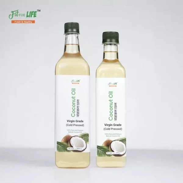
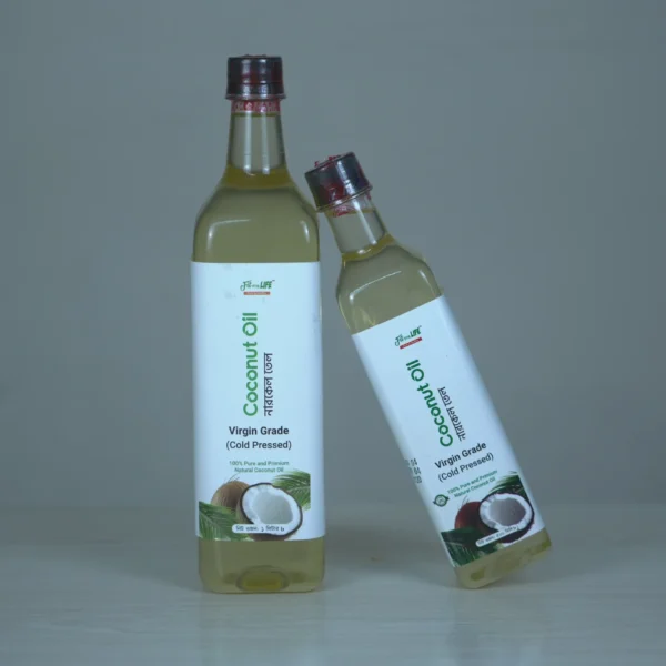
রান্নার তেল

6টি তেল

স্বাস্থ্যকর রান্নার জন্য সঠিক তেল

DESIGN 11 / 16SliderClassicBoxed

Product Slider — Classic Boxed

Classic cards in a slider with boxed title.

Best forRelated products rows.
Where to place itBottom of product pages.

How to use: add the Products block and choose slider · classic · boxed in its style settings

What you can customize in this widget
ColorsSec background, Heading color, Subtitle color, Accent, Count color, Count background, Card background, Tool background, Tool line, Box background, Box border color
Font & text sizeHead size
Size & spacingColumns, Gap, Card radius, Box margin, Box background size, Box radius
Layout & styleHead style, Layout, Text align, Arrows position, Card design, Button mode
Animation & effectsShow count, Count format, Animation, Autoplay, Loop, Card hover
Show / hide optionsCat children, Hide oos, Pagination, Show header, Show sort, Arrows, Dots, Peek, Card lift, On, Orig
Text, images & linksSource, Category, Related product, Trending days, Limit, Orderby, Empty text, Heading, Subheading, Heading tag, More text, More link, Card ratio, Title lines, Card rating, Card swatches, Card buttons, Cart label, Buy label, Badge, Flag oos, Flag low, Low threshold, Sec padding, Card ink, Box padding, Box background image, Box overlay, Box overlay o, Box border, Key, Product, W0
DESIGN 12 / 16GridFloatRibbon

Product Grid — Floating with Ribbon

Floating cards and a ribbon title for featured items.

Best forBest-seller sections.
Where to place itHome page.

How to use: add the Products block and choose grid · float · ribbon in its style settings

What you can customize in this widget
ColorsSec background, Heading color, Subtitle color, Accent, Count color, Count background, Card background, Tool background, Tool line, Box background, Box border color
Font & text sizeHead size
Size & spacingColumns, Gap, Card radius, Box margin, Box background size, Box radius
Layout & styleHead style, Layout, Text align, Arrows position, Card design, Button mode
Animation & effectsShow count, Count format, Animation, Autoplay, Loop, Card hover
Show / hide optionsCat children, Hide oos, Pagination, Show header, Show sort, Arrows, Dots, Peek, Card lift, On, Orig
Text, images & linksSource, Category, Related product, Trending days, Limit, Orderby, Empty text, Heading, Subheading, Heading tag, More text, More link, Card ratio, Title lines, Card rating, Card swatches, Card buttons, Cart label, Buy label, Badge, Flag oos, Flag low, Low threshold, Sec padding, Card ink, Box padding, Box background image, Box overlay, Box overlay o, Box border, Key, Product, W0

আচার কম্বো

8টি আচার

দুই-তিন স্বাদ এক অর্ডারে

DESIGN 13 / 16GridBorderedPlain

Product Grid — Bordered Simple

Bordered cards with a plain title.

Best forSimple catalog sections.
Where to place itCategory or shop page.

How to use: add the Products block and choose grid · bordered · plain in its style settings

What you can customize in this widget
ColorsSec background, Heading color, Subtitle color, Accent, Count color, Count background, Card background, Tool background, Tool line, Box background, Box border color
Font & text sizeHead size
Size & spacingColumns, Gap, Card radius, Box margin, Box background size, Box radius
Layout & styleHead style, Layout, Text align, Arrows position, Card design, Button mode
Animation & effectsShow count, Count format, Animation, Autoplay, Loop, Card hover
Show / hide optionsCat children, Hide oos, Pagination, Show header, Show sort, Arrows, Dots, Peek, Card lift, On, Orig
Text, images & linksSource, Category, Related product, Trending days, Limit, Orderby, Empty text, Heading, Subheading, Heading tag, More text, More link, Card ratio, Title lines, Card rating, Card swatches, Card buttons, Cart label, Buy label, Badge, Flag oos, Flag low, Low threshold, Sec padding, Card ink, Box padding, Box background image, Box overlay, Box overlay o, Box border, Key, Product, W0

শাহী রান্নার মশলা

14টি মশলা

দাওয়াতের স্বাদ ঘরে

DESIGN 14 / 16SliderMinimalBar

Product Slider — Minimal Bar Title

Minimal slider with a bar-style title.

Best forGift and honey collections.
Where to place itHome page or landing page bottom.

How to use: add the Products block and choose slider · minimal · bar in its style settings

What you can customize in this widget
ColorsSec background, Heading color, Subtitle color, Accent, Count color, Count background, Card background, Tool background, Tool line, Box background, Box border color
Font & text sizeHead size
Size & spacingColumns, Gap, Card radius, Box margin, Box background size, Box radius
Layout & styleHead style, Layout, Text align, Arrows position, Card design, Button mode
Animation & effectsShow count, Count format, Animation, Autoplay, Loop, Card hover
Show / hide optionsCat children, Hide oos, Pagination, Show header, Show sort, Arrows, Dots, Peek, Card lift, On, Orig
Text, images & linksSource, Category, Related product, Trending days, Limit, Orderby, Empty text, Heading, Subheading, Heading tag, More text, More link, Card ratio, Title lines, Card rating, Card swatches, Card buttons, Cart label, Buy label, Badge, Flag oos, Flag low, Low threshold, Sec padding, Card ink, Box padding, Box background image, Box overlay, Box overlay o, Box border, Key, Product, W0
DESIGN 15 / 16GridFooterUnderline

Product Grid — Footer Cards Underline

Footer-style cards with underline title.

Best forOil and kitchen staples.
Where to place itCategory sections.

How to use: add the Products block and choose grid · footer · underline in its style settings

What you can customize in this widget
ColorsSec background, Heading color, Subtitle color, Accent, Count color, Count background, Card background, Tool background, Tool line, Box background, Box border color
Font & text sizeHead size
Size & spacingColumns, Gap, Card radius, Box margin, Box background size, Box radius
Layout & styleHead style, Layout, Text align, Arrows position, Card design, Button mode
Animation & effectsShow count, Count format, Animation, Autoplay, Loop, Card hover
Show / hide optionsCat children, Hide oos, Pagination, Show header, Show sort, Arrows, Dots, Peek, Card lift, On, Orig
Text, images & linksSource, Category, Related product, Trending days, Limit, Orderby, Empty text, Heading, Subheading, Heading tag, More text, More link, Card ratio, Title lines, Card rating, Card swatches, Card buttons, Cart label, Buy label, Badge, Flag oos, Flag low, Low threshold, Sec padding, Card ink, Box padding, Box background image, Box overlay, Box overlay o, Box border, Key, Product, W0
DESIGN 16 / 16GridCompactCenter

Product Grid — Compact Centered

Compact grid with a centered title to show many products.

Best forLarge catalogs.
Where to place itHome page lower sections.

How to use: add the Products block and choose grid · compact · center in its style settings

What you can customize in this widget
ColorsSec background, Heading color, Subtitle color, Accent, Count color, Count background, Card background, Tool background, Tool line, Box background, Box border color
Font & text sizeHead size
Size & spacingColumns, Gap, Card radius, Box margin, Box background size, Box radius
Layout & styleHead style, Layout, Text align, Arrows position, Card design, Button mode
Animation & effectsShow count, Count format, Animation, Autoplay, Loop, Card hover
Show / hide optionsCat children, Hide oos, Pagination, Show header, Show sort, Arrows, Dots, Peek, Card lift, On, Orig
Text, images & linksSource, Category, Related product, Trending days, Limit, Orderby, Empty text, Heading, Subheading, Heading tag, More text, More link, Card ratio, Title lines, Card rating, Card swatches, Card buttons, Cart label, Buy label, Badge, Flag oos, Flag low, Low threshold, Sec padding, Card ink, Box padding, Box background image, Box overlay, Box overlay o, Box border, Key, Product, W0

ড্রাই ফ্রুটস

8টি বাদাম

কাজু, পেস্তা, কিসমিস, আখরোট