

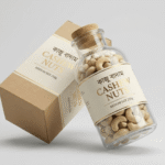
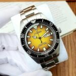
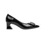
DESIGN 01 / 16PolaroidRightFlip

Polaroid Gallery — Thumbnails Right, Flip

Main photo in polaroid style, thumbnails on the right, flip effect.

Best forProducts with 4–8 photos.
Where to place itTop-left of the product page.

How to use: add the Product Gallery block and choose polaroid · right · flip in its style settings

What you can customize in this widget
ColorsMain background, Thumb background, Thumb active background, Tarw color, Tarw background, Arrow background, Arrow color, Arrow hover background, Arrow hover color, Dot color, Lb button color, Lb button background, Cat background, Cat color, Off background, Off color, Stock in background, Stock in color, Stock out background, Stock out color, Tag background, Tag color, Box background, Box border color
Font & text sizeThumb size, Tarw size, Arrow size, Dot size, Lb button size, Badge size
Size & spacingFixed h, Border w, Main radius, Gap, Thumb gap, Thumb radius, Arrow offset, Dot gap, Dot active w, Lb radius, Ob gap, Badge radius, Box margin, Box background size, Box radius
Layout & styleThumbs position, Cat position, Off position, Stock position, Tag position, Design, Arrow shape, Dot style
Animation & effectsArrows hover, Show counter, Effect, Autoplay, Autoplay speed, Hover zoom, Shadow, Lb counter, Badge animation, Badge animation speed
Show / hide optionsUse product, Extras, Show thumbs, Thumb slider, Show arrows, Show dots, Swipe, Lightbox, Zoom icon, Sticky, Show cat, Show off, Show stock, Stock show quantity, Show tag, Bangla digits, Dots over, Lb thumbs, Stock dot, On, Orig
Text, images & linksImages, Max images, Thumb visible, Sticky top, Var image, Off text, Stock in text, Stock out text, Stock quantity text, Tag text, Tag icon, Image ratio, Image height, Image fit, Image position, Image width, Main border, Main padding, Thumb fit, Thumb border, Thumb bw, Thumb active, Tarw hbg, Dot active, Lb overlay, Lb max, Ob x, Ob y, Badge padding y, Badge padding x, Box padding, Box background image, Box overlay, Box overlay o, Box border, Key, Product, W0
DESIGN 02 / 16GlowBottom

Glow Gallery — Thumbnails Below

Glowing main photo with thumbnails underneath.

Best forShiny products like honey and oil.
Where to place itTop of the product page.

How to use: add the Product Gallery block and choose glow · bottom in its style settings

What you can customize in this widget
ColorsMain background, Thumb background, Thumb active background, Tarw color, Tarw background, Arrow background, Arrow color, Arrow hover background, Arrow hover color, Dot color, Lb button color, Lb button background, Cat background, Cat color, Off background, Off color, Stock in background, Stock in color, Stock out background, Stock out color, Tag background, Tag color, Box background, Box border color
Font & text sizeThumb size, Tarw size, Arrow size, Dot size, Lb button size, Badge size
Size & spacingFixed h, Border w, Main radius, Gap, Thumb gap, Thumb radius, Arrow offset, Dot gap, Dot active w, Lb radius, Ob gap, Badge radius, Box margin, Box background size, Box radius
Layout & styleThumbs position, Cat position, Off position, Stock position, Tag position, Design, Arrow shape, Dot style
Animation & effectsArrows hover, Show counter, Effect, Autoplay, Autoplay speed, Hover zoom, Shadow, Lb counter, Badge animation, Badge animation speed
Show / hide optionsUse product, Extras, Show thumbs, Thumb slider, Show arrows, Show dots, Swipe, Lightbox, Zoom icon, Sticky, Show cat, Show off, Show stock, Stock show quantity, Show tag, Bangla digits, Dots over, Lb thumbs, Stock dot, On, Orig
Text, images & linksImages, Max images, Thumb visible, Sticky top, Var image, Off text, Stock in text, Stock out text, Stock quantity text, Tag text, Tag icon, Image ratio, Image height, Image fit, Image position, Image width, Main border, Main padding, Thumb fit, Thumb border, Thumb bw, Thumb active, Tarw hbg, Dot active, Lb overlay, Lb max, Ob x, Ob y, Badge padding y, Badge padding x, Box padding, Box background image, Box overlay, Box overlay o, Box border, Key, Product, W0
DESIGN 03 / 16PlainLeftFade

Plain Gallery — Thumbnails Left, Fade

Clean gallery with thumbnails on the left.

Best forClassic store layouts.
Where to place itProduct page top.

How to use: add the Product Gallery block and choose plain · left · fade in its style settings

What you can customize in this widget
ColorsMain background, Thumb background, Thumb active background, Tarw color, Tarw background, Arrow background, Arrow color, Arrow hover background, Arrow hover color, Dot color, Lb button color, Lb button background, Cat background, Cat color, Off background, Off color, Stock in background, Stock in color, Stock out background, Stock out color, Tag background, Tag color, Box background, Box border color
Font & text sizeThumb size, Tarw size, Arrow size, Dot size, Lb button size, Badge size
Size & spacingFixed h, Border w, Main radius, Gap, Thumb gap, Thumb radius, Arrow offset, Dot gap, Dot active w, Lb radius, Ob gap, Badge radius, Box margin, Box background size, Box radius
Layout & styleThumbs position, Cat position, Off position, Stock position, Tag position, Design, Arrow shape, Dot style
Animation & effectsArrows hover, Show counter, Effect, Autoplay, Autoplay speed, Hover zoom, Shadow, Lb counter, Badge animation, Badge animation speed
Show / hide optionsUse product, Extras, Show thumbs, Thumb slider, Show arrows, Show dots, Swipe, Lightbox, Zoom icon, Sticky, Show cat, Show off, Show stock, Stock show quantity, Show tag, Bangla digits, Dots over, Lb thumbs, Stock dot, On, Orig
Text, images & linksImages, Max images, Thumb visible, Sticky top, Var image, Off text, Stock in text, Stock out text, Stock quantity text, Tag text, Tag icon, Image ratio, Image height, Image fit, Image position, Image width, Main border, Main padding, Thumb fit, Thumb border, Thumb bw, Thumb active, Tarw hbg, Dot active, Lb overlay, Lb max, Ob x, Ob y, Badge padding y, Badge padding x, Box padding, Box background image, Box overlay, Box overlay o, Box border, Key, Product, W0
DESIGN 04 / 16CardRightSlide

Card Gallery — Thumbnails Right, Slide

Gallery in a card with slide effect.

Best forModern stores.
Where to place itProduct page top.

How to use: add the Product Gallery block and choose card · right · slide in its style settings

What you can customize in this widget
ColorsMain background, Thumb background, Thumb active background, Tarw color, Tarw background, Arrow background, Arrow color, Arrow hover background, Arrow hover color, Dot color, Lb button color, Lb button background, Cat background, Cat color, Off background, Off color, Stock in background, Stock in color, Stock out background, Stock out color, Tag background, Tag color, Box background, Box border color
Font & text sizeThumb size, Tarw size, Arrow size, Dot size, Lb button size, Badge size
Size & spacingFixed h, Border w, Main radius, Gap, Thumb gap, Thumb radius, Arrow offset, Dot gap, Dot active w, Lb radius, Ob gap, Badge radius, Box margin, Box background size, Box radius
Layout & styleThumbs position, Cat position, Off position, Stock position, Tag position, Design, Arrow shape, Dot style
Animation & effectsArrows hover, Show counter, Effect, Autoplay, Autoplay speed, Hover zoom, Shadow, Lb counter, Badge animation, Badge animation speed
Show / hide optionsUse product, Extras, Show thumbs, Thumb slider, Show arrows, Show dots, Swipe, Lightbox, Zoom icon, Sticky, Show cat, Show off, Show stock, Stock show quantity, Show tag, Bangla digits, Dots over, Lb thumbs, Stock dot, On, Orig
Text, images & linksImages, Max images, Thumb visible, Sticky top, Var image, Off text, Stock in text, Stock out text, Stock quantity text, Tag text, Tag icon, Image ratio, Image height, Image fit, Image position, Image width, Main border, Main padding, Thumb fit, Thumb border, Thumb bw, Thumb active, Tarw hbg, Dot active, Lb overlay, Lb max, Ob x, Ob y, Badge padding y, Badge padding x, Box padding, Box background image, Box overlay, Box overlay o, Box border, Key, Product, W0
DESIGN 05 / 16BorderBottomZoom

Bordered Gallery — Thumbnails Below, Zoom

Bordered photo with hover zoom.

Best forProducts where detail matters (nuts, textures).
Where to place itProduct page top.

How to use: add the Product Gallery block and choose border · bottom · zoom in its style settings

What you can customize in this widget
ColorsMain background, Thumb background, Thumb active background, Tarw color, Tarw background, Arrow background, Arrow color, Arrow hover background, Arrow hover color, Dot color, Lb button color, Lb button background, Cat background, Cat color, Off background, Off color, Stock in background, Stock in color, Stock out background, Stock out color, Tag background, Tag color, Box background, Box border color
Font & text sizeThumb size, Tarw size, Arrow size, Dot size, Lb button size, Badge size
Size & spacingFixed h, Border w, Main radius, Gap, Thumb gap, Thumb radius, Arrow offset, Dot gap, Dot active w, Lb radius, Ob gap, Badge radius, Box margin, Box background size, Box radius
Layout & styleThumbs position, Cat position, Off position, Stock position, Tag position, Design, Arrow shape, Dot style
Animation & effectsArrows hover, Show counter, Effect, Autoplay, Autoplay speed, Hover zoom, Shadow, Lb counter, Badge animation, Badge animation speed
Show / hide optionsUse product, Extras, Show thumbs, Thumb slider, Show arrows, Show dots, Swipe, Lightbox, Zoom icon, Sticky, Show cat, Show off, Show stock, Stock show quantity, Show tag, Bangla digits, Dots over, Lb thumbs, Stock dot, On, Orig
Text, images & linksImages, Max images, Thumb visible, Sticky top, Var image, Off text, Stock in text, Stock out text, Stock quantity text, Tag text, Tag icon, Image ratio, Image height, Image fit, Image position, Image width, Main border, Main padding, Thumb fit, Thumb border, Thumb bw, Thumb active, Tarw hbg, Dot active, Lb overlay, Lb max, Ob x, Ob y, Badge padding y, Badge padding x, Box padding, Box background image, Box overlay, Box overlay o, Box border, Key, Product, W0
DESIGN 06 / 16TintLeftFlip

Tinted Gallery — Thumbnails Left, Flip

Tinted background gallery.

Best forFriendly food brands.
Where to place itProduct page top.

How to use: add the Product Gallery block and choose tint · left · flip in its style settings

What you can customize in this widget
ColorsMain background, Thumb background, Thumb active background, Tarw color, Tarw background, Arrow background, Arrow color, Arrow hover background, Arrow hover color, Dot color, Lb button color, Lb button background, Cat background, Cat color, Off background, Off color, Stock in background, Stock in color, Stock out background, Stock out color, Tag background, Tag color, Box background, Box border color
Font & text sizeThumb size, Tarw size, Arrow size, Dot size, Lb button size, Badge size
Size & spacingFixed h, Border w, Main radius, Gap, Thumb gap, Thumb radius, Arrow offset, Dot gap, Dot active w, Lb radius, Ob gap, Badge radius, Box margin, Box background size, Box radius
Layout & styleThumbs position, Cat position, Off position, Stock position, Tag position, Design, Arrow shape, Dot style
Animation & effectsArrows hover, Show counter, Effect, Autoplay, Autoplay speed, Hover zoom, Shadow, Lb counter, Badge animation, Badge animation speed
Show / hide optionsUse product, Extras, Show thumbs, Thumb slider, Show arrows, Show dots, Swipe, Lightbox, Zoom icon, Sticky, Show cat, Show off, Show stock, Stock show quantity, Show tag, Bangla digits, Dots over, Lb thumbs, Stock dot, On, Orig
Text, images & linksImages, Max images, Thumb visible, Sticky top, Var image, Off text, Stock in text, Stock out text, Stock quantity text, Tag text, Tag icon, Image ratio, Image height, Image fit, Image position, Image width, Main border, Main padding, Thumb fit, Thumb border, Thumb bw, Thumb active, Tarw hbg, Dot active, Lb overlay, Lb max, Ob x, Ob y, Badge padding y, Badge padding x, Box padding, Box background image, Box overlay, Box overlay o, Box border, Key, Product, W0
DESIGN 07 / 16PolaroidRight

Polaroid Gallery — No Effect

Polaroid gallery without transition.

Best forHomemade products.
Where to place itProduct page top.

How to use: add the Product Gallery block and choose polaroid · right in its style settings

What you can customize in this widget
ColorsMain background, Thumb background, Thumb active background, Tarw color, Tarw background, Arrow background, Arrow color, Arrow hover background, Arrow hover color, Dot color, Lb button color, Lb button background, Cat background, Cat color, Off background, Off color, Stock in background, Stock in color, Stock out background, Stock out color, Tag background, Tag color, Box background, Box border color
Font & text sizeThumb size, Tarw size, Arrow size, Dot size, Lb button size, Badge size
Size & spacingFixed h, Border w, Main radius, Gap, Thumb gap, Thumb radius, Arrow offset, Dot gap, Dot active w, Lb radius, Ob gap, Badge radius, Box margin, Box background size, Box radius
Layout & styleThumbs position, Cat position, Off position, Stock position, Tag position, Design, Arrow shape, Dot style
Animation & effectsArrows hover, Show counter, Effect, Autoplay, Autoplay speed, Hover zoom, Shadow, Lb counter, Badge animation, Badge animation speed
Show / hide optionsUse product, Extras, Show thumbs, Thumb slider, Show arrows, Show dots, Swipe, Lightbox, Zoom icon, Sticky, Show cat, Show off, Show stock, Stock show quantity, Show tag, Bangla digits, Dots over, Lb thumbs, Stock dot, On, Orig
Text, images & linksImages, Max images, Thumb visible, Sticky top, Var image, Off text, Stock in text, Stock out text, Stock quantity text, Tag text, Tag icon, Image ratio, Image height, Image fit, Image position, Image width, Main border, Main padding, Thumb fit, Thumb border, Thumb bw, Thumb active, Tarw hbg, Dot active, Lb overlay, Lb max, Ob x, Ob y, Badge padding y, Badge padding x, Box padding, Box background image, Box overlay, Box overlay o, Box border, Key, Product, W0
DESIGN 08 / 16GlowBottomFade

Glow Gallery — Fade

Glow gallery with fade.

Best forSpice products.
Where to place itProduct page top.

How to use: add the Product Gallery block and choose glow · bottom · fade in its style settings

What you can customize in this widget
ColorsMain background, Thumb background, Thumb active background, Tarw color, Tarw background, Arrow background, Arrow color, Arrow hover background, Arrow hover color, Dot color, Lb button color, Lb button background, Cat background, Cat color, Off background, Off color, Stock in background, Stock in color, Stock out background, Stock out color, Tag background, Tag color, Box background, Box border color
Font & text sizeThumb size, Tarw size, Arrow size, Dot size, Lb button size, Badge size
Size & spacingFixed h, Border w, Main radius, Gap, Thumb gap, Thumb radius, Arrow offset, Dot gap, Dot active w, Lb radius, Ob gap, Badge radius, Box margin, Box background size, Box radius
Layout & styleThumbs position, Cat position, Off position, Stock position, Tag position, Design, Arrow shape, Dot style
Animation & effectsArrows hover, Show counter, Effect, Autoplay, Autoplay speed, Hover zoom, Shadow, Lb counter, Badge animation, Badge animation speed
Show / hide optionsUse product, Extras, Show thumbs, Thumb slider, Show arrows, Show dots, Swipe, Lightbox, Zoom icon, Sticky, Show cat, Show off, Show stock, Stock show quantity, Show tag, Bangla digits, Dots over, Lb thumbs, Stock dot, On, Orig
Text, images & linksImages, Max images, Thumb visible, Sticky top, Var image, Off text, Stock in text, Stock out text, Stock quantity text, Tag text, Tag icon, Image ratio, Image height, Image fit, Image position, Image width, Main border, Main padding, Thumb fit, Thumb border, Thumb bw, Thumb active, Tarw hbg, Dot active, Lb overlay, Lb max, Ob x, Ob y, Badge padding y, Badge padding x, Box padding, Box background image, Box overlay, Box overlay o, Box border, Key, Product, W0
DESIGN 09 / 16PlainLeftSlide

Plain Gallery — Slide

Plain gallery with slide.

Best forHoney jars.
Where to place itProduct page top.

How to use: add the Product Gallery block and choose plain · left · slide in its style settings

What you can customize in this widget
ColorsMain background, Thumb background, Thumb active background, Tarw color, Tarw background, Arrow background, Arrow color, Arrow hover background, Arrow hover color, Dot color, Lb button color, Lb button background, Cat background, Cat color, Off background, Off color, Stock in background, Stock in color, Stock out background, Stock out color, Tag background, Tag color, Box background, Box border color
Font & text sizeThumb size, Tarw size, Arrow size, Dot size, Lb button size, Badge size
Size & spacingFixed h, Border w, Main radius, Gap, Thumb gap, Thumb radius, Arrow offset, Dot gap, Dot active w, Lb radius, Ob gap, Badge radius, Box margin, Box background size, Box radius
Layout & styleThumbs position, Cat position, Off position, Stock position, Tag position, Design, Arrow shape, Dot style
Animation & effectsArrows hover, Show counter, Effect, Autoplay, Autoplay speed, Hover zoom, Shadow, Lb counter, Badge animation, Badge animation speed
Show / hide optionsUse product, Extras, Show thumbs, Thumb slider, Show arrows, Show dots, Swipe, Lightbox, Zoom icon, Sticky, Show cat, Show off, Show stock, Stock show quantity, Show tag, Bangla digits, Dots over, Lb thumbs, Stock dot, On, Orig
Text, images & linksImages, Max images, Thumb visible, Sticky top, Var image, Off text, Stock in text, Stock out text, Stock quantity text, Tag text, Tag icon, Image ratio, Image height, Image fit, Image position, Image width, Main border, Main padding, Thumb fit, Thumb border, Thumb bw, Thumb active, Tarw hbg, Dot active, Lb overlay, Lb max, Ob x, Ob y, Badge padding y, Badge padding x, Box padding, Box background image, Box overlay, Box overlay o, Box border, Key, Product, W0
DESIGN 10 / 16CardRightZoom

Card Gallery — Zoom

Card gallery with zoom.

Best forOil bottles.
Where to place itProduct page top.

How to use: add the Product Gallery block and choose card · right · zoom in its style settings

What you can customize in this widget
ColorsMain background, Thumb background, Thumb active background, Tarw color, Tarw background, Arrow background, Arrow color, Arrow hover background, Arrow hover color, Dot color, Lb button color, Lb button background, Cat background, Cat color, Off background, Off color, Stock in background, Stock in color, Stock out background, Stock out color, Tag background, Tag color, Box background, Box border color
Font & text sizeThumb size, Tarw size, Arrow size, Dot size, Lb button size, Badge size
Size & spacingFixed h, Border w, Main radius, Gap, Thumb gap, Thumb radius, Arrow offset, Dot gap, Dot active w, Lb radius, Ob gap, Badge radius, Box margin, Box background size, Box radius
Layout & styleThumbs position, Cat position, Off position, Stock position, Tag position, Design, Arrow shape, Dot style
Animation & effectsArrows hover, Show counter, Effect, Autoplay, Autoplay speed, Hover zoom, Shadow, Lb counter, Badge animation, Badge animation speed
Show / hide optionsUse product, Extras, Show thumbs, Thumb slider, Show arrows, Show dots, Swipe, Lightbox, Zoom icon, Sticky, Show cat, Show off, Show stock, Stock show quantity, Show tag, Bangla digits, Dots over, Lb thumbs, Stock dot, On, Orig
Text, images & linksImages, Max images, Thumb visible, Sticky top, Var image, Off text, Stock in text, Stock out text, Stock quantity text, Tag text, Tag icon, Image ratio, Image height, Image fit, Image position, Image width, Main border, Main padding, Thumb fit, Thumb border, Thumb bw, Thumb active, Tarw hbg, Dot active, Lb overlay, Lb max, Ob x, Ob y, Badge padding y, Badge padding x, Box padding, Box background image, Box overlay, Box overlay o, Box border, Key, Product, W0
DESIGN 11 / 16BorderBottomFlip

Bordered Gallery — Flip

Bordered with flip.

Best forNuts packs.
Where to place itProduct page top.

How to use: add the Product Gallery block and choose border · bottom · flip in its style settings

What you can customize in this widget
ColorsMain background, Thumb background, Thumb active background, Tarw color, Tarw background, Arrow background, Arrow color, Arrow hover background, Arrow hover color, Dot color, Lb button color, Lb button background, Cat background, Cat color, Off background, Off color, Stock in background, Stock in color, Stock out background, Stock out color, Tag background, Tag color, Box background, Box border color
Font & text sizeThumb size, Tarw size, Arrow size, Dot size, Lb button size, Badge size
Size & spacingFixed h, Border w, Main radius, Gap, Thumb gap, Thumb radius, Arrow offset, Dot gap, Dot active w, Lb radius, Ob gap, Badge radius, Box margin, Box background size, Box radius
Layout & styleThumbs position, Cat position, Off position, Stock position, Tag position, Design, Arrow shape, Dot style
Animation & effectsArrows hover, Show counter, Effect, Autoplay, Autoplay speed, Hover zoom, Shadow, Lb counter, Badge animation, Badge animation speed
Show / hide optionsUse product, Extras, Show thumbs, Thumb slider, Show arrows, Show dots, Swipe, Lightbox, Zoom icon, Sticky, Show cat, Show off, Show stock, Stock show quantity, Show tag, Bangla digits, Dots over, Lb thumbs, Stock dot, On, Orig
Text, images & linksImages, Max images, Thumb visible, Sticky top, Var image, Off text, Stock in text, Stock out text, Stock quantity text, Tag text, Tag icon, Image ratio, Image height, Image fit, Image position, Image width, Main border, Main padding, Thumb fit, Thumb border, Thumb bw, Thumb active, Tarw hbg, Dot active, Lb overlay, Lb max, Ob x, Ob y, Badge padding y, Badge padding x, Box padding, Box background image, Box overlay, Box overlay o, Box border, Key, Product, W0
DESIGN 12 / 16TintLeft

Tinted Gallery — No Effect

Tinted, simple.

Best forPickles.
Where to place itProduct page top.

How to use: add the Product Gallery block and choose tint · left in its style settings

What you can customize in this widget
ColorsMain background, Thumb background, Thumb active background, Tarw color, Tarw background, Arrow background, Arrow color, Arrow hover background, Arrow hover color, Dot color, Lb button color, Lb button background, Cat background, Cat color, Off background, Off color, Stock in background, Stock in color, Stock out background, Stock out color, Tag background, Tag color, Box background, Box border color
Font & text sizeThumb size, Tarw size, Arrow size, Dot size, Lb button size, Badge size
Size & spacingFixed h, Border w, Main radius, Gap, Thumb gap, Thumb radius, Arrow offset, Dot gap, Dot active w, Lb radius, Ob gap, Badge radius, Box margin, Box background size, Box radius
Layout & styleThumbs position, Cat position, Off position, Stock position, Tag position, Design, Arrow shape, Dot style
Animation & effectsArrows hover, Show counter, Effect, Autoplay, Autoplay speed, Hover zoom, Shadow, Lb counter, Badge animation, Badge animation speed
Show / hide optionsUse product, Extras, Show thumbs, Thumb slider, Show arrows, Show dots, Swipe, Lightbox, Zoom icon, Sticky, Show cat, Show off, Show stock, Stock show quantity, Show tag, Bangla digits, Dots over, Lb thumbs, Stock dot, On, Orig
Text, images & linksImages, Max images, Thumb visible, Sticky top, Var image, Off text, Stock in text, Stock out text, Stock quantity text, Tag text, Tag icon, Image ratio, Image height, Image fit, Image position, Image width, Main border, Main padding, Thumb fit, Thumb border, Thumb bw, Thumb active, Tarw hbg, Dot active, Lb overlay, Lb max, Ob x, Ob y, Badge padding y, Badge padding x, Box padding, Box background image, Box overlay, Box overlay o, Box border, Key, Product, W0
DESIGN 13 / 16PolaroidRightFade

Polaroid Gallery — Fade

Polaroid with fade.

Best forSpice.
Where to place itProduct page top.

How to use: add the Product Gallery block and choose polaroid · right · fade in its style settings

What you can customize in this widget
ColorsMain background, Thumb background, Thumb active background, Tarw color, Tarw background, Arrow background, Arrow color, Arrow hover background, Arrow hover color, Dot color, Lb button color, Lb button background, Cat background, Cat color, Off background, Off color, Stock in background, Stock in color, Stock out background, Stock out color, Tag background, Tag color, Box background, Box border color
Font & text sizeThumb size, Tarw size, Arrow size, Dot size, Lb button size, Badge size
Size & spacingFixed h, Border w, Main radius, Gap, Thumb gap, Thumb radius, Arrow offset, Dot gap, Dot active w, Lb radius, Ob gap, Badge radius, Box margin, Box background size, Box radius
Layout & styleThumbs position, Cat position, Off position, Stock position, Tag position, Design, Arrow shape, Dot style
Animation & effectsArrows hover, Show counter, Effect, Autoplay, Autoplay speed, Hover zoom, Shadow, Lb counter, Badge animation, Badge animation speed
Show / hide optionsUse product, Extras, Show thumbs, Thumb slider, Show arrows, Show dots, Swipe, Lightbox, Zoom icon, Sticky, Show cat, Show off, Show stock, Stock show quantity, Show tag, Bangla digits, Dots over, Lb thumbs, Stock dot, On, Orig
Text, images & linksImages, Max images, Thumb visible, Sticky top, Var image, Off text, Stock in text, Stock out text, Stock quantity text, Tag text, Tag icon, Image ratio, Image height, Image fit, Image position, Image width, Main border, Main padding, Thumb fit, Thumb border, Thumb bw, Thumb active, Tarw hbg, Dot active, Lb overlay, Lb max, Ob x, Ob y, Badge padding y, Badge padding x, Box padding, Box background image, Box overlay, Box overlay o, Box border, Key, Product, W0
DESIGN 14 / 16GlowBottomSlide

Glow Gallery — Slide

Glow with slide.

Best forGift items.
Where to place itProduct page top.

How to use: add the Product Gallery block and choose glow · bottom · slide in its style settings

What you can customize in this widget
ColorsMain background, Thumb background, Thumb active background, Tarw color, Tarw background, Arrow background, Arrow color, Arrow hover background, Arrow hover color, Dot color, Lb button color, Lb button background, Cat background, Cat color, Off background, Off color, Stock in background, Stock in color, Stock out background, Stock out color, Tag background, Tag color, Box background, Box border color
Font & text sizeThumb size, Tarw size, Arrow size, Dot size, Lb button size, Badge size
Size & spacingFixed h, Border w, Main radius, Gap, Thumb gap, Thumb radius, Arrow offset, Dot gap, Dot active w, Lb radius, Ob gap, Badge radius, Box margin, Box background size, Box radius
Layout & styleThumbs position, Cat position, Off position, Stock position, Tag position, Design, Arrow shape, Dot style
Animation & effectsArrows hover, Show counter, Effect, Autoplay, Autoplay speed, Hover zoom, Shadow, Lb counter, Badge animation, Badge animation speed
Show / hide optionsUse product, Extras, Show thumbs, Thumb slider, Show arrows, Show dots, Swipe, Lightbox, Zoom icon, Sticky, Show cat, Show off, Show stock, Stock show quantity, Show tag, Bangla digits, Dots over, Lb thumbs, Stock dot, On, Orig
Text, images & linksImages, Max images, Thumb visible, Sticky top, Var image, Off text, Stock in text, Stock out text, Stock quantity text, Tag text, Tag icon, Image ratio, Image height, Image fit, Image position, Image width, Main border, Main padding, Thumb fit, Thumb border, Thumb bw, Thumb active, Tarw hbg, Dot active, Lb overlay, Lb max, Ob x, Ob y, Badge padding y, Badge padding x, Box padding, Box background image, Box overlay, Box overlay o, Box border, Key, Product, W0
DESIGN 15 / 16PlainLeftZoom

Plain Gallery — Zoom

Plain with zoom.

Best forKitchen staples.
Where to place itProduct page top.

How to use: add the Product Gallery block and choose plain · left · zoom in its style settings

What you can customize in this widget
ColorsMain background, Thumb background, Thumb active background, Tarw color, Tarw background, Arrow background, Arrow color, Arrow hover background, Arrow hover color, Dot color, Lb button color, Lb button background, Cat background, Cat color, Off background, Off color, Stock in background, Stock in color, Stock out background, Stock out color, Tag background, Tag color, Box background, Box border color
Font & text sizeThumb size, Tarw size, Arrow size, Dot size, Lb button size, Badge size
Size & spacingFixed h, Border w, Main radius, Gap, Thumb gap, Thumb radius, Arrow offset, Dot gap, Dot active w, Lb radius, Ob gap, Badge radius, Box margin, Box background size, Box radius
Layout & styleThumbs position, Cat position, Off position, Stock position, Tag position, Design, Arrow shape, Dot style
Animation & effectsArrows hover, Show counter, Effect, Autoplay, Autoplay speed, Hover zoom, Shadow, Lb counter, Badge animation, Badge animation speed
Show / hide optionsUse product, Extras, Show thumbs, Thumb slider, Show arrows, Show dots, Swipe, Lightbox, Zoom icon, Sticky, Show cat, Show off, Show stock, Stock show quantity, Show tag, Bangla digits, Dots over, Lb thumbs, Stock dot, On, Orig
Text, images & linksImages, Max images, Thumb visible, Sticky top, Var image, Off text, Stock in text, Stock out text, Stock quantity text, Tag text, Tag icon, Image ratio, Image height, Image fit, Image position, Image width, Main border, Main padding, Thumb fit, Thumb border, Thumb bw, Thumb active, Tarw hbg, Dot active, Lb overlay, Lb max, Ob x, Ob y, Badge padding y, Badge padding x, Box padding, Box background image, Box overlay, Box overlay o, Box border, Key, Product, W0
DESIGN 16 / 16CardRightFlip

Card Gallery — Flip Default

Card gallery with flip — modern default.

Best forAny product.
Where to place itTop of the product page.

How to use: add the Product Gallery block and choose card · right · flip in its style settings

What you can customize in this widget
ColorsMain background, Thumb background, Thumb active background, Tarw color, Tarw background, Arrow background, Arrow color, Arrow hover background, Arrow hover color, Dot color, Lb button color, Lb button background, Cat background, Cat color, Off background, Off color, Stock in background, Stock in color, Stock out background, Stock out color, Tag background, Tag color, Box background, Box border color
Font & text sizeThumb size, Tarw size, Arrow size, Dot size, Lb button size, Badge size
Size & spacingFixed h, Border w, Main radius, Gap, Thumb gap, Thumb radius, Arrow offset, Dot gap, Dot active w, Lb radius, Ob gap, Badge radius, Box margin, Box background size, Box radius
Layout & styleThumbs position, Cat position, Off position, Stock position, Tag position, Design, Arrow shape, Dot style
Animation & effectsArrows hover, Show counter, Effect, Autoplay, Autoplay speed, Hover zoom, Shadow, Lb counter, Badge animation, Badge animation speed
Show / hide optionsUse product, Extras, Show thumbs, Thumb slider, Show arrows, Show dots, Swipe, Lightbox, Zoom icon, Sticky, Show cat, Show off, Show stock, Stock show quantity, Show tag, Bangla digits, Dots over, Lb thumbs, Stock dot, On, Orig
Text, images & linksImages, Max images, Thumb visible, Sticky top, Var image, Off text, Stock in text, Stock out text, Stock quantity text, Tag text, Tag icon, Image ratio, Image height, Image fit, Image position, Image width, Main border, Main padding, Thumb fit, Thumb border, Thumb bw, Thumb active, Tarw hbg, Dot active, Lb overlay, Lb max, Ob x, Ob y, Badge padding y, Badge padding x, Box padding, Box background image, Box overlay, Box overlay o, Box border, Key, Product, W0