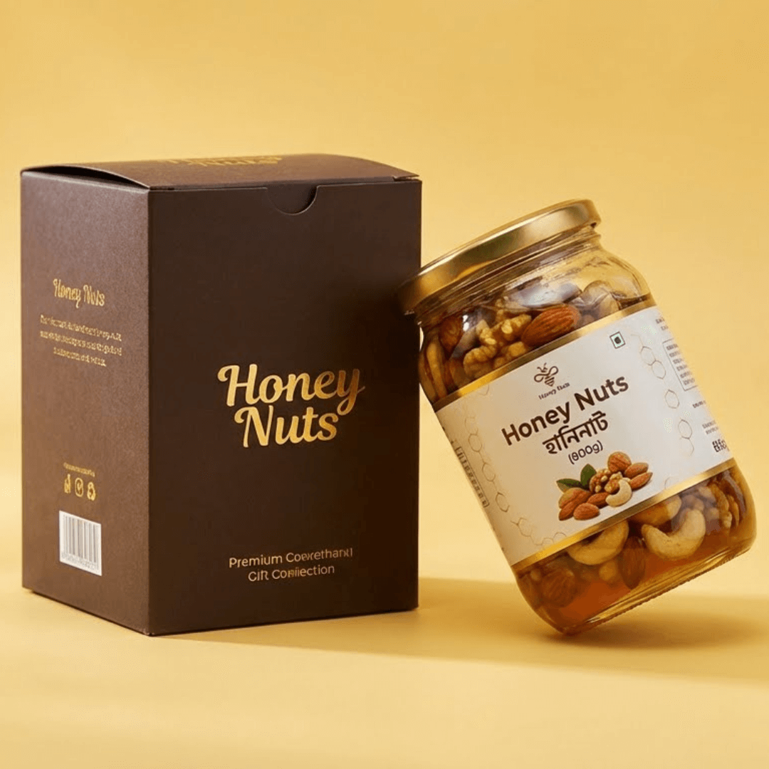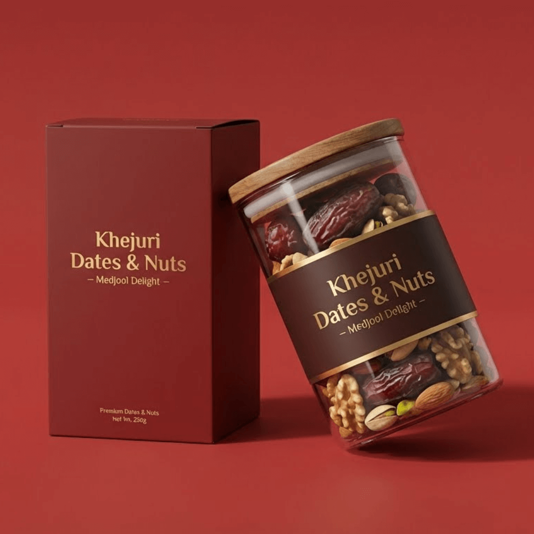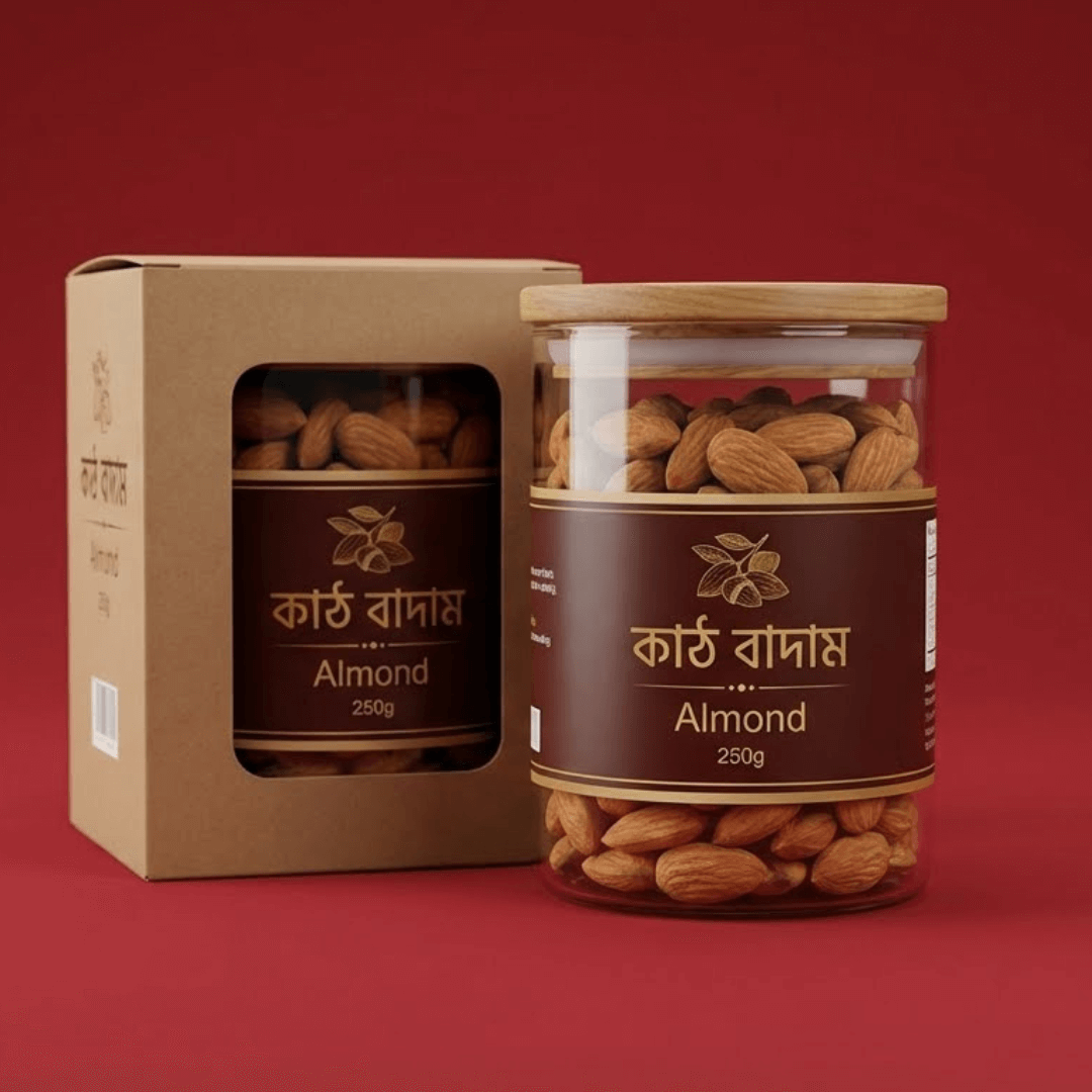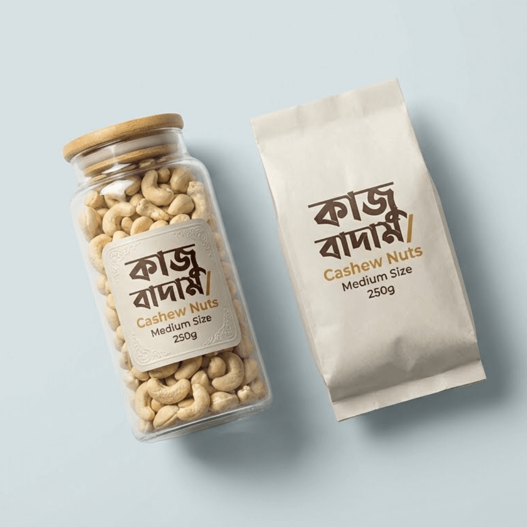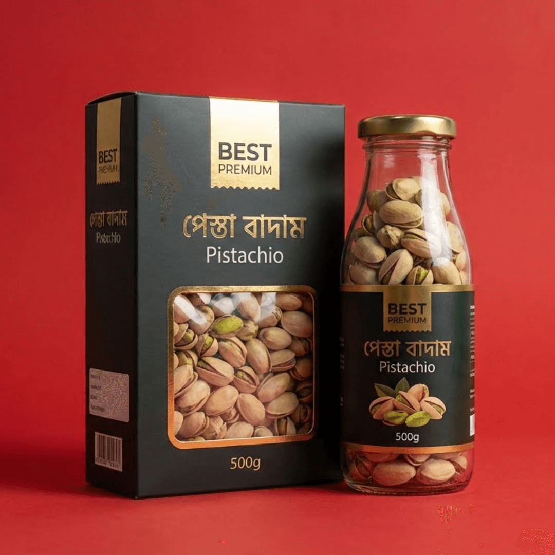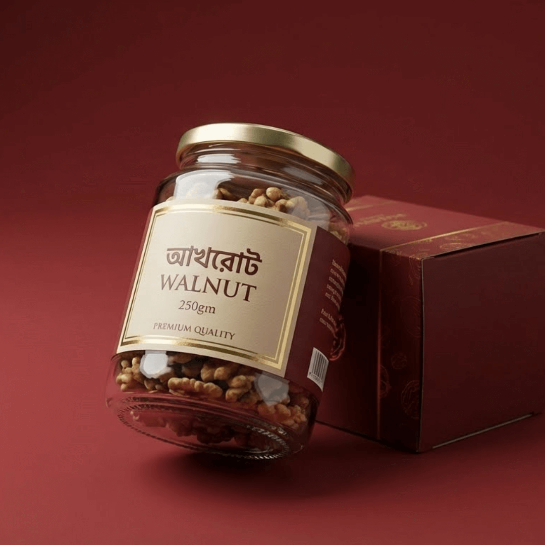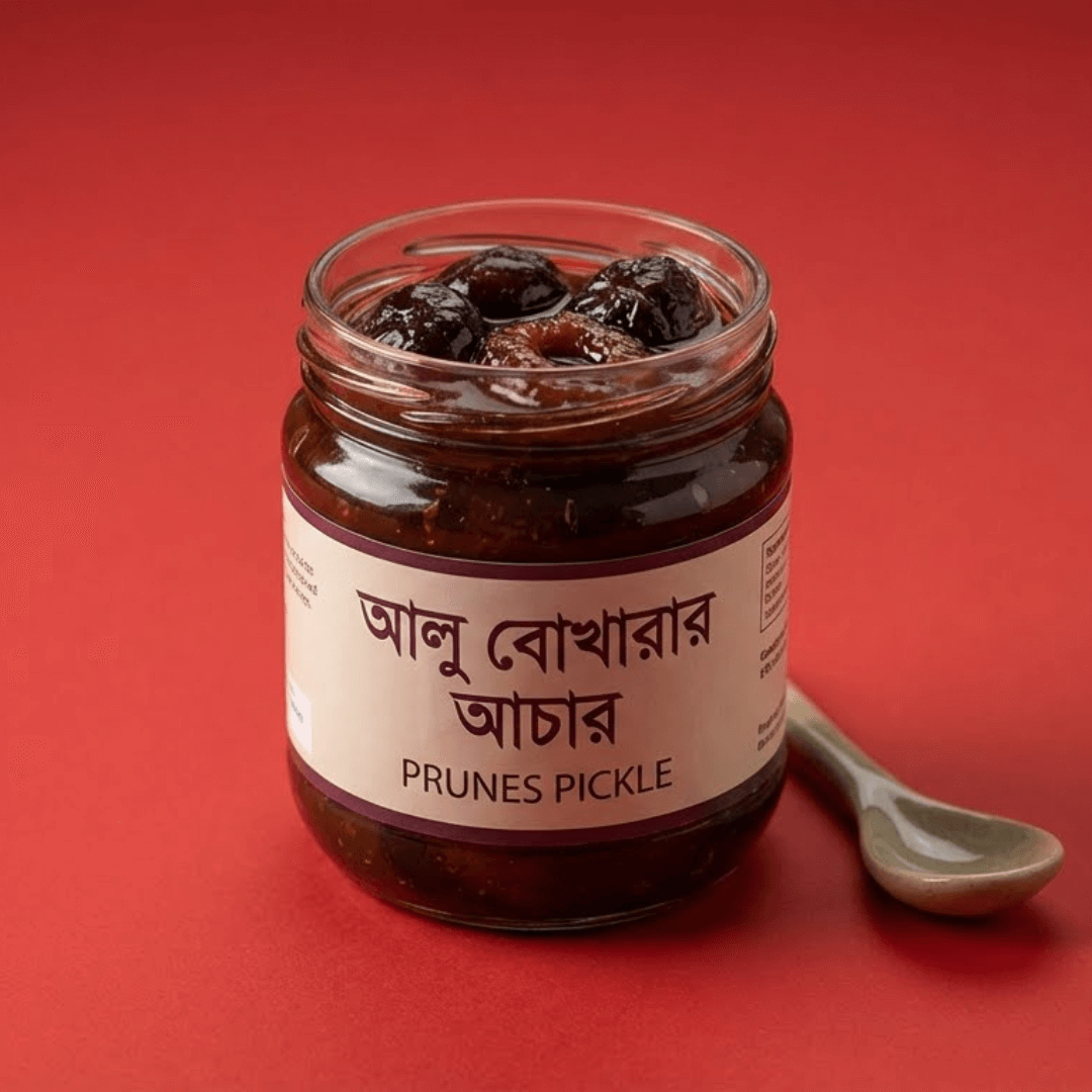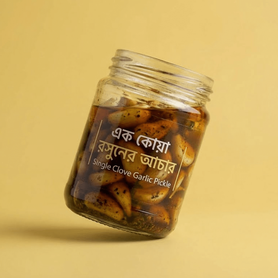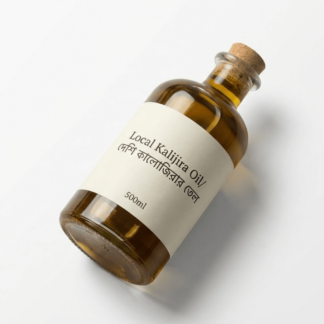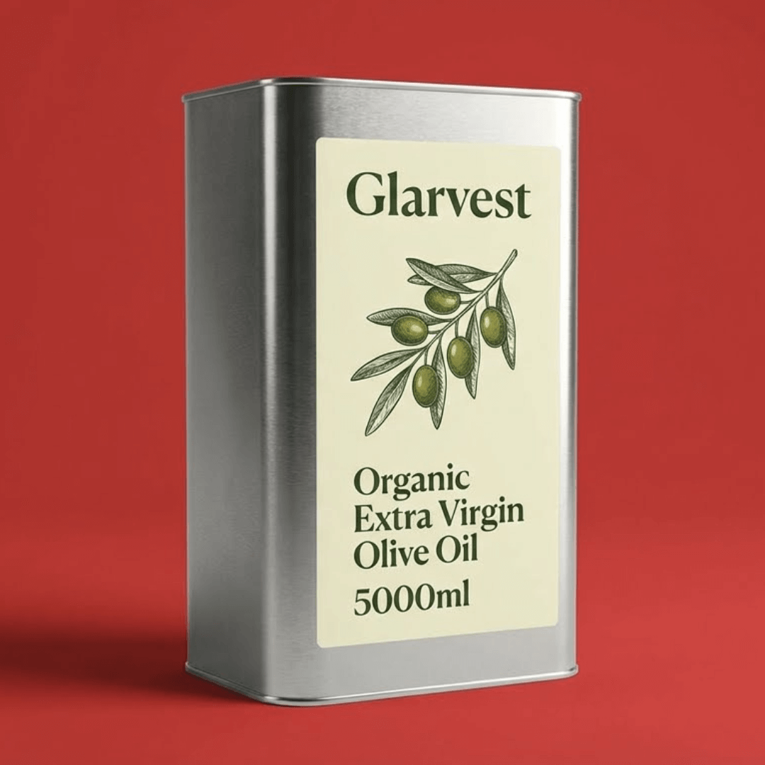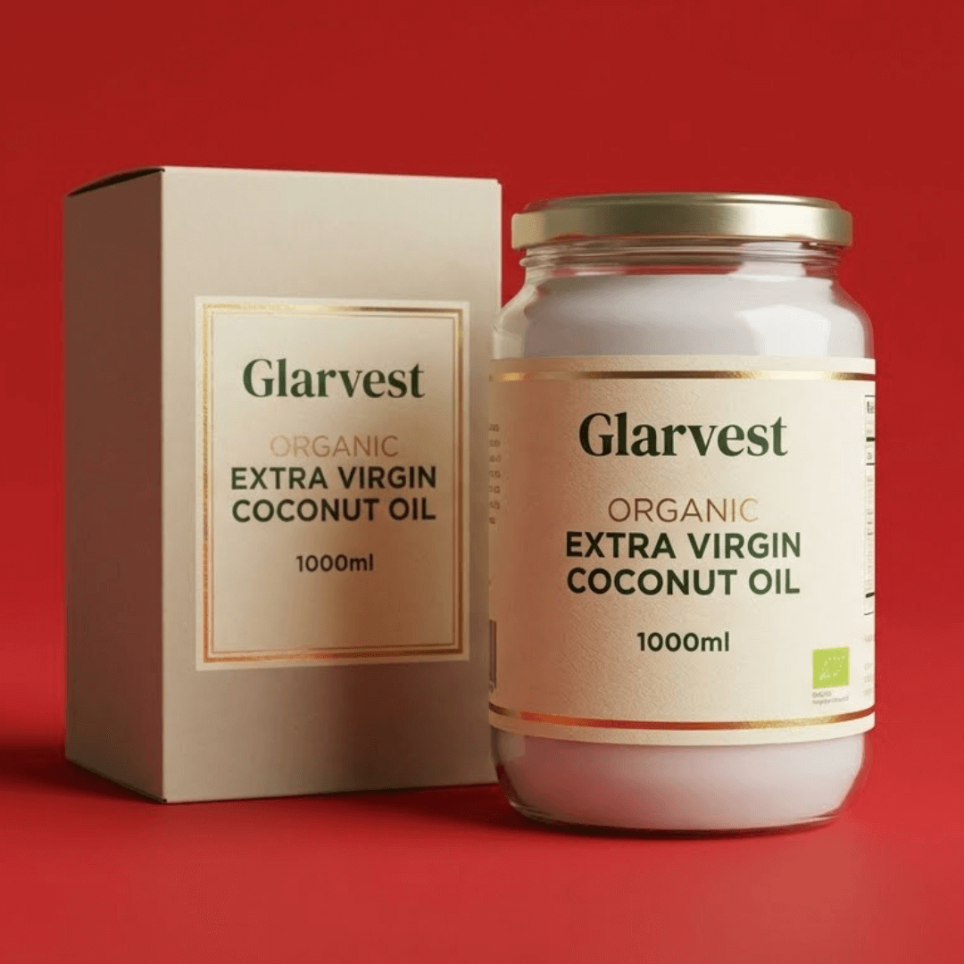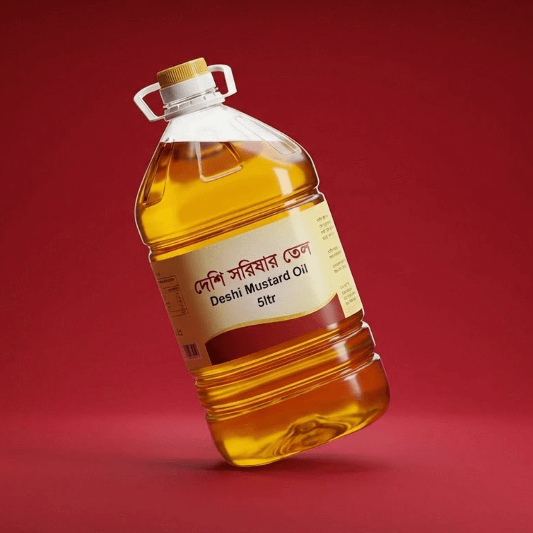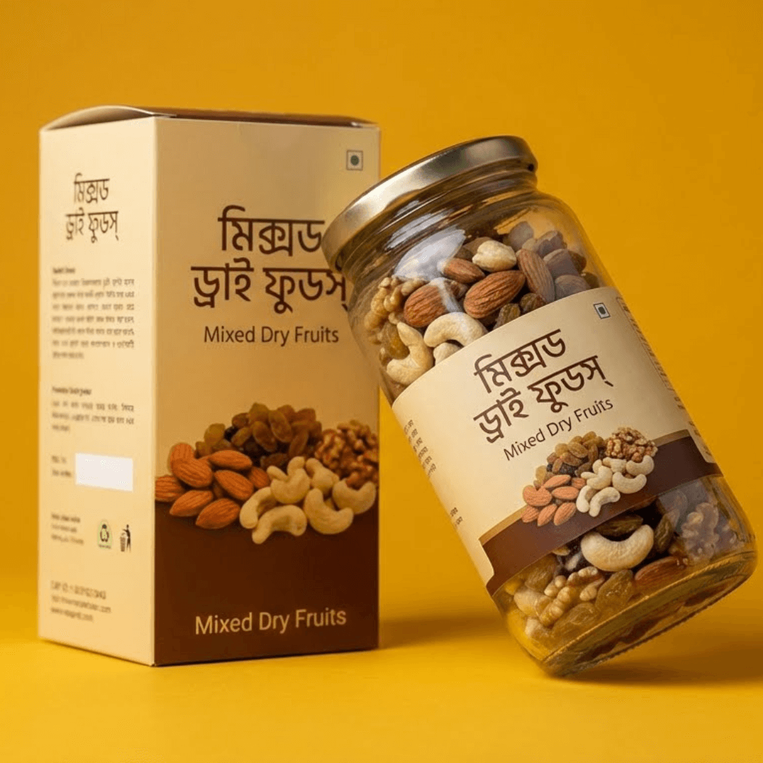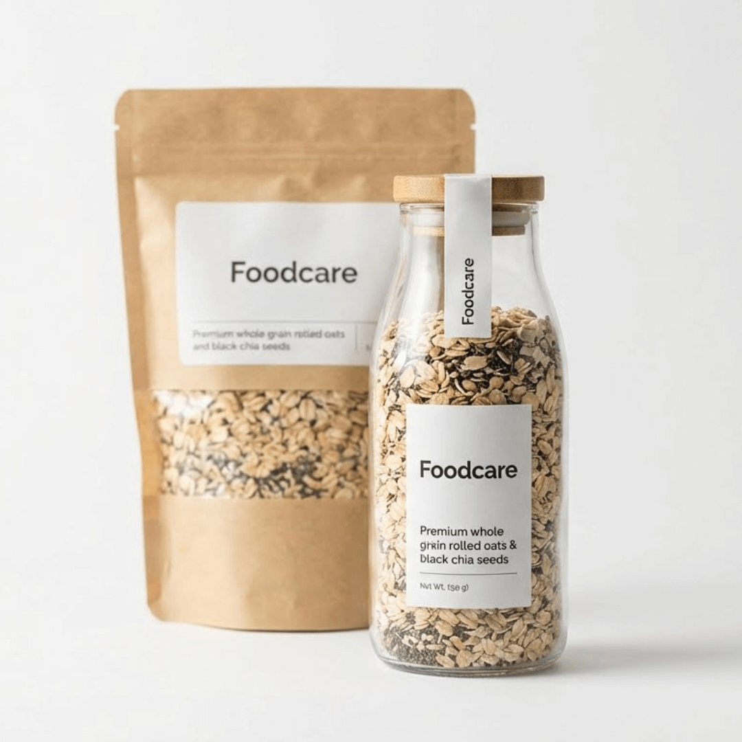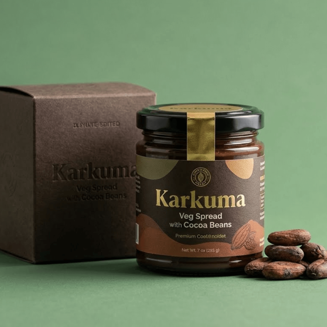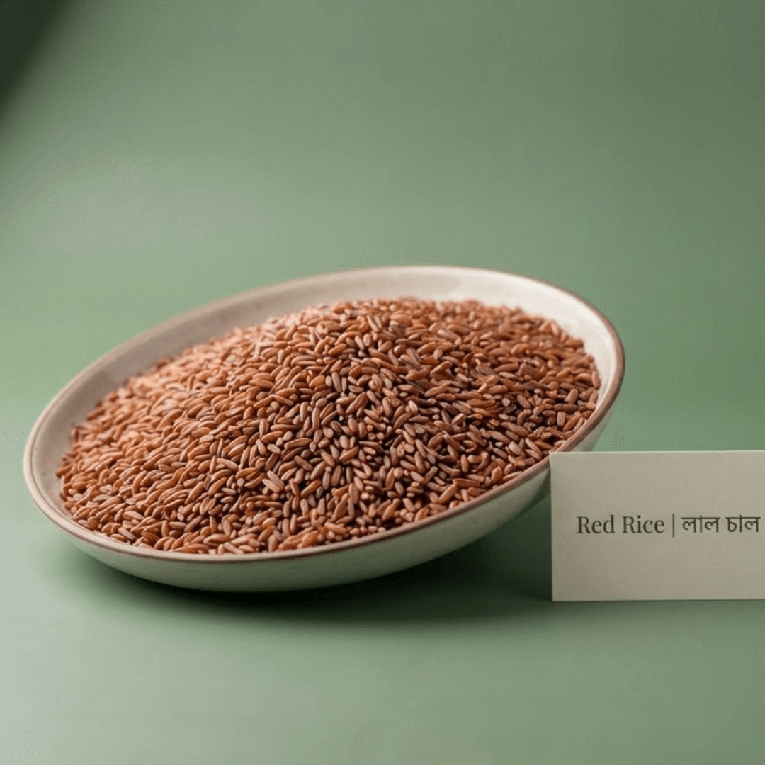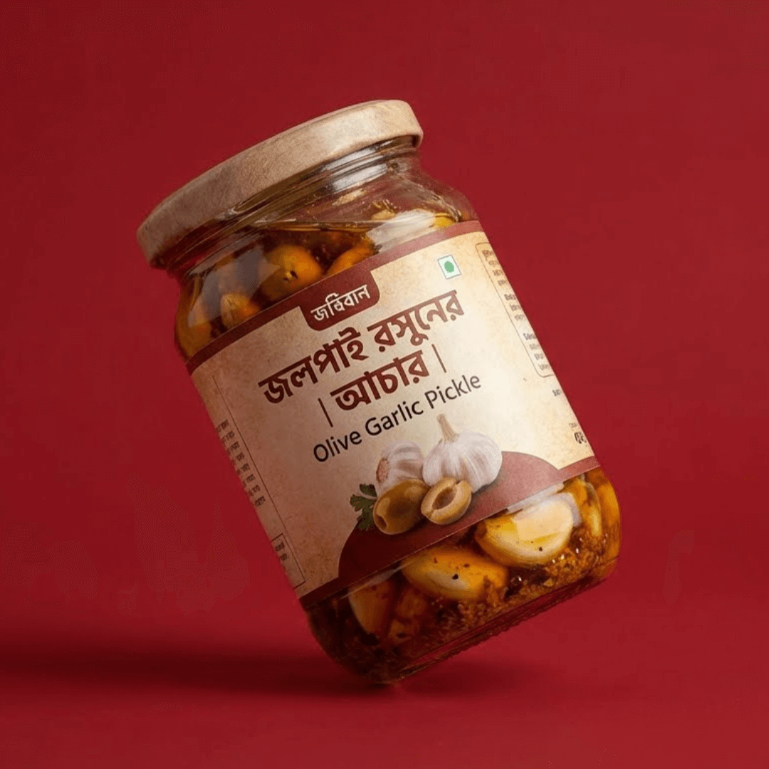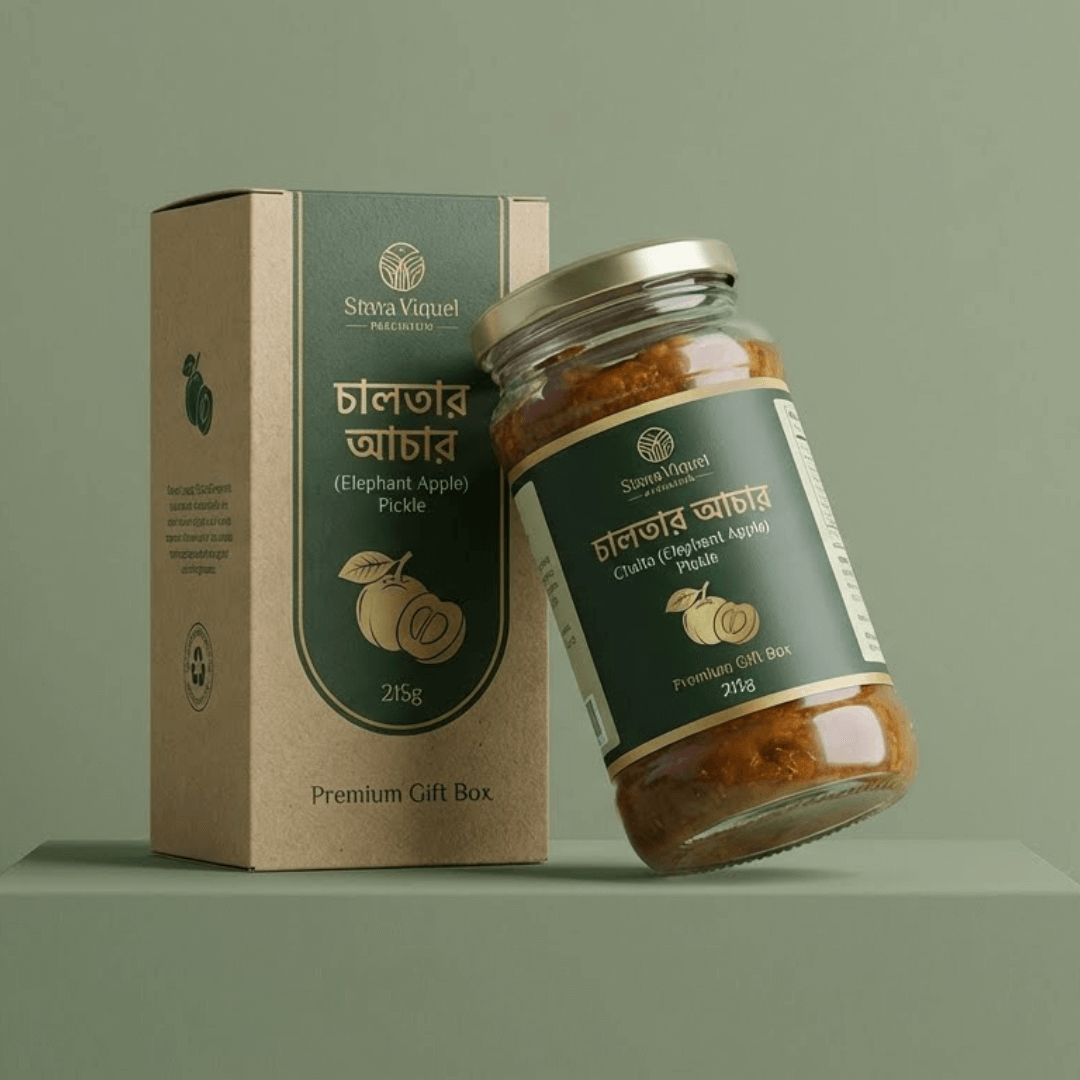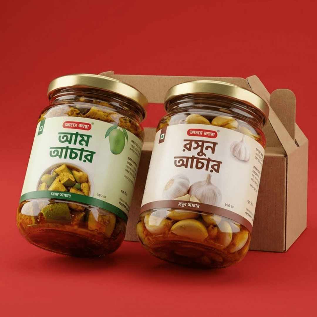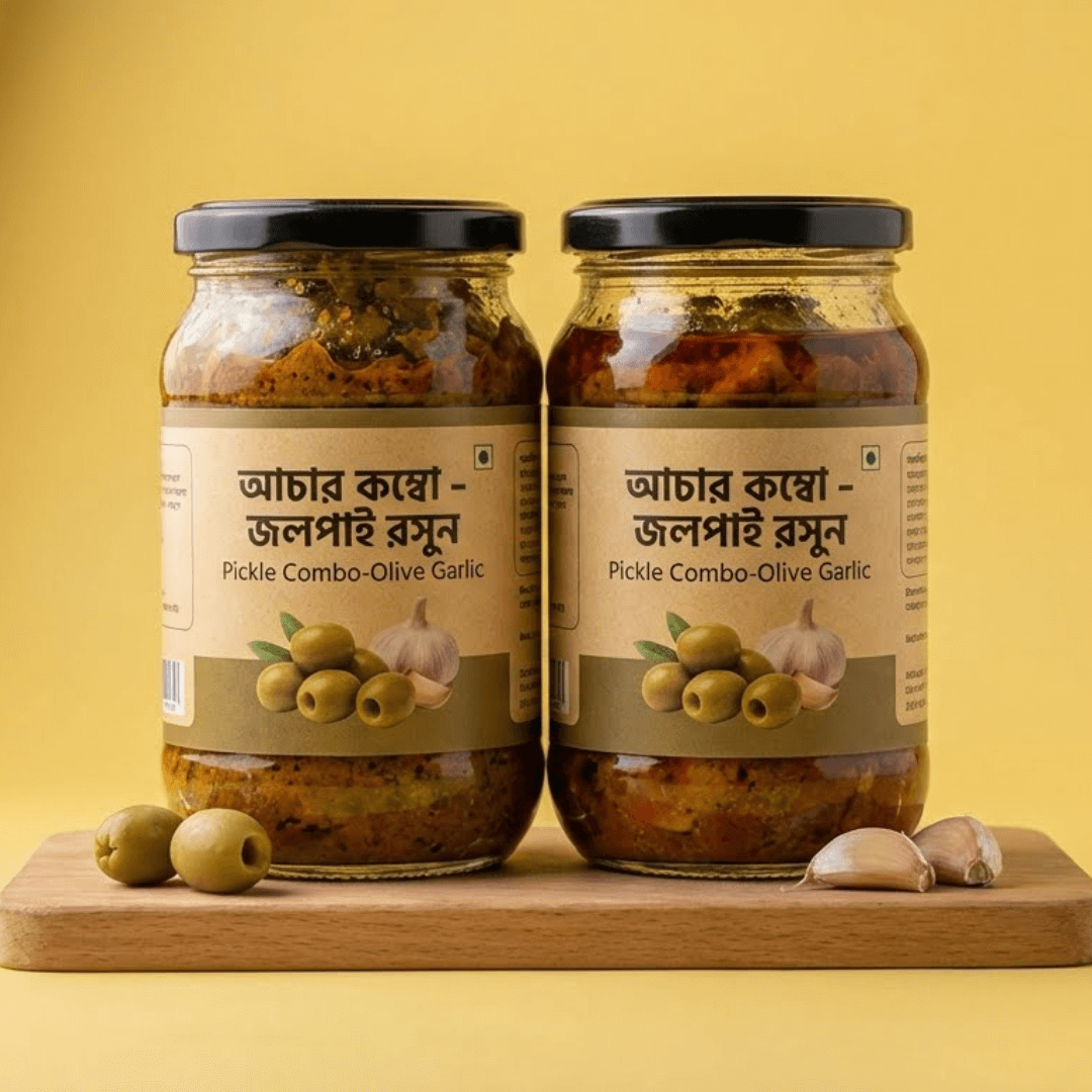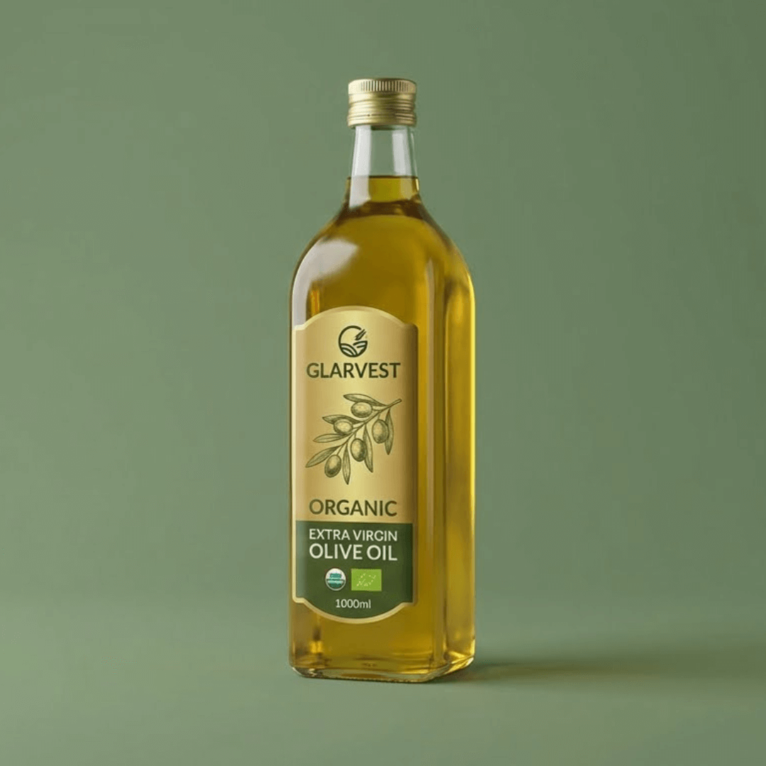

DESIGN 01 / 16GridOriginal

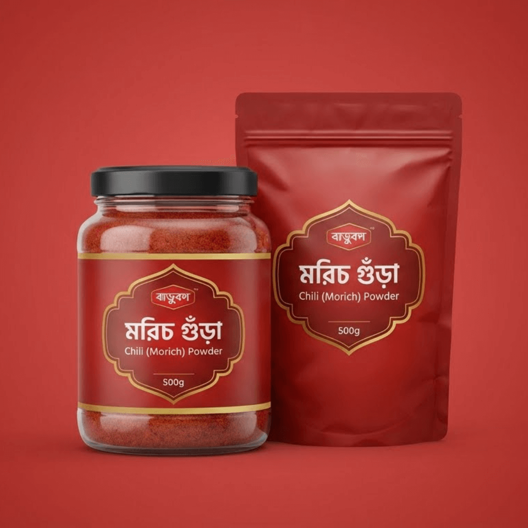
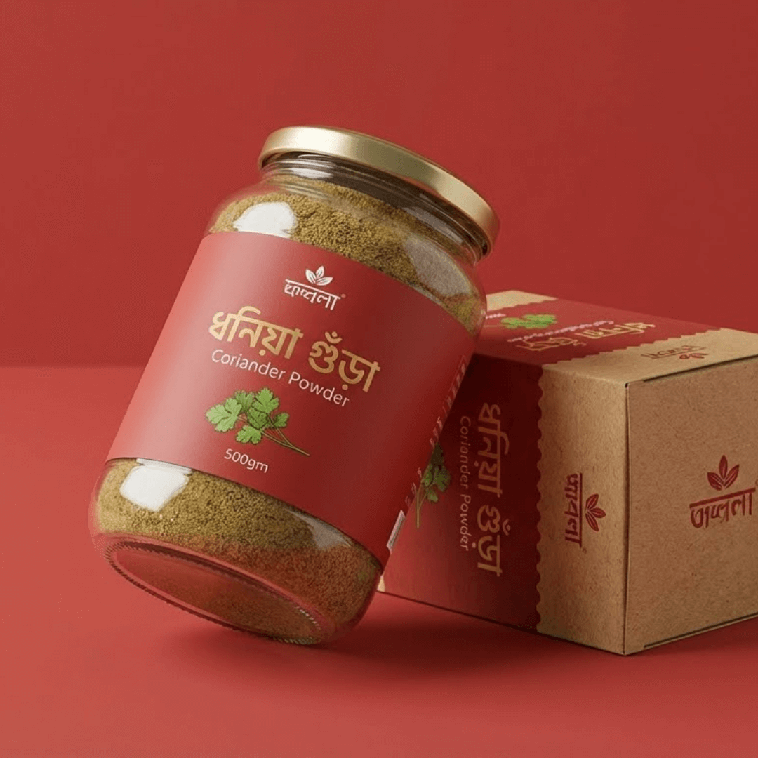
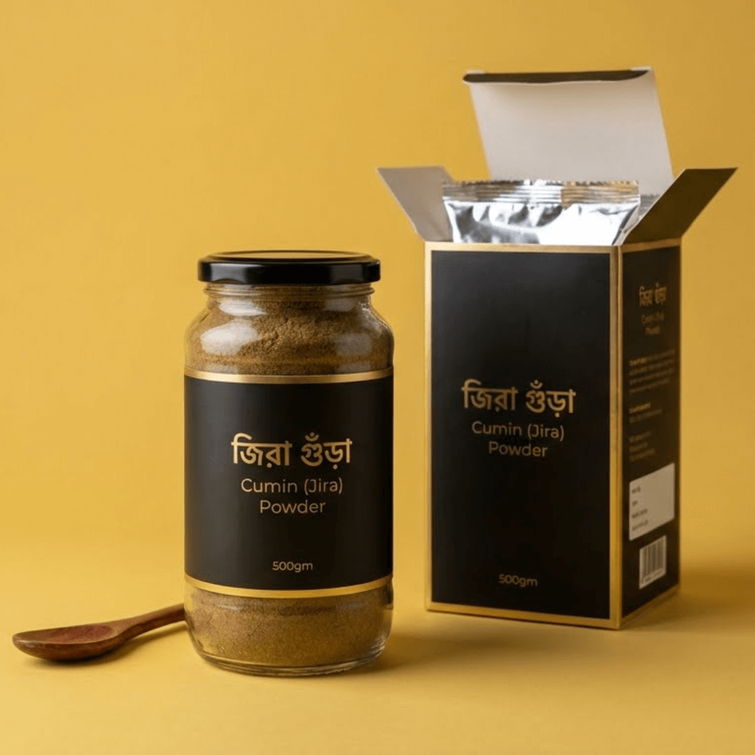
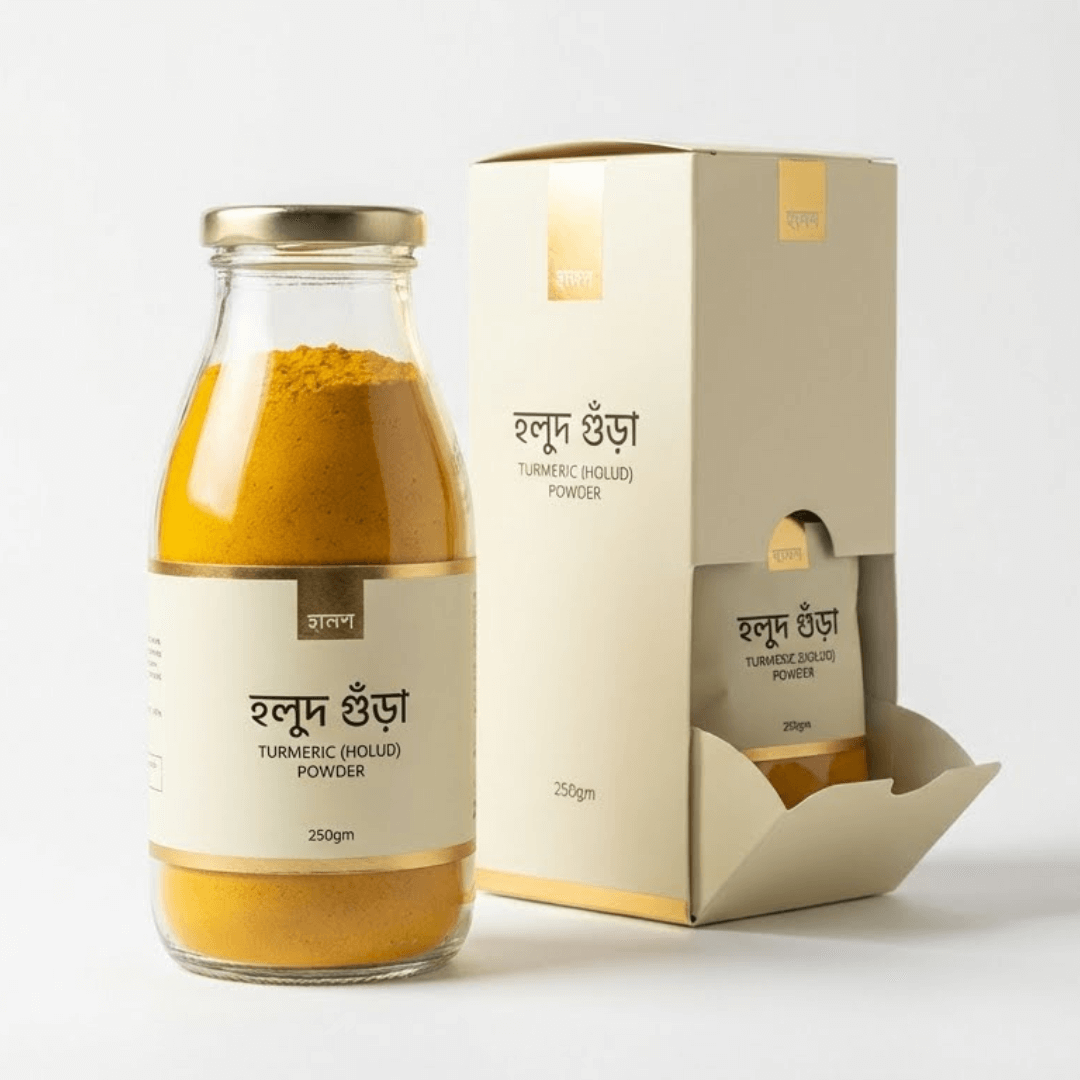
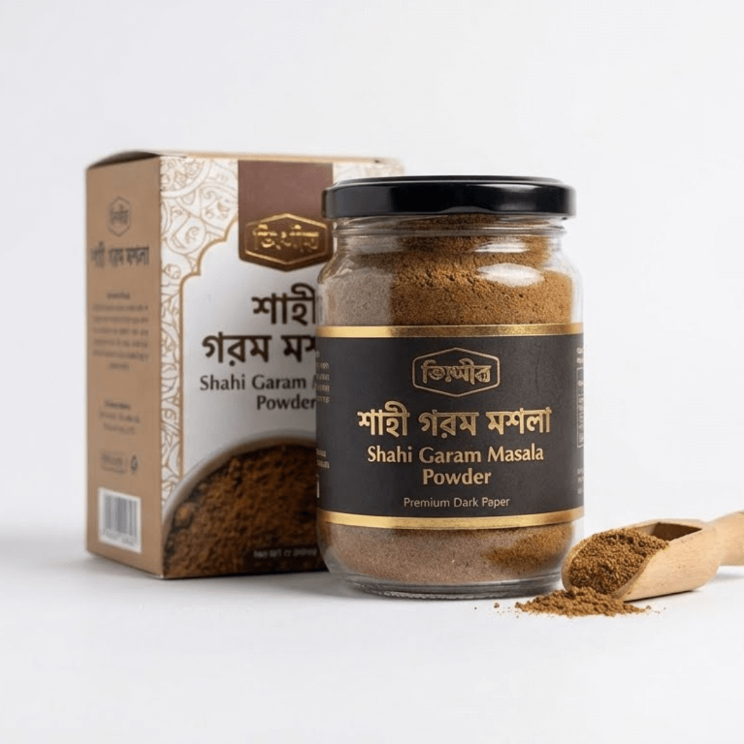
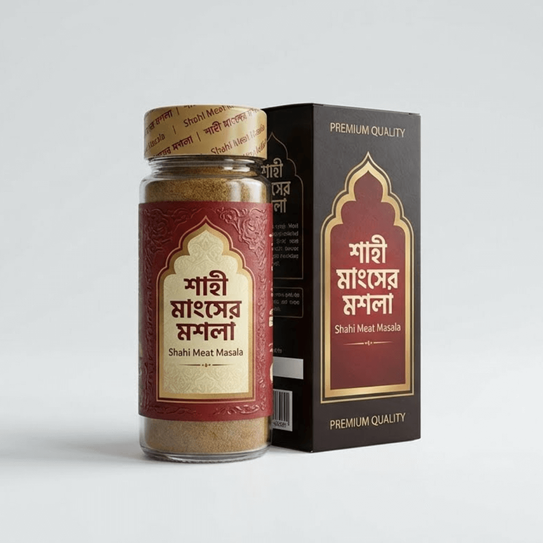
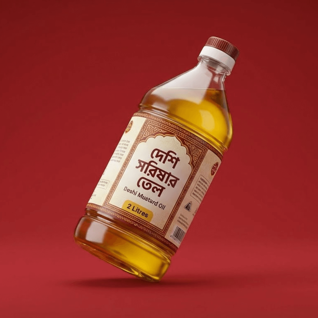
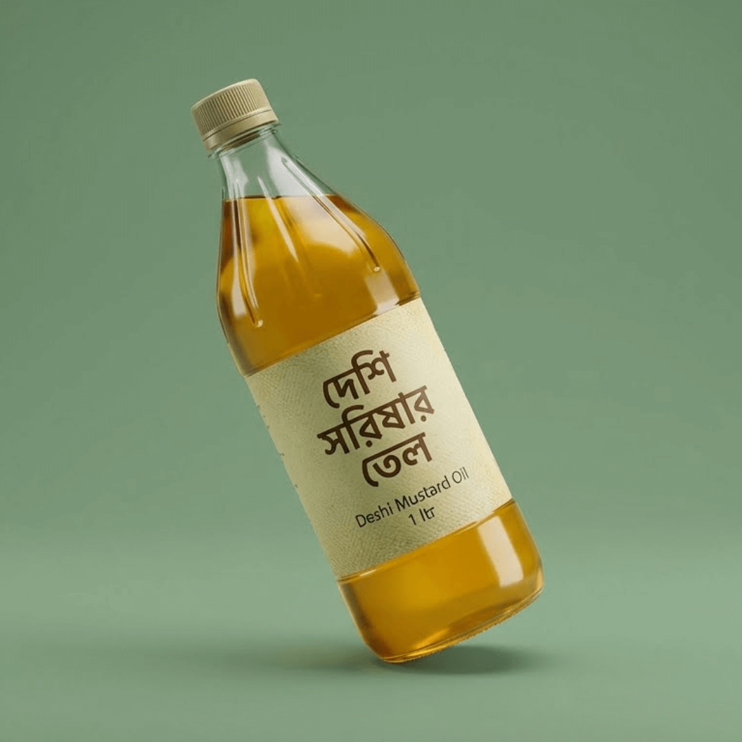
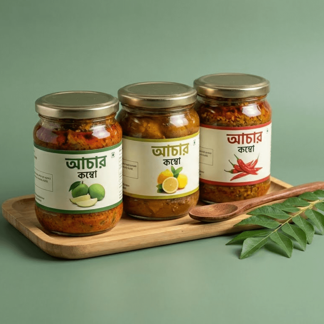
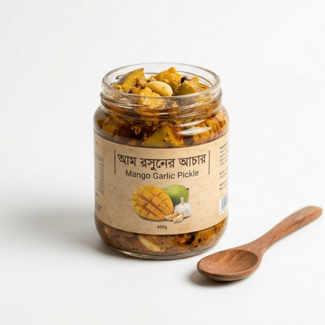
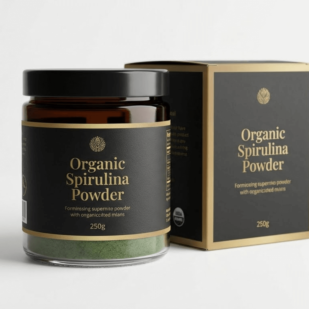
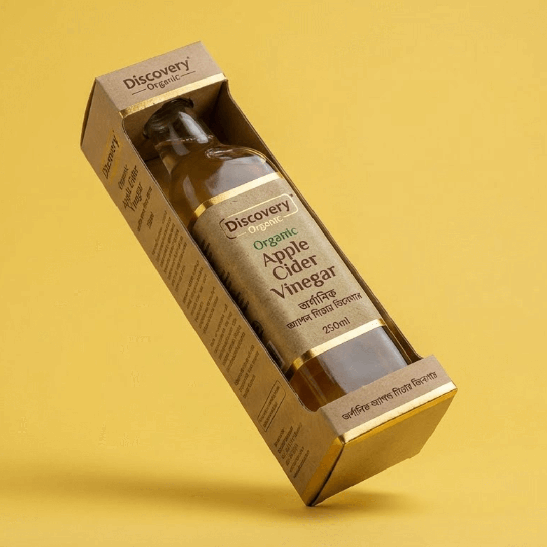
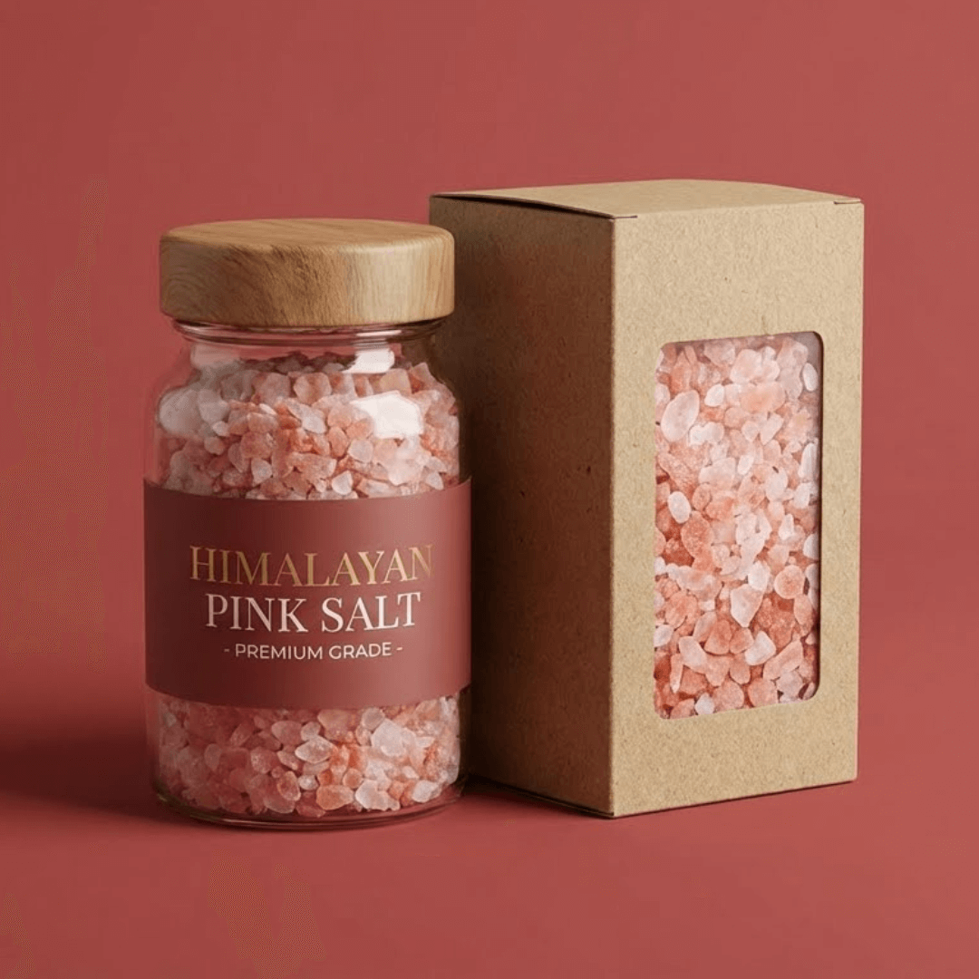
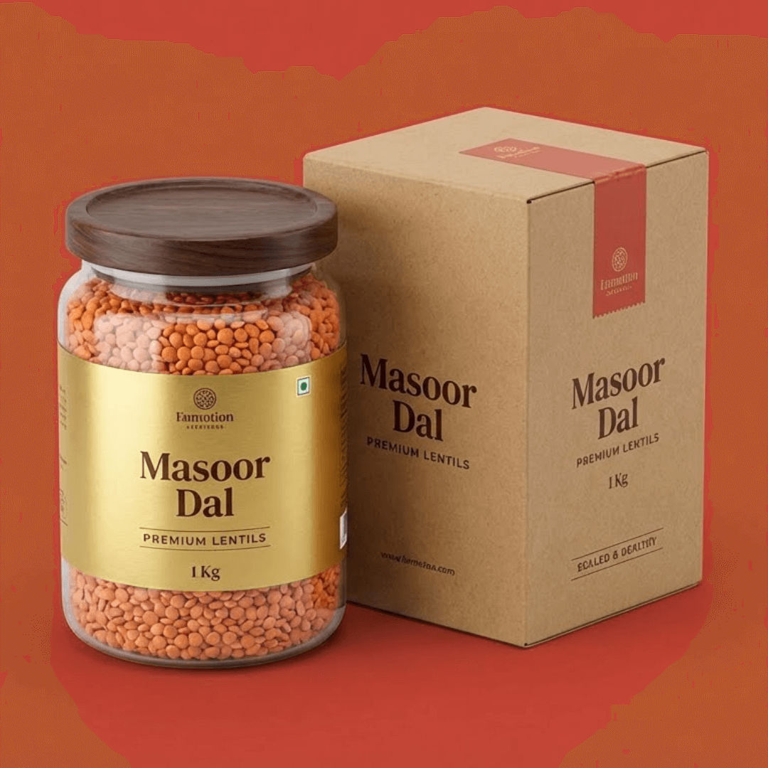
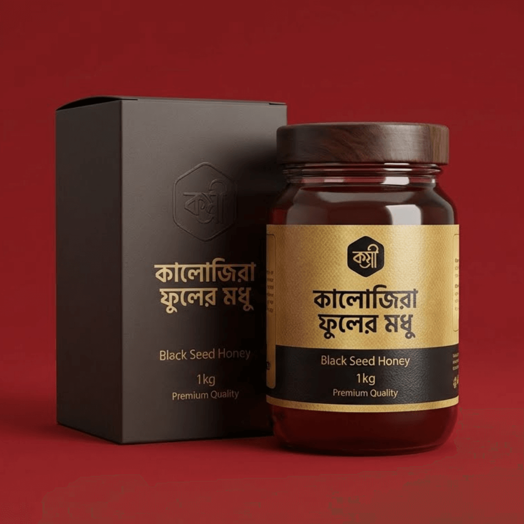
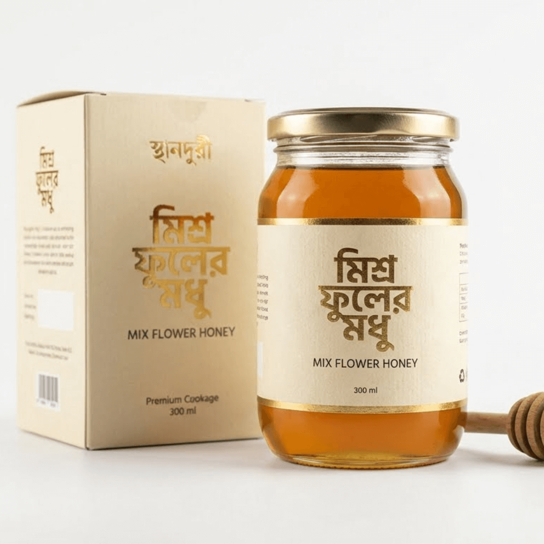
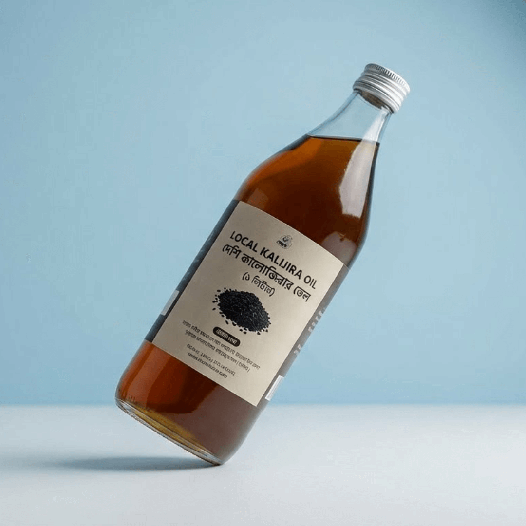
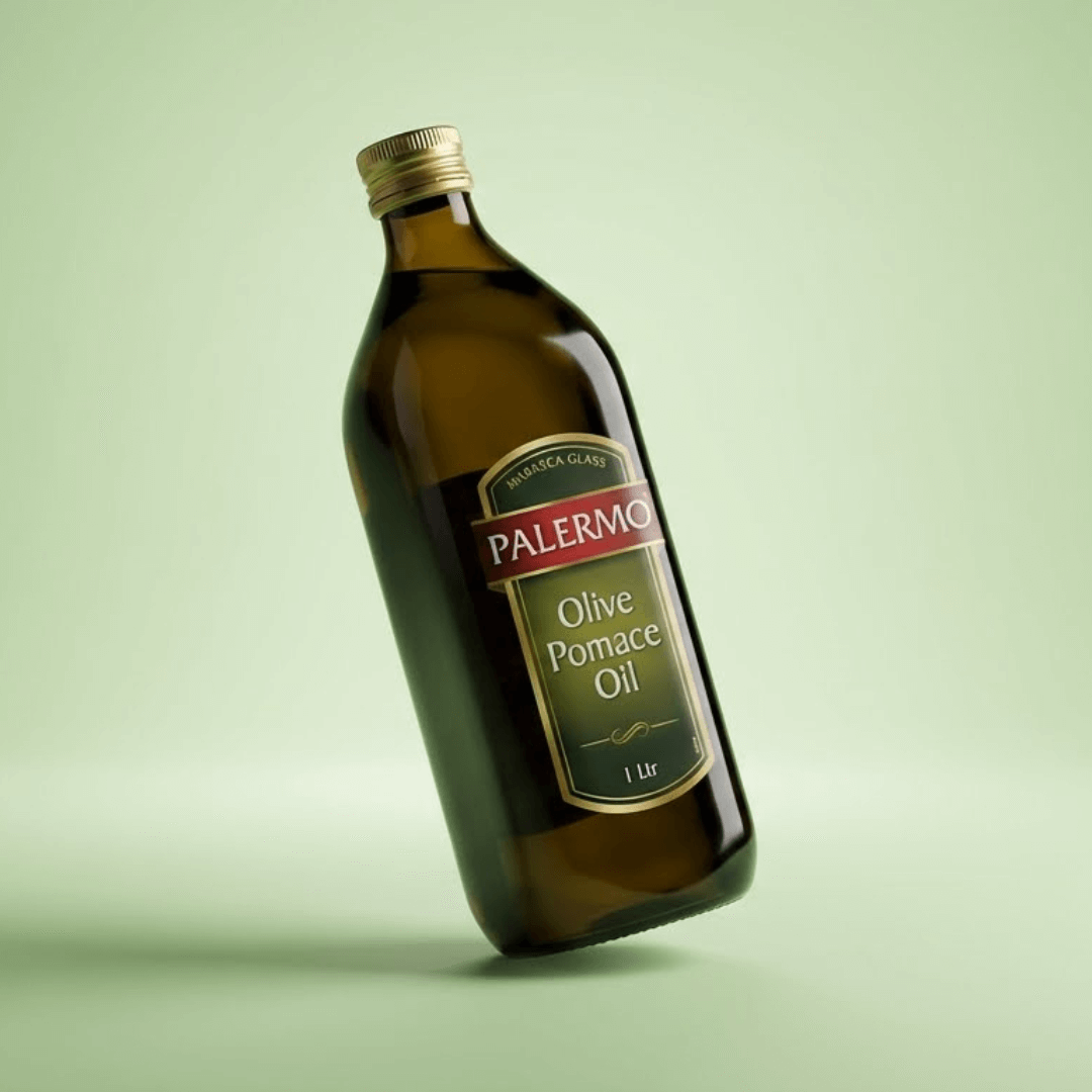
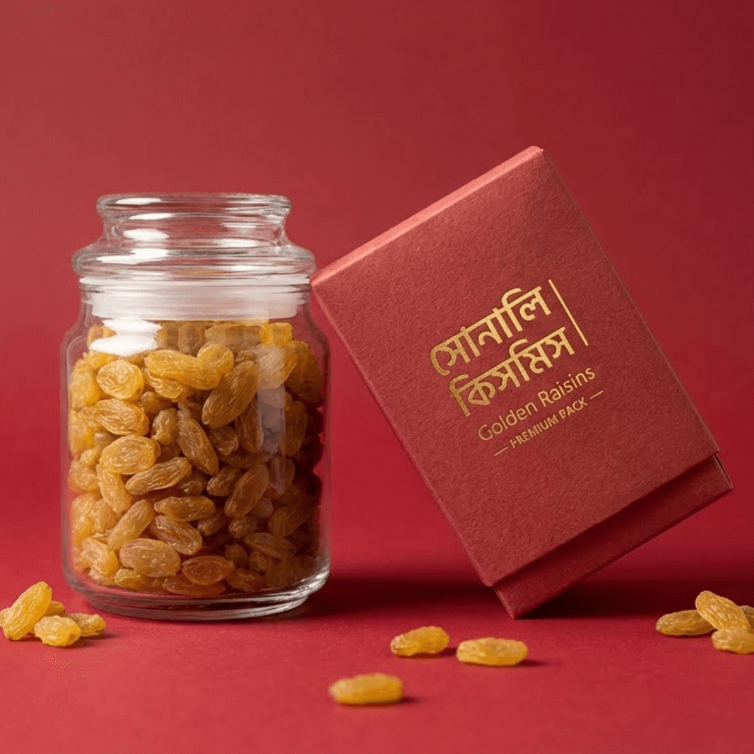
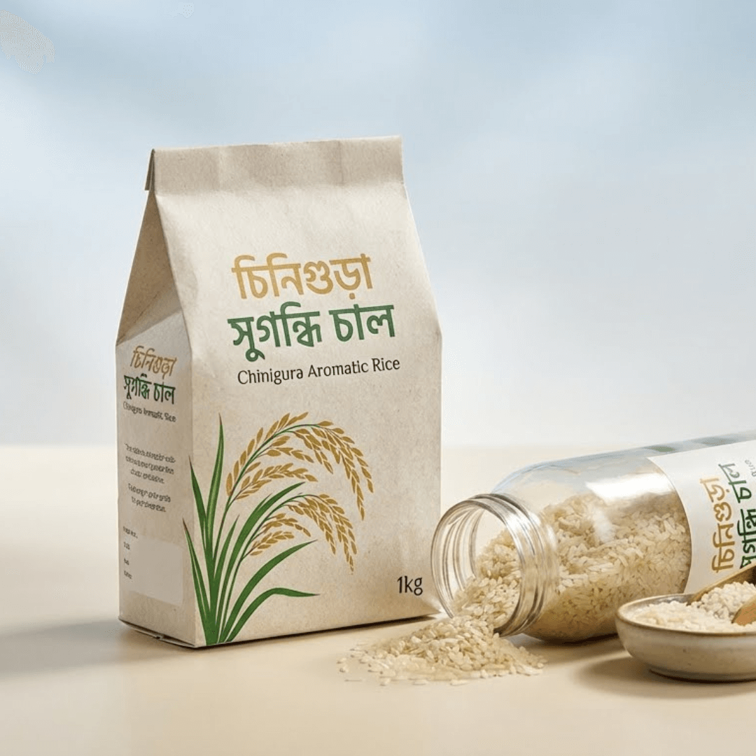
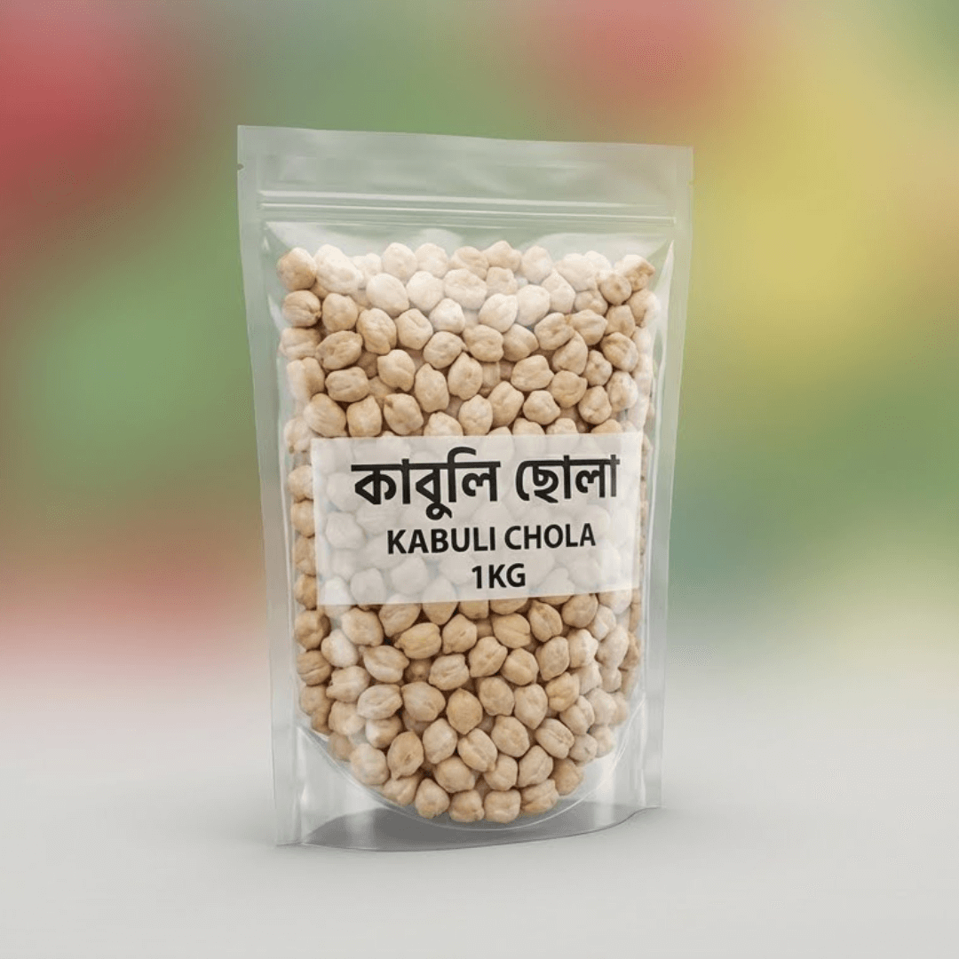
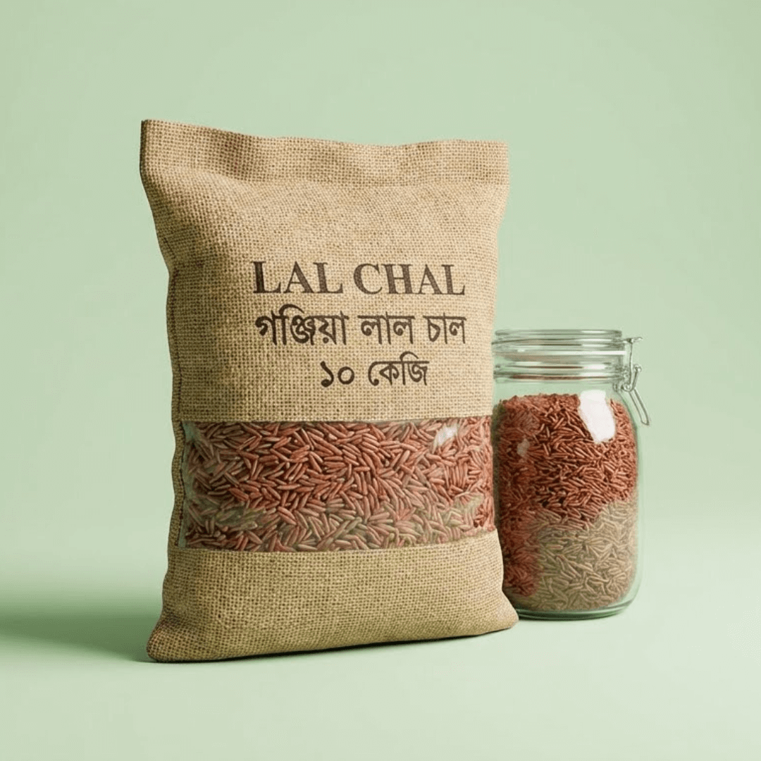
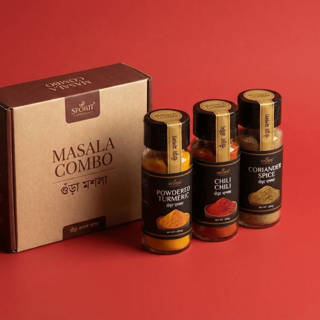
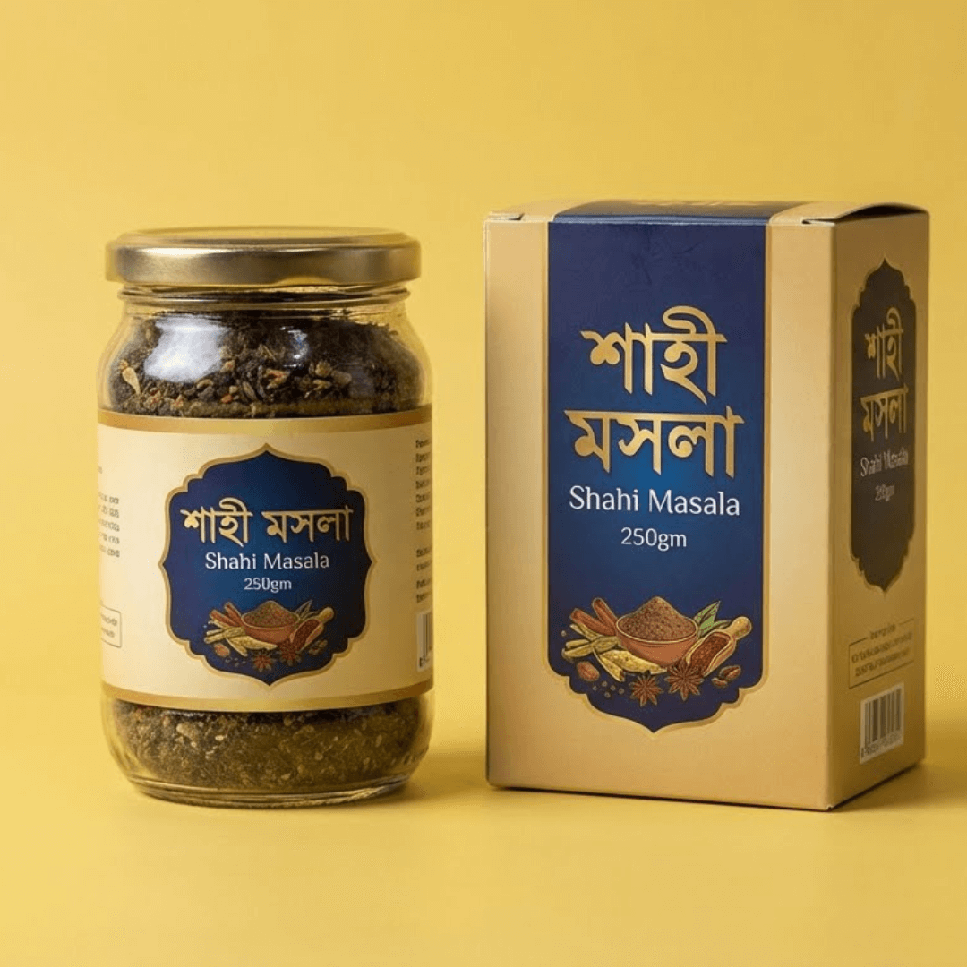
Grid Image Gallery — Original

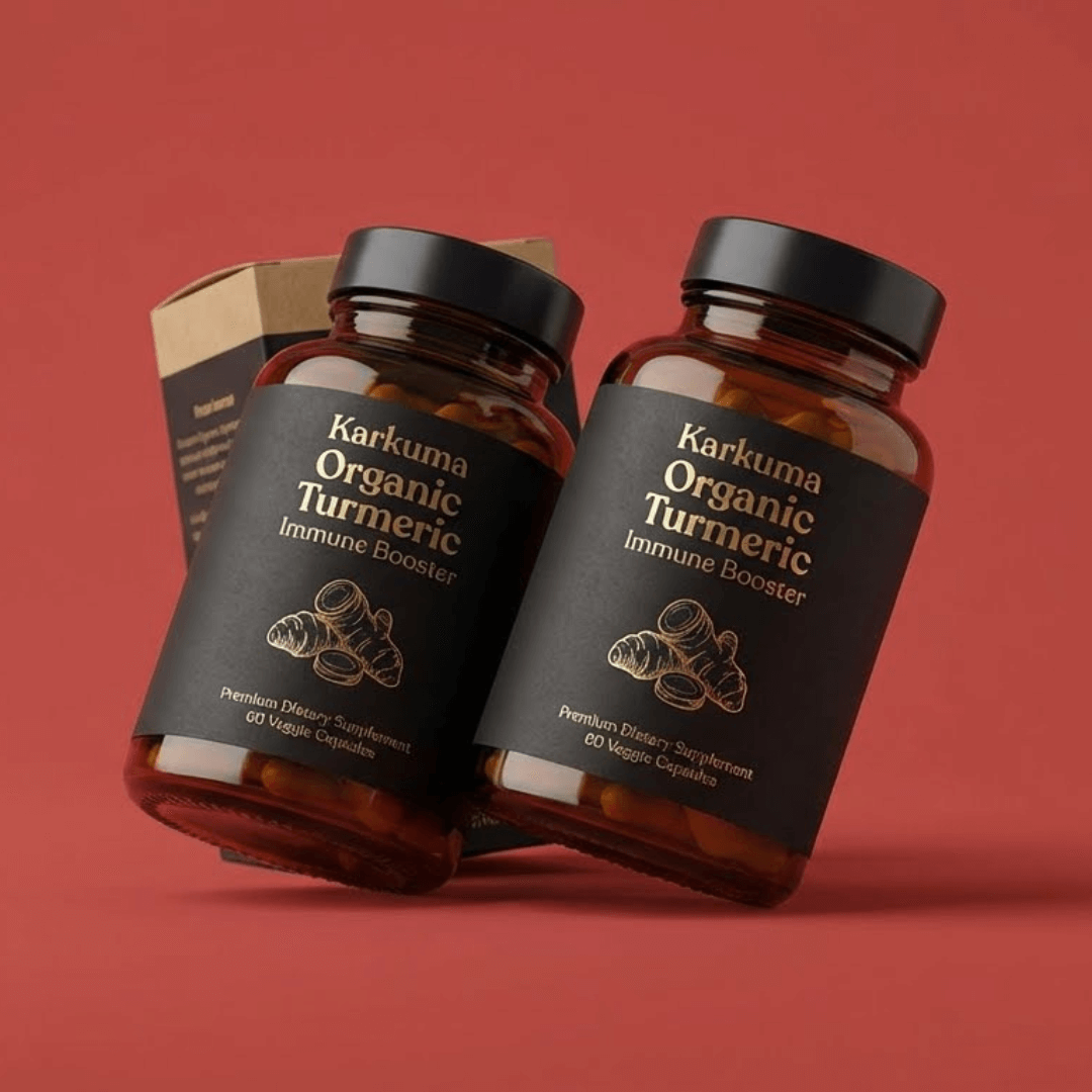
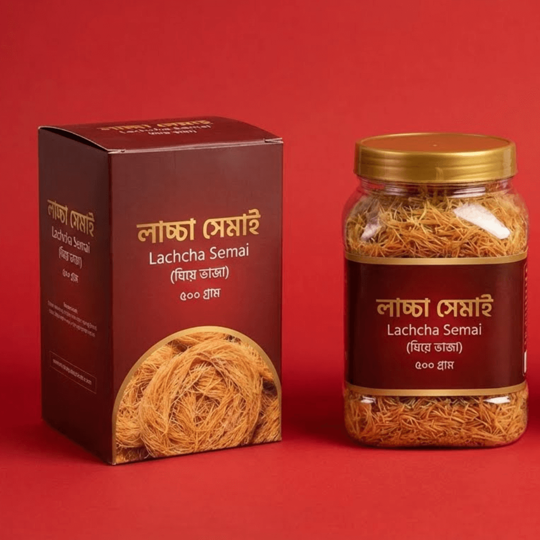
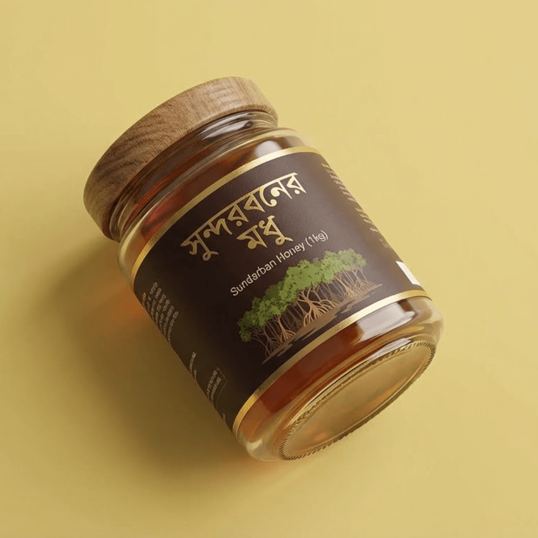
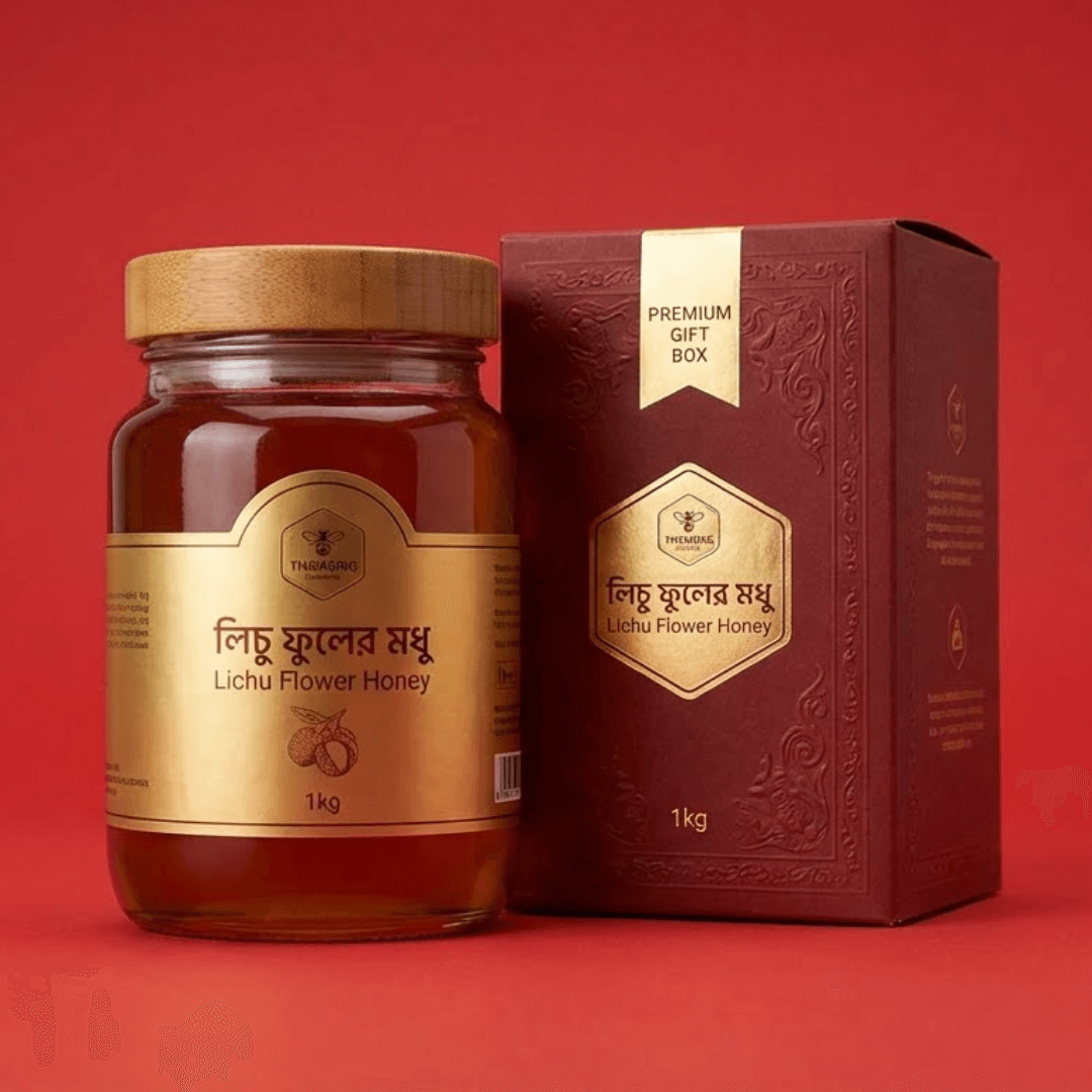
Photos in a neat, even grid. Photo shape: original.

Best forShowing product, process or customer photos. Works nicely for nuts, dry fruits and healthy snacks.
Where to place itAfter the hero or product video.

How to use: add the Image Gallery block and choose grid · original in its style settings

What you can customize in this widget
ColorsEyebrow color, Title color, Subtitle color, Head background, Head line, Cap color, Overlay color, Tile background, Border color, Btn1 color, Btn1 background, Btn2 color, Arrow color, Arrow background, Dot color, Box background, Box border color
Font & text sizeTitle size, Subtitle size, Eyebrow size, Cap size
Size & spacingHead w, Head gap, Columns, Gap, Radius, Border w, Button radius, Head radius, Box margin, Box background size, Box radius
Layout & styleHeading position, Text align, Head valign, Body valign, Layout, Cap align, Lb theme, Button icon position
Animation & effectsHover, Shadow, Animation, Slider autoplay, Slider loop, Lb counter
Show / hide optionsShow heading, Use gallery, Cap below, Slider arrows, Slider dots, Lightbox, Zoom icon, Lb caption, Btn1 blank, Btn2 blank, On, Orig
Text, images & linksEyebrow, Title, Subtitle, Items, Ratio, Btn1 text, Btn1 link, Btn1 icon, Btn2 text, Btn2 link, Btn2 icon, Head padding, Overlay ink, Box padding, Box background image, Box overlay, Box overlay o, Box border, Key, Product, W0
DESIGN 02 / 16MasonrySquareZoom

Masonry Image Gallery — Square, Zoom

Photos in a Pinterest-style masonry wall. Photo shape: square; hover effect: zoom.

Best forShowing product, process or customer photos. Works nicely for pickles and homemade foods.
Where to place itIn the making/story section.

How to use: add the Image Gallery block and choose masonry · square · zoom in its style settings

What you can customize in this widget
ColorsEyebrow color, Title color, Subtitle color, Head background, Head line, Cap color, Overlay color, Tile background, Border color, Btn1 color, Btn1 background, Btn2 color, Arrow color, Arrow background, Dot color, Box background, Box border color
Font & text sizeTitle size, Subtitle size, Eyebrow size, Cap size
Size & spacingHead w, Head gap, Columns, Gap, Radius, Border w, Button radius, Head radius, Box margin, Box background size, Box radius
Layout & styleHeading position, Text align, Head valign, Body valign, Layout, Cap align, Lb theme, Button icon position
Animation & effectsHover, Shadow, Animation, Slider autoplay, Slider loop, Lb counter
Show / hide optionsShow heading, Use gallery, Cap below, Slider arrows, Slider dots, Lightbox, Zoom icon, Lb caption, Btn1 blank, Btn2 blank, On, Orig
Text, images & linksEyebrow, Title, Subtitle, Items, Ratio, Btn1 text, Btn1 link, Btn1 icon, Btn2 text, Btn2 link, Btn2 icon, Head padding, Overlay ink, Box padding, Box background image, Box overlay, Box overlay o, Box border, Key, Product, W0
DESIGN 03 / 16SliderPortraitOverlay

Slider Image Gallery — Portrait, Overlay

Photos in a swipeable slider. Photo shape: portrait; hover effect: overlay.

Best forShowing product, process or customer photos. Works nicely for spices and masala.
Where to place itBefore the reviews.

How to use: add the Image Gallery block and choose slider · portrait · overlay in its style settings

What you can customize in this widget
ColorsEyebrow color, Title color, Subtitle color, Head background, Head line, Cap color, Overlay color, Tile background, Border color, Btn1 color, Btn1 background, Btn2 color, Arrow color, Arrow background, Dot color, Box background, Box border color
Font & text sizeTitle size, Subtitle size, Eyebrow size, Cap size
Size & spacingHead w, Head gap, Columns, Gap, Radius, Border w, Button radius, Head radius, Box margin, Box background size, Box radius
Layout & styleHeading position, Text align, Head valign, Body valign, Layout, Cap align, Lb theme, Button icon position
Animation & effectsHover, Shadow, Animation, Slider autoplay, Slider loop, Lb counter
Show / hide optionsShow heading, Use gallery, Cap below, Slider arrows, Slider dots, Lightbox, Zoom icon, Lb caption, Btn1 blank, Btn2 blank, On, Orig
Text, images & linksEyebrow, Title, Subtitle, Items, Ratio, Btn1 text, Btn1 link, Btn1 icon, Btn2 text, Btn2 link, Btn2 icon, Head padding, Overlay ink, Box padding, Box background image, Box overlay, Box overlay o, Box border, Key, Product, W0
DESIGN 04 / 16GridTallCaption

Grid Image Gallery — Tall, Caption

Photos in a neat, even grid. Photo shape: tall; hover effect: caption.

Best forShowing product, process or customer photos. Works nicely for honey and gift items.
Where to place itMid-page as a visual break.

How to use: add the Image Gallery block and choose grid · tall · caption in its style settings

What you can customize in this widget
ColorsEyebrow color, Title color, Subtitle color, Head background, Head line, Cap color, Overlay color, Tile background, Border color, Btn1 color, Btn1 background, Btn2 color, Arrow color, Arrow background, Dot color, Box background, Box border color
Font & text sizeTitle size, Subtitle size, Eyebrow size, Cap size
Size & spacingHead w, Head gap, Columns, Gap, Radius, Border w, Button radius, Head radius, Box margin, Box background size, Box radius
Layout & styleHeading position, Text align, Head valign, Body valign, Layout, Cap align, Lb theme, Button icon position
Animation & effectsHover, Shadow, Animation, Slider autoplay, Slider loop, Lb counter
Show / hide optionsShow heading, Use gallery, Cap below, Slider arrows, Slider dots, Lightbox, Zoom icon, Lb caption, Btn1 blank, Btn2 blank, On, Orig
Text, images & linksEyebrow, Title, Subtitle, Items, Ratio, Btn1 text, Btn1 link, Btn1 icon, Btn2 text, Btn2 link, Btn2 icon, Head padding, Overlay ink, Box padding, Box background image, Box overlay, Box overlay o, Box border, Key, Product, W0
DESIGN 05 / 16MasonryLandscapeInstagram

Masonry Image Gallery — Landscape, Instagram

Photos in a Pinterest-style masonry wall. Photo shape: landscape; hover effect: instagram.

Best forShowing product, process or customer photos. Works nicely for mustard oil, ghee and kitchen staples.
Where to place itAfter the hero or product video.

How to use: add the Image Gallery block and choose masonry · landscape · instagram in its style settings

What you can customize in this widget
ColorsEyebrow color, Title color, Subtitle color, Head background, Head line, Cap color, Overlay color, Tile background, Border color, Btn1 color, Btn1 background, Btn2 color, Arrow color, Arrow background, Dot color, Box background, Box border color
Font & text sizeTitle size, Subtitle size, Eyebrow size, Cap size
Size & spacingHead w, Head gap, Columns, Gap, Radius, Border w, Button radius, Head radius, Box margin, Box background size, Box radius
Layout & styleHeading position, Text align, Head valign, Body valign, Layout, Cap align, Lb theme, Button icon position
Animation & effectsHover, Shadow, Animation, Slider autoplay, Slider loop, Lb counter
Show / hide optionsShow heading, Use gallery, Cap below, Slider arrows, Slider dots, Lightbox, Zoom icon, Lb caption, Btn1 blank, Btn2 blank, On, Orig
Text, images & linksEyebrow, Title, Subtitle, Items, Ratio, Btn1 text, Btn1 link, Btn1 icon, Btn2 text, Btn2 link, Btn2 icon, Head padding, Overlay ink, Box padding, Box background image, Box overlay, Box overlay o, Box border, Key, Product, W0
DESIGN 06 / 16SliderWideTilt

Slider Image Gallery — Wide, Tilt

Photos in a swipeable slider. Photo shape: wide; hover effect: tilt.

Best forShowing product, process or customer photos. Works nicely for nuts, dry fruits and healthy snacks.
Where to place itIn the making/story section.

How to use: add the Image Gallery block and choose slider · wide · tilt in its style settings

What you can customize in this widget
ColorsEyebrow color, Title color, Subtitle color, Head background, Head line, Cap color, Overlay color, Tile background, Border color, Btn1 color, Btn1 background, Btn2 color, Arrow color, Arrow background, Dot color, Box background, Box border color
Font & text sizeTitle size, Subtitle size, Eyebrow size, Cap size
Size & spacingHead w, Head gap, Columns, Gap, Radius, Border w, Button radius, Head radius, Box margin, Box background size, Box radius
Layout & styleHeading position, Text align, Head valign, Body valign, Layout, Cap align, Lb theme, Button icon position
Animation & effectsHover, Shadow, Animation, Slider autoplay, Slider loop, Lb counter
Show / hide optionsShow heading, Use gallery, Cap below, Slider arrows, Slider dots, Lightbox, Zoom icon, Lb caption, Btn1 blank, Btn2 blank, On, Orig
Text, images & linksEyebrow, Title, Subtitle, Items, Ratio, Btn1 text, Btn1 link, Btn1 icon, Btn2 text, Btn2 link, Btn2 icon, Head padding, Overlay ink, Box padding, Box background image, Box overlay, Box overlay o, Box border, Key, Product, W0
DESIGN 07 / 16GridOriginal

Grid Image Gallery — Original (Alt 2)

Photos in a neat, even grid. Photo shape: original.

Best forShowing product, process or customer photos. Works nicely for pickles and homemade foods.
Where to place itBefore the reviews.

How to use: add the Image Gallery block and choose grid · original in its style settings

What you can customize in this widget
ColorsEyebrow color, Title color, Subtitle color, Head background, Head line, Cap color, Overlay color, Tile background, Border color, Btn1 color, Btn1 background, Btn2 color, Arrow color, Arrow background, Dot color, Box background, Box border color
Font & text sizeTitle size, Subtitle size, Eyebrow size, Cap size
Size & spacingHead w, Head gap, Columns, Gap, Radius, Border w, Button radius, Head radius, Box margin, Box background size, Box radius
Layout & styleHeading position, Text align, Head valign, Body valign, Layout, Cap align, Lb theme, Button icon position
Animation & effectsHover, Shadow, Animation, Slider autoplay, Slider loop, Lb counter
Show / hide optionsShow heading, Use gallery, Cap below, Slider arrows, Slider dots, Lightbox, Zoom icon, Lb caption, Btn1 blank, Btn2 blank, On, Orig
Text, images & linksEyebrow, Title, Subtitle, Items, Ratio, Btn1 text, Btn1 link, Btn1 icon, Btn2 text, Btn2 link, Btn2 icon, Head padding, Overlay ink, Box padding, Box background image, Box overlay, Box overlay o, Box border, Key, Product, W0
DESIGN 08 / 16MasonrySquareZoom

Masonry Image Gallery — Square, Zoom (Alt 2)

Photos in a Pinterest-style masonry wall. Photo shape: square; hover effect: zoom.

Best forShowing product, process or customer photos. Works nicely for spices and masala.
Where to place itMid-page as a visual break.

How to use: add the Image Gallery block and choose masonry · square · zoom in its style settings

What you can customize in this widget
ColorsEyebrow color, Title color, Subtitle color, Head background, Head line, Cap color, Overlay color, Tile background, Border color, Btn1 color, Btn1 background, Btn2 color, Arrow color, Arrow background, Dot color, Box background, Box border color
Font & text sizeTitle size, Subtitle size, Eyebrow size, Cap size
Size & spacingHead w, Head gap, Columns, Gap, Radius, Border w, Button radius, Head radius, Box margin, Box background size, Box radius
Layout & styleHeading position, Text align, Head valign, Body valign, Layout, Cap align, Lb theme, Button icon position
Animation & effectsHover, Shadow, Animation, Slider autoplay, Slider loop, Lb counter
Show / hide optionsShow heading, Use gallery, Cap below, Slider arrows, Slider dots, Lightbox, Zoom icon, Lb caption, Btn1 blank, Btn2 blank, On, Orig
Text, images & linksEyebrow, Title, Subtitle, Items, Ratio, Btn1 text, Btn1 link, Btn1 icon, Btn2 text, Btn2 link, Btn2 icon, Head padding, Overlay ink, Box padding, Box background image, Box overlay, Box overlay o, Box border, Key, Product, W0
DESIGN 09 / 16SliderPortraitOverlay

Slider Image Gallery — Portrait, Overlay (Alt 2)

Photos in a swipeable slider. Photo shape: portrait; hover effect: overlay.

Best forShowing product, process or customer photos. Works nicely for honey and gift items.
Where to place itAfter the hero or product video.

How to use: add the Image Gallery block and choose slider · portrait · overlay in its style settings

What you can customize in this widget
ColorsEyebrow color, Title color, Subtitle color, Head background, Head line, Cap color, Overlay color, Tile background, Border color, Btn1 color, Btn1 background, Btn2 color, Arrow color, Arrow background, Dot color, Box background, Box border color
Font & text sizeTitle size, Subtitle size, Eyebrow size, Cap size
Size & spacingHead w, Head gap, Columns, Gap, Radius, Border w, Button radius, Head radius, Box margin, Box background size, Box radius
Layout & styleHeading position, Text align, Head valign, Body valign, Layout, Cap align, Lb theme, Button icon position
Animation & effectsHover, Shadow, Animation, Slider autoplay, Slider loop, Lb counter
Show / hide optionsShow heading, Use gallery, Cap below, Slider arrows, Slider dots, Lightbox, Zoom icon, Lb caption, Btn1 blank, Btn2 blank, On, Orig
Text, images & linksEyebrow, Title, Subtitle, Items, Ratio, Btn1 text, Btn1 link, Btn1 icon, Btn2 text, Btn2 link, Btn2 icon, Head padding, Overlay ink, Box padding, Box background image, Box overlay, Box overlay o, Box border, Key, Product, W0
DESIGN 10 / 16GridTallCaption

Grid Image Gallery — Tall, Caption (Alt 2)

Photos in a neat, even grid. Photo shape: tall; hover effect: caption.

Best forShowing product, process or customer photos. Works nicely for mustard oil, ghee and kitchen staples.
Where to place itIn the making/story section.

How to use: add the Image Gallery block and choose grid · tall · caption in its style settings

What you can customize in this widget
ColorsEyebrow color, Title color, Subtitle color, Head background, Head line, Cap color, Overlay color, Tile background, Border color, Btn1 color, Btn1 background, Btn2 color, Arrow color, Arrow background, Dot color, Box background, Box border color
Font & text sizeTitle size, Subtitle size, Eyebrow size, Cap size
Size & spacingHead w, Head gap, Columns, Gap, Radius, Border w, Button radius, Head radius, Box margin, Box background size, Box radius
Layout & styleHeading position, Text align, Head valign, Body valign, Layout, Cap align, Lb theme, Button icon position
Animation & effectsHover, Shadow, Animation, Slider autoplay, Slider loop, Lb counter
Show / hide optionsShow heading, Use gallery, Cap below, Slider arrows, Slider dots, Lightbox, Zoom icon, Lb caption, Btn1 blank, Btn2 blank, On, Orig
Text, images & linksEyebrow, Title, Subtitle, Items, Ratio, Btn1 text, Btn1 link, Btn1 icon, Btn2 text, Btn2 link, Btn2 icon, Head padding, Overlay ink, Box padding, Box background image, Box overlay, Box overlay o, Box border, Key, Product, W0
DESIGN 11 / 16MasonryLandscapeInstagram

Masonry Image Gallery — Landscape, Instagram (Alt 2)

Photos in a Pinterest-style masonry wall. Photo shape: landscape; hover effect: instagram.

Best forShowing product, process or customer photos. Works nicely for nuts, dry fruits and healthy snacks.
Where to place itBefore the reviews.

How to use: add the Image Gallery block and choose masonry · landscape · instagram in its style settings

What you can customize in this widget
ColorsEyebrow color, Title color, Subtitle color, Head background, Head line, Cap color, Overlay color, Tile background, Border color, Btn1 color, Btn1 background, Btn2 color, Arrow color, Arrow background, Dot color, Box background, Box border color
Font & text sizeTitle size, Subtitle size, Eyebrow size, Cap size
Size & spacingHead w, Head gap, Columns, Gap, Radius, Border w, Button radius, Head radius, Box margin, Box background size, Box radius
Layout & styleHeading position, Text align, Head valign, Body valign, Layout, Cap align, Lb theme, Button icon position
Animation & effectsHover, Shadow, Animation, Slider autoplay, Slider loop, Lb counter
Show / hide optionsShow heading, Use gallery, Cap below, Slider arrows, Slider dots, Lightbox, Zoom icon, Lb caption, Btn1 blank, Btn2 blank, On, Orig
Text, images & linksEyebrow, Title, Subtitle, Items, Ratio, Btn1 text, Btn1 link, Btn1 icon, Btn2 text, Btn2 link, Btn2 icon, Head padding, Overlay ink, Box padding, Box background image, Box overlay, Box overlay o, Box border, Key, Product, W0
DESIGN 12 / 16SliderWideTilt

Slider Image Gallery — Wide, Tilt (Alt 2)

Photos in a swipeable slider. Photo shape: wide; hover effect: tilt.

Best forShowing product, process or customer photos. Works nicely for pickles and homemade foods.
Where to place itMid-page as a visual break.

How to use: add the Image Gallery block and choose slider · wide · tilt in its style settings

What you can customize in this widget
ColorsEyebrow color, Title color, Subtitle color, Head background, Head line, Cap color, Overlay color, Tile background, Border color, Btn1 color, Btn1 background, Btn2 color, Arrow color, Arrow background, Dot color, Box background, Box border color
Font & text sizeTitle size, Subtitle size, Eyebrow size, Cap size
Size & spacingHead w, Head gap, Columns, Gap, Radius, Border w, Button radius, Head radius, Box margin, Box background size, Box radius
Layout & styleHeading position, Text align, Head valign, Body valign, Layout, Cap align, Lb theme, Button icon position
Animation & effectsHover, Shadow, Animation, Slider autoplay, Slider loop, Lb counter
Show / hide optionsShow heading, Use gallery, Cap below, Slider arrows, Slider dots, Lightbox, Zoom icon, Lb caption, Btn1 blank, Btn2 blank, On, Orig
Text, images & linksEyebrow, Title, Subtitle, Items, Ratio, Btn1 text, Btn1 link, Btn1 icon, Btn2 text, Btn2 link, Btn2 icon, Head padding, Overlay ink, Box padding, Box background image, Box overlay, Box overlay o, Box border, Key, Product, W0
DESIGN 13 / 16GridOriginal

Grid Image Gallery — Original (Alt 3)

Photos in a neat, even grid. Photo shape: original.

Best forShowing product, process or customer photos. Works nicely for spices and masala.
Where to place itAfter the hero or product video.

How to use: add the Image Gallery block and choose grid · original in its style settings

What you can customize in this widget
ColorsEyebrow color, Title color, Subtitle color, Head background, Head line, Cap color, Overlay color, Tile background, Border color, Btn1 color, Btn1 background, Btn2 color, Arrow color, Arrow background, Dot color, Box background, Box border color
Font & text sizeTitle size, Subtitle size, Eyebrow size, Cap size
Size & spacingHead w, Head gap, Columns, Gap, Radius, Border w, Button radius, Head radius, Box margin, Box background size, Box radius
Layout & styleHeading position, Text align, Head valign, Body valign, Layout, Cap align, Lb theme, Button icon position
Animation & effectsHover, Shadow, Animation, Slider autoplay, Slider loop, Lb counter
Show / hide optionsShow heading, Use gallery, Cap below, Slider arrows, Slider dots, Lightbox, Zoom icon, Lb caption, Btn1 blank, Btn2 blank, On, Orig
Text, images & linksEyebrow, Title, Subtitle, Items, Ratio, Btn1 text, Btn1 link, Btn1 icon, Btn2 text, Btn2 link, Btn2 icon, Head padding, Overlay ink, Box padding, Box background image, Box overlay, Box overlay o, Box border, Key, Product, W0
DESIGN 14 / 16MasonrySquareZoom

Masonry Image Gallery — Square, Zoom (Alt 3)

Photos in a Pinterest-style masonry wall. Photo shape: square; hover effect: zoom.

Best forShowing product, process or customer photos. Works nicely for honey and gift items.
Where to place itIn the making/story section.

How to use: add the Image Gallery block and choose masonry · square · zoom in its style settings

What you can customize in this widget
ColorsEyebrow color, Title color, Subtitle color, Head background, Head line, Cap color, Overlay color, Tile background, Border color, Btn1 color, Btn1 background, Btn2 color, Arrow color, Arrow background, Dot color, Box background, Box border color
Font & text sizeTitle size, Subtitle size, Eyebrow size, Cap size
Size & spacingHead w, Head gap, Columns, Gap, Radius, Border w, Button radius, Head radius, Box margin, Box background size, Box radius
Layout & styleHeading position, Text align, Head valign, Body valign, Layout, Cap align, Lb theme, Button icon position
Animation & effectsHover, Shadow, Animation, Slider autoplay, Slider loop, Lb counter
Show / hide optionsShow heading, Use gallery, Cap below, Slider arrows, Slider dots, Lightbox, Zoom icon, Lb caption, Btn1 blank, Btn2 blank, On, Orig
Text, images & linksEyebrow, Title, Subtitle, Items, Ratio, Btn1 text, Btn1 link, Btn1 icon, Btn2 text, Btn2 link, Btn2 icon, Head padding, Overlay ink, Box padding, Box background image, Box overlay, Box overlay o, Box border, Key, Product, W0
DESIGN 15 / 16SliderPortraitOverlay

Slider Image Gallery — Portrait, Overlay (Alt 3)

Photos in a swipeable slider. Photo shape: portrait; hover effect: overlay.

Best forShowing product, process or customer photos. Works nicely for mustard oil, ghee and kitchen staples.
Where to place itBefore the reviews.

How to use: add the Image Gallery block and choose slider · portrait · overlay in its style settings

What you can customize in this widget
ColorsEyebrow color, Title color, Subtitle color, Head background, Head line, Cap color, Overlay color, Tile background, Border color, Btn1 color, Btn1 background, Btn2 color, Arrow color, Arrow background, Dot color, Box background, Box border color
Font & text sizeTitle size, Subtitle size, Eyebrow size, Cap size
Size & spacingHead w, Head gap, Columns, Gap, Radius, Border w, Button radius, Head radius, Box margin, Box background size, Box radius
Layout & styleHeading position, Text align, Head valign, Body valign, Layout, Cap align, Lb theme, Button icon position
Animation & effectsHover, Shadow, Animation, Slider autoplay, Slider loop, Lb counter
Show / hide optionsShow heading, Use gallery, Cap below, Slider arrows, Slider dots, Lightbox, Zoom icon, Lb caption, Btn1 blank, Btn2 blank, On, Orig
Text, images & linksEyebrow, Title, Subtitle, Items, Ratio, Btn1 text, Btn1 link, Btn1 icon, Btn2 text, Btn2 link, Btn2 icon, Head padding, Overlay ink, Box padding, Box background image, Box overlay, Box overlay o, Box border, Key, Product, W0
DESIGN 16 / 16GridTallCaption

Grid Image Gallery — Tall, Caption (Alt 3)

Photos in a neat, even grid. Photo shape: tall; hover effect: caption.

Best forShowing product, process or customer photos. Works nicely for nuts, dry fruits and healthy snacks.
Where to place itMid-page as a visual break.

How to use: add the Image Gallery block and choose grid · tall · caption in its style settings

What you can customize in this widget
ColorsEyebrow color, Title color, Subtitle color, Head background, Head line, Cap color, Overlay color, Tile background, Border color, Btn1 color, Btn1 background, Btn2 color, Arrow color, Arrow background, Dot color, Box background, Box border color
Font & text sizeTitle size, Subtitle size, Eyebrow size, Cap size
Size & spacingHead w, Head gap, Columns, Gap, Radius, Border w, Button radius, Head radius, Box margin, Box background size, Box radius
Layout & styleHeading position, Text align, Head valign, Body valign, Layout, Cap align, Lb theme, Button icon position
Animation & effectsHover, Shadow, Animation, Slider autoplay, Slider loop, Lb counter
Show / hide optionsShow heading, Use gallery, Cap below, Slider arrows, Slider dots, Lightbox, Zoom icon, Lb caption, Btn1 blank, Btn2 blank, On, Orig
Text, images & linksEyebrow, Title, Subtitle, Items, Ratio, Btn1 text, Btn1 link, Btn1 icon, Btn2 text, Btn2 link, Btn2 icon, Head padding, Overlay ink, Box padding, Box background image, Box overlay, Box overlay o, Box border, Key, Product, W0