

DESIGN 01 / 16GridSquareInline

Grid Fit Finder — Square, Inline

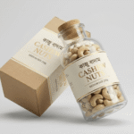
Buyers tap the use-case that matches them (e.g. daily snack, travel, kids’ tiffin) and see if the product is a good fit — use-case pictures shown in a grid. Picture shape: square; answer shown on the page.

Best forHelping buyers see the product fits their need, with an order button in each answer. Works nicely for nuts, dry fruits and healthy snacks.
Where to place itAfter the benefits section.

How to use: add the Fit Finder block and choose grid · square · inline in its style settings

What you can customize in this widget
ColorsHead color, Subtitle color, Hint background, Hint color, Lbl color, Lbl background, Lbl hover color, Lbl hover background, Ok color, No color, Res background, Fitbtn background, Fitbtn color, Card background, Card name color, Card price color, Cardbtn background, Cardbtn color, Cardbtn background hover, Cardbtn color hover, More background, Arrow background, Arrow color, Accent, Background, Box background, Box border color
Font & text sizeSel size by, Alt size by, Head size, Subtitle size, Lbl size, Rt size, Rm size, Arrow size
Size & spacingColumns, Sel slide width, Sel gap, Alt columns, Alt slide width, Alt gap, Thumb radius, Res radius, Fit gal gap, Fitbtn radius, Cardbtn radius, Radius, Box margin, Box background size, Box radius
Layout & styleSel layout, Result mode, Card design, Alt layout, Text align, Hint align
Animation & effectsHover, Animation, Shadow
Show / hide optionsShow hint, Auto first, Boxed, Sel arrows, Fit lightbox, Alt fallback, Alt arrows, Fit crop, On, Orig
Text, images & linksHeading, Subtitle, Hint text, Items, Sel per view, Image ratio, Card button text, Alt per view, Hint border, Thumb bw, Thumb border, Thumb active, Res bc, Res bw, Res padding, Fit image w, Fit image h, Fit image radius, Card border, Primary, Ink, Border, Padding, Box padding, Box background image, Box overlay, Box overlay o, Box border, Key, Product, W0

কোন কাজে বাদাম নেবেন?

আপনার প্রয়োজনটি ট্যাপ করুন — আমাদের বাদাম সেটার জন্য মানানসই কিনা দেখে নিন।

👆 ছবিতে ক্লিক করুন — দেখে নিন এটি আপনার জন্য বেস্ট ফিট কিনা
DESIGN 02 / 16SliderLandPopup

Slider Fit Finder — Land, Popup

Same “is this right for me?” finder, with use-case pictures in a swipe slider. Picture shape: landscape; answer shown in a popup.

Best forHelping buyers see the product fits their need, with an order button in each answer. Works nicely for pickles and homemade foods.
Where to place itMid-page, before the price.

How to use: add the Fit Finder block and choose slider · land · popup in its style settings

What you can customize in this widget
ColorsHead color, Subtitle color, Hint background, Hint color, Lbl color, Lbl background, Lbl hover color, Lbl hover background, Ok color, No color, Res background, Fitbtn background, Fitbtn color, Card background, Card name color, Card price color, Cardbtn background, Cardbtn color, Cardbtn background hover, Cardbtn color hover, More background, Arrow background, Arrow color, Accent, Background, Box background, Box border color
Font & text sizeSel size by, Alt size by, Head size, Subtitle size, Lbl size, Rt size, Rm size, Arrow size
Size & spacingColumns, Sel slide width, Sel gap, Alt columns, Alt slide width, Alt gap, Thumb radius, Res radius, Fit gal gap, Fitbtn radius, Cardbtn radius, Radius, Box margin, Box background size, Box radius
Layout & styleSel layout, Result mode, Card design, Alt layout, Text align, Hint align
Animation & effectsHover, Animation, Shadow
Show / hide optionsShow hint, Auto first, Boxed, Sel arrows, Fit lightbox, Alt fallback, Alt arrows, Fit crop, On, Orig
Text, images & linksHeading, Subtitle, Hint text, Items, Sel per view, Image ratio, Card button text, Alt per view, Hint border, Thumb bw, Thumb border, Thumb active, Res bc, Res bw, Res padding, Fit image w, Fit image h, Fit image radius, Card border, Primary, Ink, Border, Padding, Box padding, Box background image, Box overlay, Box overlay o, Box border, Key, Product, W0

কোন কাজে আচার নেবেন?

আপনার প্রয়োজনটি ট্যাপ করুন — আমাদের আচার সেটার জন্য মানানসই কিনা দেখে নিন।

👆 ছবিতে ক্লিক করুন — দেখে নিন এটি আপনার জন্য বেস্ট ফিট কিনা
DESIGN 03 / 16GridPortPopupm

Grid Fit Finder — Port, Popupm

Buyers tap the use-case that matches them (e.g. daily snack, travel, kids’ tiffin) and see if the product is a good fit — use-case pictures shown in a grid. Picture shape: portrait; answer shown in a popup on mobile only.

Best forHelping buyers see the product fits their need, with an order button in each answer. Works nicely for spices and masala.
Where to place itAfter the hero.

How to use: add the Fit Finder block and choose grid · port · popupm in its style settings

What you can customize in this widget
ColorsHead color, Subtitle color, Hint background, Hint color, Lbl color, Lbl background, Lbl hover color, Lbl hover background, Ok color, No color, Res background, Fitbtn background, Fitbtn color, Card background, Card name color, Card price color, Cardbtn background, Cardbtn color, Cardbtn background hover, Cardbtn color hover, More background, Arrow background, Arrow color, Accent, Background, Box background, Box border color
Font & text sizeSel size by, Alt size by, Head size, Subtitle size, Lbl size, Rt size, Rm size, Arrow size
Size & spacingColumns, Sel slide width, Sel gap, Alt columns, Alt slide width, Alt gap, Thumb radius, Res radius, Fit gal gap, Fitbtn radius, Cardbtn radius, Radius, Box margin, Box background size, Box radius
Layout & styleSel layout, Result mode, Card design, Alt layout, Text align, Hint align
Animation & effectsHover, Animation, Shadow
Show / hide optionsShow hint, Auto first, Boxed, Sel arrows, Fit lightbox, Alt fallback, Alt arrows, Fit crop, On, Orig
Text, images & linksHeading, Subtitle, Hint text, Items, Sel per view, Image ratio, Card button text, Alt per view, Hint border, Thumb bw, Thumb border, Thumb active, Res bc, Res bw, Res padding, Fit image w, Fit image h, Fit image radius, Card border, Primary, Ink, Border, Padding, Box padding, Box background image, Box overlay, Box overlay o, Box border, Key, Product, W0

কোন রান্নায় মশলা নেবেন?

আপনার রান্নাটি ট্যাপ করুন — আমাদের মশলা তাতে মানানসই কিনা দেখে নিন।

👆 ছবিতে ক্লিক করুন — দেখে নিন এটি আপনার রান্নার জন্য ফিট কিনা
DESIGN 04 / 16SliderWideInline

Slider Fit Finder — Wide, Inline

Same “is this right for me?” finder, with use-case pictures in a swipe slider. Picture shape: wide; answer shown on the page.

Best forHelping buyers see the product fits their need, with an order button in each answer. Works nicely for honey and gift items.
Where to place itBefore the FAQ.

How to use: add the Fit Finder block and choose slider · wide · inline in its style settings

What you can customize in this widget
ColorsHead color, Subtitle color, Hint background, Hint color, Lbl color, Lbl background, Lbl hover color, Lbl hover background, Ok color, No color, Res background, Fitbtn background, Fitbtn color, Card background, Card name color, Card price color, Cardbtn background, Cardbtn color, Cardbtn background hover, Cardbtn color hover, More background, Arrow background, Arrow color, Accent, Background, Box background, Box border color
Font & text sizeSel size by, Alt size by, Head size, Subtitle size, Lbl size, Rt size, Rm size, Arrow size
Size & spacingColumns, Sel slide width, Sel gap, Alt columns, Alt slide width, Alt gap, Thumb radius, Res radius, Fit gal gap, Fitbtn radius, Cardbtn radius, Radius, Box margin, Box background size, Box radius
Layout & styleSel layout, Result mode, Card design, Alt layout, Text align, Hint align
Animation & effectsHover, Animation, Shadow
Show / hide optionsShow hint, Auto first, Boxed, Sel arrows, Fit lightbox, Alt fallback, Alt arrows, Fit crop, On, Orig
Text, images & linksHeading, Subtitle, Hint text, Items, Sel per view, Image ratio, Card button text, Alt per view, Hint border, Thumb bw, Thumb border, Thumb active, Res bc, Res bw, Res padding, Fit image w, Fit image h, Fit image radius, Card border, Primary, Ink, Border, Padding, Box padding, Box background image, Box overlay, Box overlay o, Box border, Key, Product, W0

কোন কাজে মধু নেবেন?

আপনার প্রয়োজনটি ট্যাপ করুন — সুন্দরবনের খাঁটি চাকের মধু সেটার জন্য মানানসই কিনা দেখে নিন।

👆 ছবিতে ক্লিক করুন — দেখে নিন এটি আপনার জন্য বেস্ট ফিট কিনা
DESIGN 05 / 16GridSquarePopup

Grid Fit Finder — Square, Popup

Buyers tap the use-case that matches them (e.g. daily snack, travel, kids’ tiffin) and see if the product is a good fit — use-case pictures shown in a grid. Picture shape: square; answer shown in a popup.

Best forHelping buyers see the product fits their need, with an order button in each answer. Works nicely for mustard oil, ghee and kitchen staples.
Where to place itAfter the benefits section.

How to use: add the Fit Finder block and choose grid · square · popup in its style settings

What you can customize in this widget
ColorsHead color, Subtitle color, Hint background, Hint color, Lbl color, Lbl background, Lbl hover color, Lbl hover background, Ok color, No color, Res background, Fitbtn background, Fitbtn color, Card background, Card name color, Card price color, Cardbtn background, Cardbtn color, Cardbtn background hover, Cardbtn color hover, More background, Arrow background, Arrow color, Accent, Background, Box background, Box border color
Font & text sizeSel size by, Alt size by, Head size, Subtitle size, Lbl size, Rt size, Rm size, Arrow size
Size & spacingColumns, Sel slide width, Sel gap, Alt columns, Alt slide width, Alt gap, Thumb radius, Res radius, Fit gal gap, Fitbtn radius, Cardbtn radius, Radius, Box margin, Box background size, Box radius
Layout & styleSel layout, Result mode, Card design, Alt layout, Text align, Hint align
Animation & effectsHover, Animation, Shadow
Show / hide optionsShow hint, Auto first, Boxed, Sel arrows, Fit lightbox, Alt fallback, Alt arrows, Fit crop, On, Orig
Text, images & linksHeading, Subtitle, Hint text, Items, Sel per view, Image ratio, Card button text, Alt per view, Hint border, Thumb bw, Thumb border, Thumb active, Res bc, Res bw, Res padding, Fit image w, Fit image h, Fit image radius, Card border, Primary, Ink, Border, Padding, Box padding, Box background image, Box overlay, Box overlay o, Box border, Key, Product, W0

কোন কাজে তেল নেবেন?

আপনার প্রয়োজনটি ট্যাপ করুন — আমাদের তেল সেটার জন্য মানানসই কিনা দেখে নিন।

👆 ছবিতে ক্লিক করুন — দেখে নিন এটি আপনার জন্য বেস্ট ফিট কিনা
DESIGN 06 / 16SliderLandPopupm

Slider Fit Finder — Land, Popupm

Same “is this right for me?” finder, with use-case pictures in a swipe slider. Picture shape: landscape; answer shown in a popup on mobile only.

Best forHelping buyers see the product fits their need, with an order button in each answer. Works nicely for nuts, dry fruits and healthy snacks.
Where to place itMid-page, before the price.

How to use: add the Fit Finder block and choose slider · land · popupm in its style settings

What you can customize in this widget
ColorsHead color, Subtitle color, Hint background, Hint color, Lbl color, Lbl background, Lbl hover color, Lbl hover background, Ok color, No color, Res background, Fitbtn background, Fitbtn color, Card background, Card name color, Card price color, Cardbtn background, Cardbtn color, Cardbtn background hover, Cardbtn color hover, More background, Arrow background, Arrow color, Accent, Background, Box background, Box border color
Font & text sizeSel size by, Alt size by, Head size, Subtitle size, Lbl size, Rt size, Rm size, Arrow size
Size & spacingColumns, Sel slide width, Sel gap, Alt columns, Alt slide width, Alt gap, Thumb radius, Res radius, Fit gal gap, Fitbtn radius, Cardbtn radius, Radius, Box margin, Box background size, Box radius
Layout & styleSel layout, Result mode, Card design, Alt layout, Text align, Hint align
Animation & effectsHover, Animation, Shadow
Show / hide optionsShow hint, Auto first, Boxed, Sel arrows, Fit lightbox, Alt fallback, Alt arrows, Fit crop, On, Orig
Text, images & linksHeading, Subtitle, Hint text, Items, Sel per view, Image ratio, Card button text, Alt per view, Hint border, Thumb bw, Thumb border, Thumb active, Res bc, Res bw, Res padding, Fit image w, Fit image h, Fit image radius, Card border, Primary, Ink, Border, Padding, Box padding, Box background image, Box overlay, Box overlay o, Box border, Key, Product, W0

কোন কাজে বাদাম নেবেন?

আপনার প্রয়োজনটি ট্যাপ করুন — আমাদের বাদাম সেটার জন্য মানানসই কিনা দেখে নিন।

👆 ছবিতে ক্লিক করুন — দেখে নিন এটি আপনার জন্য বেস্ট ফিট কিনা
DESIGN 07 / 16GridPortInline

Grid Fit Finder — Port, Inline

Buyers tap the use-case that matches them (e.g. daily snack, travel, kids’ tiffin) and see if the product is a good fit — use-case pictures shown in a grid. Picture shape: portrait; answer shown on the page.

Best forHelping buyers see the product fits their need, with an order button in each answer. Works nicely for pickles and homemade foods.
Where to place itAfter the hero.

How to use: add the Fit Finder block and choose grid · port · inline in its style settings

What you can customize in this widget
ColorsHead color, Subtitle color, Hint background, Hint color, Lbl color, Lbl background, Lbl hover color, Lbl hover background, Ok color, No color, Res background, Fitbtn background, Fitbtn color, Card background, Card name color, Card price color, Cardbtn background, Cardbtn color, Cardbtn background hover, Cardbtn color hover, More background, Arrow background, Arrow color, Accent, Background, Box background, Box border color
Font & text sizeSel size by, Alt size by, Head size, Subtitle size, Lbl size, Rt size, Rm size, Arrow size
Size & spacingColumns, Sel slide width, Sel gap, Alt columns, Alt slide width, Alt gap, Thumb radius, Res radius, Fit gal gap, Fitbtn radius, Cardbtn radius, Radius, Box margin, Box background size, Box radius
Layout & styleSel layout, Result mode, Card design, Alt layout, Text align, Hint align
Animation & effectsHover, Animation, Shadow
Show / hide optionsShow hint, Auto first, Boxed, Sel arrows, Fit lightbox, Alt fallback, Alt arrows, Fit crop, On, Orig
Text, images & linksHeading, Subtitle, Hint text, Items, Sel per view, Image ratio, Card button text, Alt per view, Hint border, Thumb bw, Thumb border, Thumb active, Res bc, Res bw, Res padding, Fit image w, Fit image h, Fit image radius, Card border, Primary, Ink, Border, Padding, Box padding, Box background image, Box overlay, Box overlay o, Box border, Key, Product, W0

কোন কাজে আচার নেবেন?

আপনার প্রয়োজনটি ট্যাপ করুন — আমাদের আচার সেটার জন্য মানানসই কিনা দেখে নিন।

👆 ছবিতে ক্লিক করুন — দেখে নিন এটি আপনার জন্য বেস্ট ফিট কিনা
DESIGN 08 / 16SliderWidePopup

Slider Fit Finder — Wide, Popup

Same “is this right for me?” finder, with use-case pictures in a swipe slider. Picture shape: wide; answer shown in a popup.

Best forHelping buyers see the product fits their need, with an order button in each answer. Works nicely for spices and masala.
Where to place itBefore the FAQ.

How to use: add the Fit Finder block and choose slider · wide · popup in its style settings

What you can customize in this widget
ColorsHead color, Subtitle color, Hint background, Hint color, Lbl color, Lbl background, Lbl hover color, Lbl hover background, Ok color, No color, Res background, Fitbtn background, Fitbtn color, Card background, Card name color, Card price color, Cardbtn background, Cardbtn color, Cardbtn background hover, Cardbtn color hover, More background, Arrow background, Arrow color, Accent, Background, Box background, Box border color
Font & text sizeSel size by, Alt size by, Head size, Subtitle size, Lbl size, Rt size, Rm size, Arrow size
Size & spacingColumns, Sel slide width, Sel gap, Alt columns, Alt slide width, Alt gap, Thumb radius, Res radius, Fit gal gap, Fitbtn radius, Cardbtn radius, Radius, Box margin, Box background size, Box radius
Layout & styleSel layout, Result mode, Card design, Alt layout, Text align, Hint align
Animation & effectsHover, Animation, Shadow
Show / hide optionsShow hint, Auto first, Boxed, Sel arrows, Fit lightbox, Alt fallback, Alt arrows, Fit crop, On, Orig
Text, images & linksHeading, Subtitle, Hint text, Items, Sel per view, Image ratio, Card button text, Alt per view, Hint border, Thumb bw, Thumb border, Thumb active, Res bc, Res bw, Res padding, Fit image w, Fit image h, Fit image radius, Card border, Primary, Ink, Border, Padding, Box padding, Box background image, Box overlay, Box overlay o, Box border, Key, Product, W0

কোন রান্নায় মশলা নেবেন?

আপনার রান্নাটি ট্যাপ করুন — আমাদের মশলা তাতে মানানসই কিনা দেখে নিন।

👆 ছবিতে ক্লিক করুন — দেখে নিন এটি আপনার রান্নার জন্য ফিট কিনা
DESIGN 09 / 16GridSquarePopupm

Grid Fit Finder — Square, Popupm

Buyers tap the use-case that matches them (e.g. daily snack, travel, kids’ tiffin) and see if the product is a good fit — use-case pictures shown in a grid. Picture shape: square; answer shown in a popup on mobile only.

Best forHelping buyers see the product fits their need, with an order button in each answer. Works nicely for honey and gift items.
Where to place itAfter the benefits section.

How to use: add the Fit Finder block and choose grid · square · popupm in its style settings

What you can customize in this widget
ColorsHead color, Subtitle color, Hint background, Hint color, Lbl color, Lbl background, Lbl hover color, Lbl hover background, Ok color, No color, Res background, Fitbtn background, Fitbtn color, Card background, Card name color, Card price color, Cardbtn background, Cardbtn color, Cardbtn background hover, Cardbtn color hover, More background, Arrow background, Arrow color, Accent, Background, Box background, Box border color
Font & text sizeSel size by, Alt size by, Head size, Subtitle size, Lbl size, Rt size, Rm size, Arrow size
Size & spacingColumns, Sel slide width, Sel gap, Alt columns, Alt slide width, Alt gap, Thumb radius, Res radius, Fit gal gap, Fitbtn radius, Cardbtn radius, Radius, Box margin, Box background size, Box radius
Layout & styleSel layout, Result mode, Card design, Alt layout, Text align, Hint align
Animation & effectsHover, Animation, Shadow
Show / hide optionsShow hint, Auto first, Boxed, Sel arrows, Fit lightbox, Alt fallback, Alt arrows, Fit crop, On, Orig
Text, images & linksHeading, Subtitle, Hint text, Items, Sel per view, Image ratio, Card button text, Alt per view, Hint border, Thumb bw, Thumb border, Thumb active, Res bc, Res bw, Res padding, Fit image w, Fit image h, Fit image radius, Card border, Primary, Ink, Border, Padding, Box padding, Box background image, Box overlay, Box overlay o, Box border, Key, Product, W0

কোন কাজে মধু নেবেন?

আপনার প্রয়োজনটি ট্যাপ করুন — সুন্দরবনের খাঁটি চাকের মধু সেটার জন্য মানানসই কিনা দেখে নিন।

👆 ছবিতে ক্লিক করুন — দেখে নিন এটি আপনার জন্য বেস্ট ফিট কিনা
DESIGN 10 / 16SliderLandInline

Slider Fit Finder — Land, Inline

Same “is this right for me?” finder, with use-case pictures in a swipe slider. Picture shape: landscape; answer shown on the page.

Best forHelping buyers see the product fits their need, with an order button in each answer. Works nicely for mustard oil, ghee and kitchen staples.
Where to place itMid-page, before the price.

How to use: add the Fit Finder block and choose slider · land · inline in its style settings

What you can customize in this widget
ColorsHead color, Subtitle color, Hint background, Hint color, Lbl color, Lbl background, Lbl hover color, Lbl hover background, Ok color, No color, Res background, Fitbtn background, Fitbtn color, Card background, Card name color, Card price color, Cardbtn background, Cardbtn color, Cardbtn background hover, Cardbtn color hover, More background, Arrow background, Arrow color, Accent, Background, Box background, Box border color
Font & text sizeSel size by, Alt size by, Head size, Subtitle size, Lbl size, Rt size, Rm size, Arrow size
Size & spacingColumns, Sel slide width, Sel gap, Alt columns, Alt slide width, Alt gap, Thumb radius, Res radius, Fit gal gap, Fitbtn radius, Cardbtn radius, Radius, Box margin, Box background size, Box radius
Layout & styleSel layout, Result mode, Card design, Alt layout, Text align, Hint align
Animation & effectsHover, Animation, Shadow
Show / hide optionsShow hint, Auto first, Boxed, Sel arrows, Fit lightbox, Alt fallback, Alt arrows, Fit crop, On, Orig
Text, images & linksHeading, Subtitle, Hint text, Items, Sel per view, Image ratio, Card button text, Alt per view, Hint border, Thumb bw, Thumb border, Thumb active, Res bc, Res bw, Res padding, Fit image w, Fit image h, Fit image radius, Card border, Primary, Ink, Border, Padding, Box padding, Box background image, Box overlay, Box overlay o, Box border, Key, Product, W0

কোন কাজে তেল নেবেন?

আপনার প্রয়োজনটি ট্যাপ করুন — আমাদের তেল সেটার জন্য মানানসই কিনা দেখে নিন।

👆 ছবিতে ক্লিক করুন — দেখে নিন এটি আপনার জন্য বেস্ট ফিট কিনা
DESIGN 11 / 16GridPortPopup

Grid Fit Finder — Port, Popup

Buyers tap the use-case that matches them (e.g. daily snack, travel, kids’ tiffin) and see if the product is a good fit — use-case pictures shown in a grid. Picture shape: portrait; answer shown in a popup.

Best forHelping buyers see the product fits their need, with an order button in each answer. Works nicely for nuts, dry fruits and healthy snacks.
Where to place itAfter the hero.

How to use: add the Fit Finder block and choose grid · port · popup in its style settings

What you can customize in this widget
ColorsHead color, Subtitle color, Hint background, Hint color, Lbl color, Lbl background, Lbl hover color, Lbl hover background, Ok color, No color, Res background, Fitbtn background, Fitbtn color, Card background, Card name color, Card price color, Cardbtn background, Cardbtn color, Cardbtn background hover, Cardbtn color hover, More background, Arrow background, Arrow color, Accent, Background, Box background, Box border color
Font & text sizeSel size by, Alt size by, Head size, Subtitle size, Lbl size, Rt size, Rm size, Arrow size
Size & spacingColumns, Sel slide width, Sel gap, Alt columns, Alt slide width, Alt gap, Thumb radius, Res radius, Fit gal gap, Fitbtn radius, Cardbtn radius, Radius, Box margin, Box background size, Box radius
Layout & styleSel layout, Result mode, Card design, Alt layout, Text align, Hint align
Animation & effectsHover, Animation, Shadow
Show / hide optionsShow hint, Auto first, Boxed, Sel arrows, Fit lightbox, Alt fallback, Alt arrows, Fit crop, On, Orig
Text, images & linksHeading, Subtitle, Hint text, Items, Sel per view, Image ratio, Card button text, Alt per view, Hint border, Thumb bw, Thumb border, Thumb active, Res bc, Res bw, Res padding, Fit image w, Fit image h, Fit image radius, Card border, Primary, Ink, Border, Padding, Box padding, Box background image, Box overlay, Box overlay o, Box border, Key, Product, W0

কোন কাজে বাদাম নেবেন?

আপনার প্রয়োজনটি ট্যাপ করুন — আমাদের বাদাম সেটার জন্য মানানসই কিনা দেখে নিন।

👆 ছবিতে ক্লিক করুন — দেখে নিন এটি আপনার জন্য বেস্ট ফিট কিনা
DESIGN 12 / 16SliderWidePopupm

Slider Fit Finder — Wide, Popupm

Same “is this right for me?” finder, with use-case pictures in a swipe slider. Picture shape: wide; answer shown in a popup on mobile only.

Best forHelping buyers see the product fits their need, with an order button in each answer. Works nicely for pickles and homemade foods.
Where to place itBefore the FAQ.

How to use: add the Fit Finder block and choose slider · wide · popupm in its style settings

What you can customize in this widget
ColorsHead color, Subtitle color, Hint background, Hint color, Lbl color, Lbl background, Lbl hover color, Lbl hover background, Ok color, No color, Res background, Fitbtn background, Fitbtn color, Card background, Card name color, Card price color, Cardbtn background, Cardbtn color, Cardbtn background hover, Cardbtn color hover, More background, Arrow background, Arrow color, Accent, Background, Box background, Box border color
Font & text sizeSel size by, Alt size by, Head size, Subtitle size, Lbl size, Rt size, Rm size, Arrow size
Size & spacingColumns, Sel slide width, Sel gap, Alt columns, Alt slide width, Alt gap, Thumb radius, Res radius, Fit gal gap, Fitbtn radius, Cardbtn radius, Radius, Box margin, Box background size, Box radius
Layout & styleSel layout, Result mode, Card design, Alt layout, Text align, Hint align
Animation & effectsHover, Animation, Shadow
Show / hide optionsShow hint, Auto first, Boxed, Sel arrows, Fit lightbox, Alt fallback, Alt arrows, Fit crop, On, Orig
Text, images & linksHeading, Subtitle, Hint text, Items, Sel per view, Image ratio, Card button text, Alt per view, Hint border, Thumb bw, Thumb border, Thumb active, Res bc, Res bw, Res padding, Fit image w, Fit image h, Fit image radius, Card border, Primary, Ink, Border, Padding, Box padding, Box background image, Box overlay, Box overlay o, Box border, Key, Product, W0

কোন কাজে আচার নেবেন?

আপনার প্রয়োজনটি ট্যাপ করুন — আমাদের আচার সেটার জন্য মানানসই কিনা দেখে নিন।

👆 ছবিতে ক্লিক করুন — দেখে নিন এটি আপনার জন্য বেস্ট ফিট কিনা
DESIGN 13 / 16GridSquareInline

Grid Fit Finder — Square, Inline (Alt 2)

Buyers tap the use-case that matches them (e.g. daily snack, travel, kids’ tiffin) and see if the product is a good fit — use-case pictures shown in a grid. Picture shape: square; answer shown on the page.

Best forHelping buyers see the product fits their need, with an order button in each answer. Works nicely for spices and masala.
Where to place itAfter the benefits section.

How to use: add the Fit Finder block and choose grid · square · inline in its style settings

What you can customize in this widget
ColorsHead color, Subtitle color, Hint background, Hint color, Lbl color, Lbl background, Lbl hover color, Lbl hover background, Ok color, No color, Res background, Fitbtn background, Fitbtn color, Card background, Card name color, Card price color, Cardbtn background, Cardbtn color, Cardbtn background hover, Cardbtn color hover, More background, Arrow background, Arrow color, Accent, Background, Box background, Box border color
Font & text sizeSel size by, Alt size by, Head size, Subtitle size, Lbl size, Rt size, Rm size, Arrow size
Size & spacingColumns, Sel slide width, Sel gap, Alt columns, Alt slide width, Alt gap, Thumb radius, Res radius, Fit gal gap, Fitbtn radius, Cardbtn radius, Radius, Box margin, Box background size, Box radius
Layout & styleSel layout, Result mode, Card design, Alt layout, Text align, Hint align
Animation & effectsHover, Animation, Shadow
Show / hide optionsShow hint, Auto first, Boxed, Sel arrows, Fit lightbox, Alt fallback, Alt arrows, Fit crop, On, Orig
Text, images & linksHeading, Subtitle, Hint text, Items, Sel per view, Image ratio, Card button text, Alt per view, Hint border, Thumb bw, Thumb border, Thumb active, Res bc, Res bw, Res padding, Fit image w, Fit image h, Fit image radius, Card border, Primary, Ink, Border, Padding, Box padding, Box background image, Box overlay, Box overlay o, Box border, Key, Product, W0

কোন রান্নায় মশলা নেবেন?

আপনার রান্নাটি ট্যাপ করুন — আমাদের মশলা তাতে মানানসই কিনা দেখে নিন।

👆 ছবিতে ক্লিক করুন — দেখে নিন এটি আপনার রান্নার জন্য ফিট কিনা
DESIGN 14 / 16SliderLandPopup

Slider Fit Finder — Land, Popup (Alt 2)

Same “is this right for me?” finder, with use-case pictures in a swipe slider. Picture shape: landscape; answer shown in a popup.

Best forHelping buyers see the product fits their need, with an order button in each answer. Works nicely for honey and gift items.
Where to place itMid-page, before the price.

How to use: add the Fit Finder block and choose slider · land · popup in its style settings

What you can customize in this widget
ColorsHead color, Subtitle color, Hint background, Hint color, Lbl color, Lbl background, Lbl hover color, Lbl hover background, Ok color, No color, Res background, Fitbtn background, Fitbtn color, Card background, Card name color, Card price color, Cardbtn background, Cardbtn color, Cardbtn background hover, Cardbtn color hover, More background, Arrow background, Arrow color, Accent, Background, Box background, Box border color
Font & text sizeSel size by, Alt size by, Head size, Subtitle size, Lbl size, Rt size, Rm size, Arrow size
Size & spacingColumns, Sel slide width, Sel gap, Alt columns, Alt slide width, Alt gap, Thumb radius, Res radius, Fit gal gap, Fitbtn radius, Cardbtn radius, Radius, Box margin, Box background size, Box radius
Layout & styleSel layout, Result mode, Card design, Alt layout, Text align, Hint align
Animation & effectsHover, Animation, Shadow
Show / hide optionsShow hint, Auto first, Boxed, Sel arrows, Fit lightbox, Alt fallback, Alt arrows, Fit crop, On, Orig
Text, images & linksHeading, Subtitle, Hint text, Items, Sel per view, Image ratio, Card button text, Alt per view, Hint border, Thumb bw, Thumb border, Thumb active, Res bc, Res bw, Res padding, Fit image w, Fit image h, Fit image radius, Card border, Primary, Ink, Border, Padding, Box padding, Box background image, Box overlay, Box overlay o, Box border, Key, Product, W0

কোন কাজে মধু নেবেন?

আপনার প্রয়োজনটি ট্যাপ করুন — সুন্দরবনের খাঁটি চাকের মধু সেটার জন্য মানানসই কিনা দেখে নিন।

👆 ছবিতে ক্লিক করুন — দেখে নিন এটি আপনার জন্য বেস্ট ফিট কিনা
DESIGN 15 / 16GridPortPopupm

Grid Fit Finder — Port, Popupm (Alt 2)

Buyers tap the use-case that matches them (e.g. daily snack, travel, kids’ tiffin) and see if the product is a good fit — use-case pictures shown in a grid. Picture shape: portrait; answer shown in a popup on mobile only.

Best forHelping buyers see the product fits their need, with an order button in each answer. Works nicely for mustard oil, ghee and kitchen staples.
Where to place itAfter the hero.

How to use: add the Fit Finder block and choose grid · port · popupm in its style settings

What you can customize in this widget
ColorsHead color, Subtitle color, Hint background, Hint color, Lbl color, Lbl background, Lbl hover color, Lbl hover background, Ok color, No color, Res background, Fitbtn background, Fitbtn color, Card background, Card name color, Card price color, Cardbtn background, Cardbtn color, Cardbtn background hover, Cardbtn color hover, More background, Arrow background, Arrow color, Accent, Background, Box background, Box border color
Font & text sizeSel size by, Alt size by, Head size, Subtitle size, Lbl size, Rt size, Rm size, Arrow size
Size & spacingColumns, Sel slide width, Sel gap, Alt columns, Alt slide width, Alt gap, Thumb radius, Res radius, Fit gal gap, Fitbtn radius, Cardbtn radius, Radius, Box margin, Box background size, Box radius
Layout & styleSel layout, Result mode, Card design, Alt layout, Text align, Hint align
Animation & effectsHover, Animation, Shadow
Show / hide optionsShow hint, Auto first, Boxed, Sel arrows, Fit lightbox, Alt fallback, Alt arrows, Fit crop, On, Orig
Text, images & linksHeading, Subtitle, Hint text, Items, Sel per view, Image ratio, Card button text, Alt per view, Hint border, Thumb bw, Thumb border, Thumb active, Res bc, Res bw, Res padding, Fit image w, Fit image h, Fit image radius, Card border, Primary, Ink, Border, Padding, Box padding, Box background image, Box overlay, Box overlay o, Box border, Key, Product, W0

কোন কাজে তেল নেবেন?

আপনার প্রয়োজনটি ট্যাপ করুন — আমাদের তেল সেটার জন্য মানানসই কিনা দেখে নিন।

👆 ছবিতে ক্লিক করুন — দেখে নিন এটি আপনার জন্য বেস্ট ফিট কিনা
DESIGN 16 / 16SliderWideInline

Slider Fit Finder — Wide, Inline (Alt 2)

Same “is this right for me?” finder, with use-case pictures in a swipe slider. Picture shape: wide; answer shown on the page.

Best forHelping buyers see the product fits their need, with an order button in each answer. Works nicely for nuts, dry fruits and healthy snacks.
Where to place itBefore the FAQ.

How to use: add the Fit Finder block and choose slider · wide · inline in its style settings

What you can customize in this widget
ColorsHead color, Subtitle color, Hint background, Hint color, Lbl color, Lbl background, Lbl hover color, Lbl hover background, Ok color, No color, Res background, Fitbtn background, Fitbtn color, Card background, Card name color, Card price color, Cardbtn background, Cardbtn color, Cardbtn background hover, Cardbtn color hover, More background, Arrow background, Arrow color, Accent, Background, Box background, Box border color
Font & text sizeSel size by, Alt size by, Head size, Subtitle size, Lbl size, Rt size, Rm size, Arrow size
Size & spacingColumns, Sel slide width, Sel gap, Alt columns, Alt slide width, Alt gap, Thumb radius, Res radius, Fit gal gap, Fitbtn radius, Cardbtn radius, Radius, Box margin, Box background size, Box radius
Layout & styleSel layout, Result mode, Card design, Alt layout, Text align, Hint align
Animation & effectsHover, Animation, Shadow
Show / hide optionsShow hint, Auto first, Boxed, Sel arrows, Fit lightbox, Alt fallback, Alt arrows, Fit crop, On, Orig
Text, images & linksHeading, Subtitle, Hint text, Items, Sel per view, Image ratio, Card button text, Alt per view, Hint border, Thumb bw, Thumb border, Thumb active, Res bc, Res bw, Res padding, Fit image w, Fit image h, Fit image radius, Card border, Primary, Ink, Border, Padding, Box padding, Box background image, Box overlay, Box overlay o, Box border, Key, Product, W0

কোন কাজে বাদাম নেবেন?

আপনার প্রয়োজনটি ট্যাপ করুন — আমাদের বাদাম সেটার জন্য মানানসই কিনা দেখে নিন।

👆 ছবিতে ক্লিক করুন — দেখে নিন এটি আপনার জন্য বেস্ট ফিট কিনা