



Your whole business, at a glance each morning
How many orders came in, where they came from, how much profit you actually kept, which courier works best in which district, and how each team member is doing — all on the first page when you open WordPress. No separate Excel sheet or calculator needed. Each part is shown below with screenshots.
📅 Date filter — which period to look at
Every number on the dashboard follows this filter. The bar stays pinned to the top as you scroll, so you can change the period from anywhere.
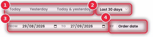
- 1Today · Yesterday · Today & yesterday One click for today, yesterday, or both. The most useful way to check “how did yesterday go” first thing in the morning.
- 2More periods The dropdown has Last 7 days, Last 30 days, This month, Last 90 days and All time.
- 3FROM · TO Your own start and end dates — e.g. to look at the 15 days before Eid on their own.
- 4BY — Order date / Last actionOrder date counts by the day the order came in. Last action counts by the day the last thing happened to the order (confirmed, shipped, delivered) — pick this to know “how many were delivered today”.
🧮 Status cards — how many orders in each state
16 cards with the count for each order status — from Processing to Delivered, Returned, Fake and No response. You can see at a glance where orders are piling up.
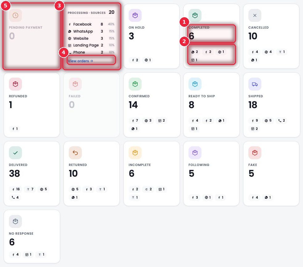
- 1Status and count How many orders are in this status for the chosen period.
- 2Source chips The small icons show where the orders came from — Facebook, WhatsApp, Website, Landing Page, Phone, TikTok and so on, with counts.
- 3Click a card to flip it The back shows the full list of sources with percentages — e.g. 40% of Processing came from Facebook.
- 4View orders → Jump straight to the orders in that status.
- 5Grey cards Statuses with no orders in this period are faded, so your eye goes to the cards that need work.
⚙️ How it works
- Pick a date at the top.
- Click the card whose number looks high (e.g. Processing or No response) to see its sources.
- Use View orders → to start working on those orders.
💵 Money cards and key numbers
The top row shows advance payments, delivery charges and discounts — the bottom row shows total orders, revenue and average order value.
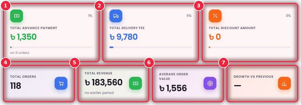
- 1Total advance payment How much customers paid upfront and on how many orders. The percentage in the corner is its share of total sales.
- 2Total delivery fee Total delivery charges collected from customers.
- 3Total discount amount How much you gave away in discounts — keep an eye on this when running offers.
- 4Total orders Total orders in this period.
- 5Total revenue Total sales amount.
- 6Average order value How much each order is worth on average. Tells you whether combo offers or upsells are working.
- 7Growth vs previous How much it went up or down compared with the previous period of the same length. Shows a dash (—) if there’s no earlier data.
📈 Net profit — what you actually kept
More sales doesn’t always mean more profit. This takes delivered orders and subtracts product cost, courier charges, packaging and return losses to show your real profit.
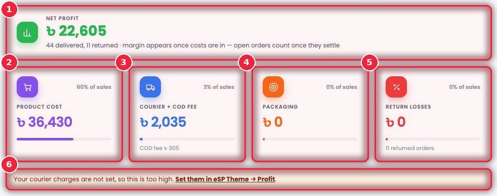
- 1Net profit Profit after all costs. Below, it shows how many deliveries and returns were counted. Orders still on the way are added once they settle.
- 2Product cost What you paid for the products sold, and what percentage of sales that is.
- 3Courier + COD fee Courier charges and COD fees combined.
- 4Packaging The cost of packets, tape and boxes.
- 5Return losses Money lost on returned orders.
- 6Warning If any cost isn’t set, it warns you that profit is showing higher than it really is, and where to fix it (eSP Theme → Profit).
⚙️ How it works
- Enter courier charges and packaging costs in eSP Theme → Profit.
- Add the purchase price (cost) to your products.
- From then on, every delivery and return is counted automatically.
🏆 Top products and Low stock
Which products bring in the most money, and which are running out of stock.
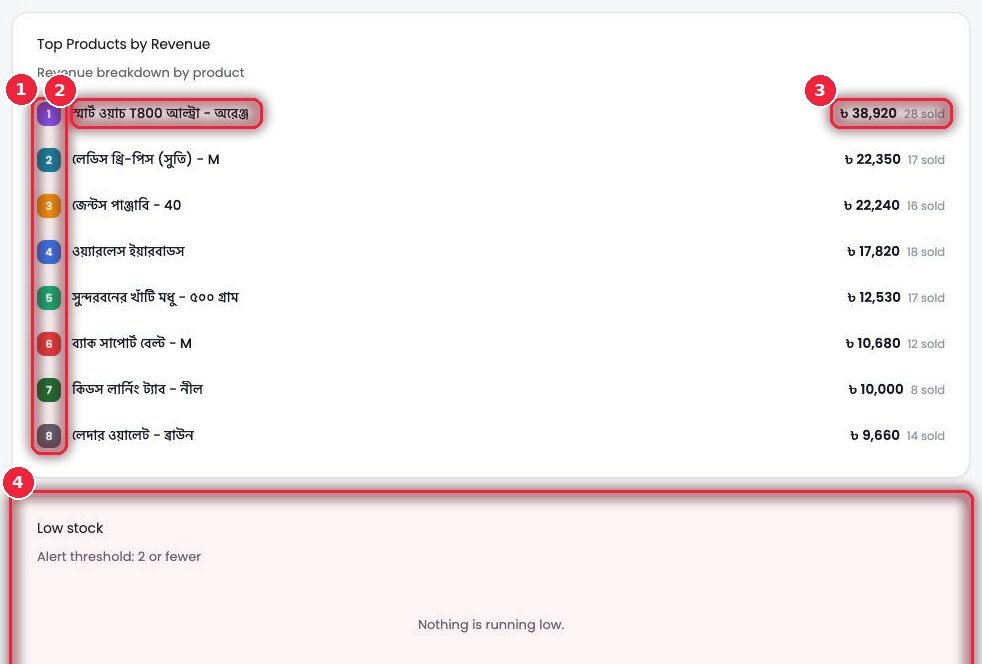
- 1Rank Sorted 1 to 8 by sales amount.
- 2Product Variations are shown separately — e.g. a watch in orange and black on separate lines.
- 3Amount and units sold Total sales amount and number of pieces.
- 4Low stock A list of products that dropped below the set limit (e.g. 2 or fewer). When all is fine it says Nothing is running low.
🧭 Order sources — where orders come from
How many orders came from each channel. Helps you decide where to spend more on ads.
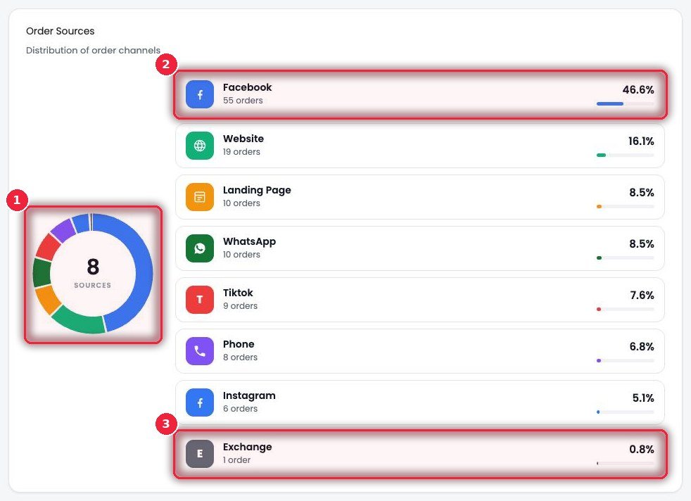
- 1Donut chart The total number of sources in the middle, split by color.
- 2Each source Name, order count, percentage and a small bar — Facebook, Website, Landing Page, WhatsApp, TikTok, Phone, Instagram and so on.
- 3Exchange Orders created from exchanges count as a separate source, so they don’t mix with real new sales.
⏰ Peak order times — when orders come in most
Which times of day bring the most orders — by your shop’s clock.
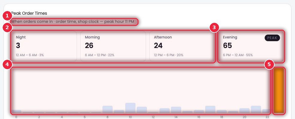
- 1Busiest hour The top line shows the hour with the most orders (e.g. 11 PM).
- 2Four parts Night, morning, afternoon, evening — orders and percentage in each.
- 3PEAK The part with the most orders is marked with a green border and a PEAK label.
- 4Hourly chart 0 to 23 — how many orders in each hour.
- 5Orange bar The busiest hour.
🧾 Product summary — sales and profit per product
The full numbers for every product in one table. Profit counts only delivered pieces, before courier and packaging.
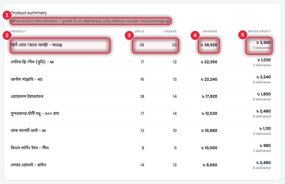
- 1How it’s calculated A short note above the table explains how profit is counted.
- 2Product Product and variation.
- 3Units · Orders How many pieces sold and in how many orders.
- 4Revenue Total sales amount.
- 5Gross profit Profit from delivered pieces, with the number delivered shown below.
🏷️ Customer tags — customers’ past records
Grouped by what the phone number behind each order did before. Click any tag to see those customers.
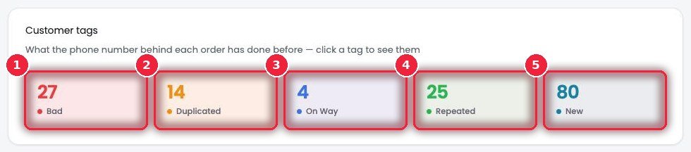
- 1Bad Took orders and returned them before, or caused trouble — be careful before confirming.
- 2Duplicated Several orders from the same number — may have been sent twice by mistake.
- 3On way Another parcel for this number is on the way right now.
- 4Repeated Bought before, was happy, and is buying again — look after them.
- 5New A brand-new customer.
👥 Team performance — how each person is doing
How many order statuses each team member changed in this period, and how their work turned out. Not just how much work, but how good it was.
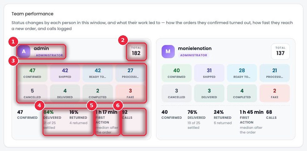
- 1Who Name and role.
- 2Total Total status changes.
- 3Split by status How many they set to Confirmed, Shipped, Ready to ship, Processing, Cancelled, Delivered, Completed and Fake.
- 4Delivered · Returned Of the orders they confirmed that have settled, what % were delivered and what % returned. A high return rate means confirmation calls need more care.
- 5First action How long, on average (median), until they first acted on a new order.
- 6Calls How many calls they logged.
🚚 Courier success by district — which courier works where
For each district, what % of each courier’s settled parcels were delivered. Order Desk uses these numbers to suggest the better courier when booking.
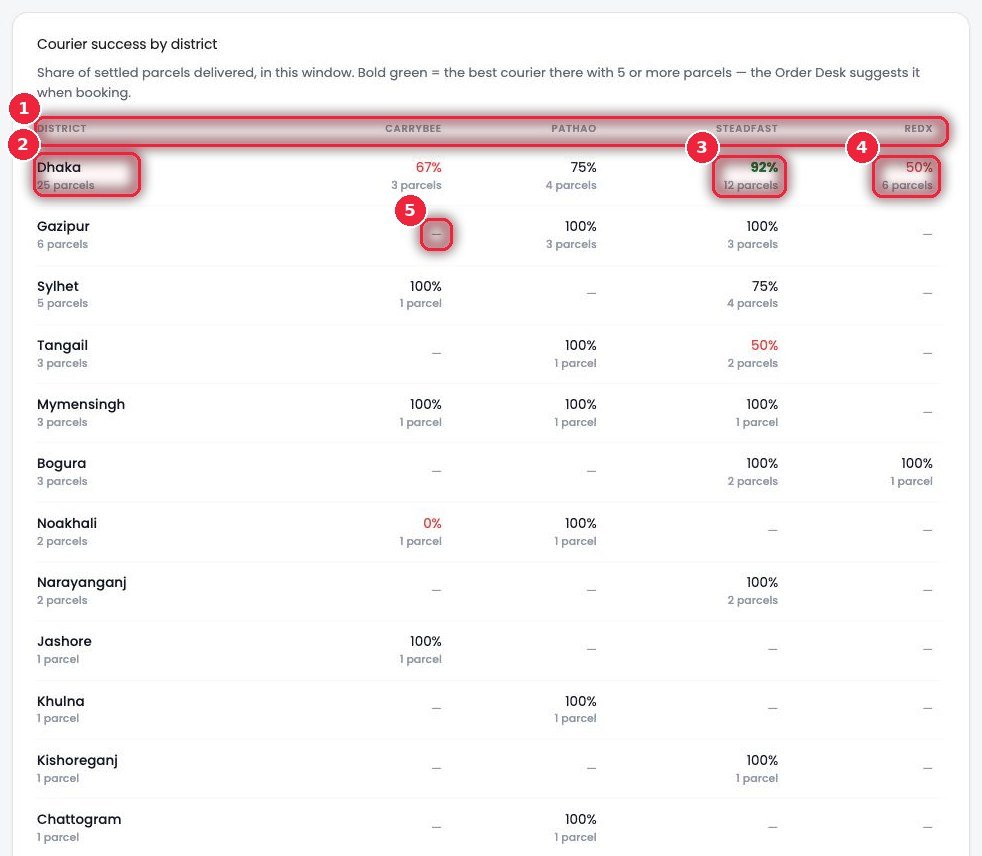
- 1Courier columns Carrybee, Pathao, Steadfast, Redx — whichever you use.
- 2District District name and total parcels.
- 3Bold green The best courier in that district (with at least 5 parcels).
- 4Red Low delivery rate — consider avoiding this courier in this district.
- 5Dash (—) No parcels sent to this district with this courier.
🔻 What shoppers did — where customers drop off
From your own tracking log — how many people at each step from viewing a product to ordering. Even if the same event goes to several pixels, it’s counted only once here.
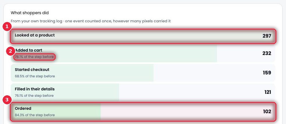
- 1Looked at a product How many people viewed a product.
- 2% of the previous step What percentage of the previous step moved forward at each step — Added to cart, Started checkout, Filled in their details.
- 3Ordered How many finally ordered.
⚙️ How it works
- Keep tracking on in Event Tracker.
- Look for problems where the percentage drops the most — e.g. if people start checkout but don’t enter details, check whether the form or the delivery charge is putting them off.
🛒 Customer journey per product and the busiest times of day
Each product on its own — how many viewed it, added it to cart, went to checkout, entered details, and bought. Carts nobody finished are counted too.
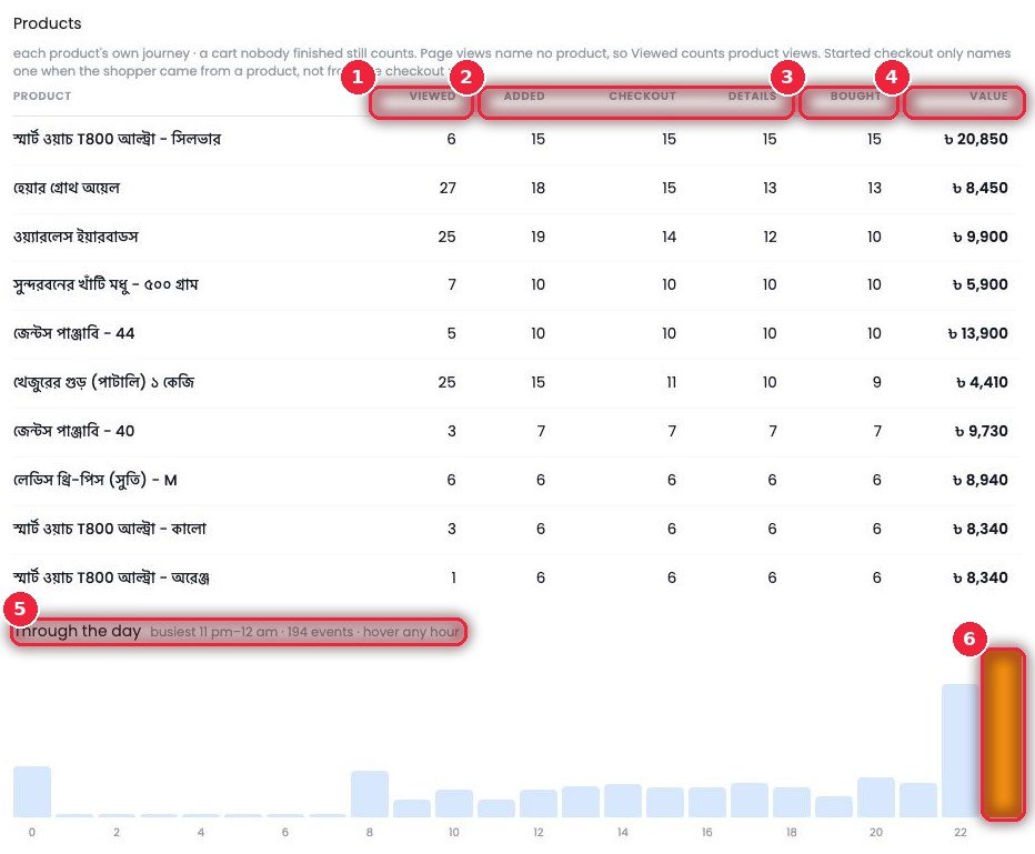
- 1Viewed How many times the product page was viewed.
- 2Added · Checkout · Details Added to cart, started checkout, and entered name and address.
- 3Bought How many bought.
- 4Value Total order value for that product.
- 5Through the day Which hours of the day have the most activity on the site, and total events. Hover over an hour for details.
- 6Busiest hour The orange bar.