DESIGN 01 / 16TicketLeftCircle
Ticket Package List — Coupon-Style Options
Each package looks like a ticket with a round selector on the left.
Best forOffering 2–4 quantity packs (500g, 1kg, 2kg).
Where to place itRight above the order form.
How to use: add the BD Package List (COD) block and choose ticket · left · circle in its style settings
What you can customize in this widget
ColorsFree background, Free color, Heading color, Subheading color, Icon color, Frame background, Card background, Title color, Subtitle color, Footer color, Accent, Background, Box background, Box border color
Font & text sizeIcon size, Heading size, Subheading size, Title size, Line size, Footer size, Free size
Size & spacingColumns, Gap, Card radius, Free offset, Free radius, Radius, Box margin, Box background size, Box radius
Layout & styleDesign, Columns mode, Icon position, Header align, Text align, Footer align, Free position
Animation & effectsHover cards, Hover, Animation, Shadow
Show / hide optionsProduct item, Product price, Bangla digits, Stagger, On, Orig
Text, images & linksHeading, Heading icon, Heading tag, Subheading, Items, Free label, Footer, Card min, Card padding, Icon frame, Image radius, Stagger step, Free padding, Card border, Primary, Ink, Border, Padding, Box padding, Box background image, Box overlay, Box overlay o, Box border, Key, Product, W0
📦 প্যাকেট খুললে যা যা পাবেন
সিল করা বক্স খুলে সবকিছু মিলিয়ে নিন — তারপর টাকা দিন।
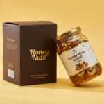 Honey Nuts/হানিনাট (৮০০গ্রাম)১,৪৭২৳
- 🥜হানিনাট১ বয়াম · ৮০০ গ্রাম
- ফ্রি🌰এ-গ্রেড কাঠবাদাম২৫০ গ্রাম জিপ-লক প্যাক
- ফ্রি🥄কাঠের চামচবয়ামের সাথে
- ফ্রি📄রেসিপি কার্ড৫টি নাস্তার আইডিয়া
সব কিছু আসবে একটাই সিল করা প্যাকেটে — খুলে মিলিয়ে নিয়ে তারপর টাকা দিবেন।
DESIGN 02 / 16DarkTopSquare
Dark Package List — Premium Options
Dark package rows with square selectors, image on top.
Best forPremium or gift packages.
Where to place itInside the offer section.
How to use: add the BD Package List (COD) block and choose dark · top · square in its style settings
What you can customize in this widget
ColorsFree background, Free color, Heading color, Subheading color, Icon color, Frame background, Card background, Title color, Subtitle color, Footer color, Accent, Background, Box background, Box border color
Font & text sizeIcon size, Heading size, Subheading size, Title size, Line size, Footer size, Free size
Size & spacingColumns, Gap, Card radius, Free offset, Free radius, Radius, Box margin, Box background size, Box radius
Layout & styleDesign, Columns mode, Icon position, Header align, Text align, Footer align, Free position
Animation & effectsHover cards, Hover, Animation, Shadow
Show / hide optionsProduct item, Product price, Bangla digits, Stagger, On, Orig
Text, images & linksHeading, Heading icon, Heading tag, Subheading, Items, Free label, Footer, Card min, Card padding, Icon frame, Image radius, Stagger step, Free padding, Card border, Primary, Ink, Border, Padding, Box padding, Box background image, Box overlay, Box overlay o, Box border, Key, Product, W0
বক্সে যা থাকছে
সিল করা বক্স খুলে সবকিছু মিলিয়ে নিন — তারপর টাকা দিন।
- আম-রসুনের আচার৪০০ গ্রাম কাচের বয়াম
- জলপাই-রসুনের আচার৪০০ গ্রাম কাচের বয়াম
- ফ্রিআচারের চামচকাঠের তৈরি
- ফ্রিক্যাশ মেমোদাম ও মেয়াদসহ
সব কিছু আসবে একটাই সিল করা প্যাকেটে — খুলে মিলিয়ে নিয়ে তারপর টাকা দিবেন।
DESIGN 03 / 16GradientLeft
Gradient Package List — Colorful Options
Gradient-filled rows that make the best deal pop.
Best forCombo and family packs.
Where to place itBefore the checkout form.
How to use: add the BD Package List (COD) block and choose gradient · left in its style settings
What you can customize in this widget
ColorsFree background, Free color, Heading color, Subheading color, Icon color, Frame background, Card background, Title color, Subtitle color, Footer color, Accent, Background, Box background, Box border color
Font & text sizeIcon size, Heading size, Subheading size, Title size, Line size, Footer size, Free size
Size & spacingColumns, Gap, Card radius, Free offset, Free radius, Radius, Box margin, Box background size, Box radius
Layout & styleDesign, Columns mode, Icon position, Header align, Text align, Footer align, Free position
Animation & effectsHover cards, Hover, Animation, Shadow
Show / hide optionsProduct item, Product price, Bangla digits, Stagger, On, Orig
Text, images & linksHeading, Heading icon, Heading tag, Subheading, Items, Free label, Footer, Card min, Card padding, Icon frame, Image radius, Stagger step, Free padding, Card border, Primary, Ink, Border, Padding, Box padding, Box background image, Box overlay, Box overlay o, Box border, Key, Product, W0
DESIGN 04 / 16GlassTopCircle
Glass Package List — Modern Frosted Options
Frosted rows with round selectors for a modern feel.
Best forModern brand pages with colored backgrounds.
Where to place itOver a colored offer section.
How to use: add the BD Package List (COD) block and choose glass · top · circle in its style settings
What you can customize in this widget
ColorsFree background, Free color, Heading color, Subheading color, Icon color, Frame background, Card background, Title color, Subtitle color, Footer color, Accent, Background, Box background, Box border color
Font & text sizeIcon size, Heading size, Subheading size, Title size, Line size, Footer size, Free size
Size & spacingColumns, Gap, Card radius, Free offset, Free radius, Radius, Box margin, Box background size, Box radius
Layout & styleDesign, Columns mode, Icon position, Header align, Text align, Footer align, Free position
Animation & effectsHover cards, Hover, Animation, Shadow
Show / hide optionsProduct item, Product price, Bangla digits, Stagger, On, Orig
Text, images & linksHeading, Heading icon, Heading tag, Subheading, Items, Free label, Footer, Card min, Card padding, Icon frame, Image radius, Stagger step, Free padding, Card border, Primary, Ink, Border, Padding, Box padding, Box background image, Box overlay, Box overlay o, Box border, Key, Product, W0
ডেলিভারি বক্সের ভেতর
সিল করা বক্স খুলে সবকিছু মিলিয়ে নিন — তারপর টাকা দিন।
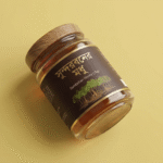 সুন্দরবনের মধু/Sundarban Honey 1kg২,০০০৳
- 🍯সুন্দরবনের খাঁটি মধু১ বোতল · ১ কেজি
- ফ্রি🌸লিচু ফুলের মধু২৫০ গ্রাম — উপহার
- ফ্রি🥄কাঠের মধু-চামচবোতলের সাথে
- ফ্রি🧪ল্যাব রিপোর্টের কপিব্যাচ নম্বরসহ
সব কিছু আসবে একটাই সিল করা প্যাকেটে — খুলে মিলিয়ে নিয়ে তারপর টাকা দিবেন।
DESIGN 05 / 16ListLeftSquare
List Package List — Simple Rows
Plain list rows with square selectors — fast and clear.
Best forEveryday products with simple size options.
Where to place itDirectly inside or above the order form.
How to use: add the BD Package List (COD) block and choose list · left · square in its style settings
What you can customize in this widget
ColorsFree background, Free color, Heading color, Subheading color, Icon color, Frame background, Card background, Title color, Subtitle color, Footer color, Accent, Background, Box background, Box border color
Font & text sizeIcon size, Heading size, Subheading size, Title size, Line size, Footer size, Free size
Size & spacingColumns, Gap, Card radius, Free offset, Free radius, Radius, Box margin, Box background size, Box radius
Layout & styleDesign, Columns mode, Icon position, Header align, Text align, Footer align, Free position
Animation & effectsHover cards, Hover, Animation, Shadow
Show / hide optionsProduct item, Product price, Bangla digits, Stagger, On, Orig
Text, images & linksHeading, Heading icon, Heading tag, Subheading, Items, Free label, Footer, Card min, Card padding, Icon frame, Image radius, Stagger step, Free padding, Card border, Primary, Ink, Border, Padding, Box padding, Box background image, Box overlay, Box overlay o, Box border, Key, Product, W0
📦 প্যাকেট খুললে যা যা পাবেন
সিল করা বক্স খুলে সবকিছু মিলিয়ে নিন — তারপর টাকা দিন।
- 🛢️দেশি সরিষার তেল৫ লিটার সিল করা জার
- ফ্রি💧কালোজিরা তেল১০০ মি.লি. — উপহার
- ফ্রি🧴ড্রপার বোতলচুলে দেওয়ার জন্য
- 📦বাবল র্যাপ প্যাকিংলিক-প্রুফ ডেলিভারি
সব কিছু আসবে একটাই সিল করা প্যাকেটে — খুলে মিলিয়ে নিয়ে তারপর টাকা দিবেন।
DESIGN 06 / 16MinimalTop
Minimal Package List — No Frills
The lightest style: just text rows, no selector icons.
Best forClean pages where the form is already busy.
Where to place itJust above the checkout.
How to use: add the BD Package List (COD) block and choose minimal · top in its style settings
What you can customize in this widget
ColorsFree background, Free color, Heading color, Subheading color, Icon color, Frame background, Card background, Title color, Subtitle color, Footer color, Accent, Background, Box background, Box border color
Font & text sizeIcon size, Heading size, Subheading size, Title size, Line size, Footer size, Free size
Size & spacingColumns, Gap, Card radius, Free offset, Free radius, Radius, Box margin, Box background size, Box radius
Layout & styleDesign, Columns mode, Icon position, Header align, Text align, Footer align, Free position
Animation & effectsHover cards, Hover, Animation, Shadow
Show / hide optionsProduct item, Product price, Bangla digits, Stagger, On, Orig
Text, images & linksHeading, Heading icon, Heading tag, Subheading, Items, Free label, Footer, Card min, Card padding, Icon frame, Image radius, Stagger step, Free padding, Card border, Primary, Ink, Border, Padding, Box padding, Box background image, Box overlay, Box overlay o, Box border, Key, Product, W0
বক্সে যা থাকছে
সিল করা বক্স খুলে সবকিছু মিলিয়ে নিন — তারপর টাকা দিন।
- হানিনাট১ বয়াম · ৮০০ গ্রাম
- ফ্রিএ-গ্রেড কাঠবাদাম২৫০ গ্রাম জিপ-লক প্যাক
- ফ্রিকাঠের চামচবয়ামের সাথে
- ফ্রিরেসিপি কার্ড৫টি নাস্তার আইডিয়া
সব কিছু আসবে একটাই সিল করা প্যাকেটে — খুলে মিলিয়ে নিয়ে তারপর টাকা দিবেন।
DESIGN 07 / 16CardsLeftCircle
Card Package List — Separate Boxes
Each package in its own card with a round selector.
Best forShowing clear differences between packs.
Where to place itIn the pricing section.
How to use: add the BD Package List (COD) block and choose cards · left · circle in its style settings
What you can customize in this widget
ColorsFree background, Free color, Heading color, Subheading color, Icon color, Frame background, Card background, Title color, Subtitle color, Footer color, Accent, Background, Box background, Box border color
Font & text sizeIcon size, Heading size, Subheading size, Title size, Line size, Footer size, Free size
Size & spacingColumns, Gap, Card radius, Free offset, Free radius, Radius, Box margin, Box background size, Box radius
Layout & styleDesign, Columns mode, Icon position, Header align, Text align, Footer align, Free position
Animation & effectsHover cards, Hover, Animation, Shadow
Show / hide optionsProduct item, Product price, Bangla digits, Stagger, On, Orig
Text, images & linksHeading, Heading icon, Heading tag, Subheading, Items, Free label, Footer, Card min, Card padding, Icon frame, Image radius, Stagger step, Free padding, Card border, Primary, Ink, Border, Padding, Box padding, Box background image, Box overlay, Box overlay o, Box border, Key, Product, W0
DESIGN 08 / 16TintedTopSquare
Tinted Package List — Soft Color Rows
Softly tinted rows with square selectors, image on top.
Best forSpice and food packs with photos.
Where to place itBefore the order form.
How to use: add the BD Package List (COD) block and choose tinted · top · square in its style settings
What you can customize in this widget
ColorsFree background, Free color, Heading color, Subheading color, Icon color, Frame background, Card background, Title color, Subtitle color, Footer color, Accent, Background, Box background, Box border color
Font & text sizeIcon size, Heading size, Subheading size, Title size, Line size, Footer size, Free size
Size & spacingColumns, Gap, Card radius, Free offset, Free radius, Radius, Box margin, Box background size, Box radius
Layout & styleDesign, Columns mode, Icon position, Header align, Text align, Footer align, Free position
Animation & effectsHover cards, Hover, Animation, Shadow
Show / hide optionsProduct item, Product price, Bangla digits, Stagger, On, Orig
Text, images & linksHeading, Heading icon, Heading tag, Subheading, Items, Free label, Footer, Card min, Card padding, Icon frame, Image radius, Stagger step, Free padding, Card border, Primary, Ink, Border, Padding, Box padding, Box background image, Box overlay, Box overlay o, Box border, Key, Product, W0
ডেলিভারি বক্সের ভেতর
সিল করা বক্স খুলে সবকিছু মিলিয়ে নিন — তারপর টাকা দিন।
- 🟡হলুদ গুঁড়া২০০ গ্রাম জিপ-লক
- 🌶️মরিচ গুঁড়া২০০ গ্রাম জিপ-লক
- 🌿ধনিয়া গুঁড়া২০০ গ্রাম জিপ-লক
- ফ্রি🫙শাহী গরম মশলা৫০ গ্রাম — উপহার
সব কিছু আসবে একটাই সিল করা প্যাকেটে — খুলে মিলিয়ে নিয়ে তারপর টাকা দিবেন।
DESIGN 09 / 16OutlineLeft
Outline Package List — Bordered Options
Bordered rows without selector icons — neat and light.
Best forHoney and simple size options.
Where to place itNext to the price section.
How to use: add the BD Package List (COD) block and choose outline · left in its style settings
What you can customize in this widget
ColorsFree background, Free color, Heading color, Subheading color, Icon color, Frame background, Card background, Title color, Subtitle color, Footer color, Accent, Background, Box background, Box border color
Font & text sizeIcon size, Heading size, Subheading size, Title size, Line size, Footer size, Free size
Size & spacingColumns, Gap, Card radius, Free offset, Free radius, Radius, Box margin, Box background size, Box radius
Layout & styleDesign, Columns mode, Icon position, Header align, Text align, Footer align, Free position
Animation & effectsHover cards, Hover, Animation, Shadow
Show / hide optionsProduct item, Product price, Bangla digits, Stagger, On, Orig
Text, images & linksHeading, Heading icon, Heading tag, Subheading, Items, Free label, Footer, Card min, Card padding, Icon frame, Image radius, Stagger step, Free padding, Card border, Primary, Ink, Border, Padding, Box padding, Box background image, Box overlay, Box overlay o, Box border, Key, Product, W0
📦 প্যাকেট খুললে যা যা পাবেন
সিল করা বক্স খুলে সবকিছু মিলিয়ে নিন — তারপর টাকা দিন।
- 🍯সুন্দরবনের খাঁটি মধু১ বোতল · ১ কেজি
- ফ্রি🌸লিচু ফুলের মধু২৫০ গ্রাম — উপহার
- ফ্রি🥄কাঠের মধু-চামচবোতলের সাথে
- ফ্রি🧪ল্যাব রিপোর্টের কপিব্যাচ নম্বরসহ
সব কিছু আসবে একটাই সিল করা প্যাকেটে — খুলে মিলিয়ে নিয়ে তারপর টাকা দিবেন।
DESIGN 10 / 16TicketTopCircle
Ticket Package List — Oil Bulk Packs
Ticket style again, good for 1L / 2L / 5L style packs.
Best forOil and ghee quantity options.
Where to place itAbove the checkout form.
How to use: add the BD Package List (COD) block and choose ticket · top · circle in its style settings
What you can customize in this widget
ColorsFree background, Free color, Heading color, Subheading color, Icon color, Frame background, Card background, Title color, Subtitle color, Footer color, Accent, Background, Box background, Box border color
Font & text sizeIcon size, Heading size, Subheading size, Title size, Line size, Footer size, Free size
Size & spacingColumns, Gap, Card radius, Free offset, Free radius, Radius, Box margin, Box background size, Box radius
Layout & styleDesign, Columns mode, Icon position, Header align, Text align, Footer align, Free position
Animation & effectsHover cards, Hover, Animation, Shadow
Show / hide optionsProduct item, Product price, Bangla digits, Stagger, On, Orig
Text, images & linksHeading, Heading icon, Heading tag, Subheading, Items, Free label, Footer, Card min, Card padding, Icon frame, Image radius, Stagger step, Free padding, Card border, Primary, Ink, Border, Padding, Box padding, Box background image, Box overlay, Box overlay o, Box border, Key, Product, W0
বক্সে যা থাকছে
সিল করা বক্স খুলে সবকিছু মিলিয়ে নিন — তারপর টাকা দিন।
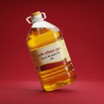 দেশি সরিষার তেল/Deshi Mustard Oil 5ltr.১,৫১৯৳
- দেশি সরিষার তেল৫ লিটার সিল করা জার
- ফ্রিকালোজিরা তেল১০০ মি.লি. — উপহার
- ফ্রিড্রপার বোতলচুলে দেওয়ার জন্য
- বাবল র্যাপ প্যাকিংলিক-প্রুফ ডেলিভারি
সব কিছু আসবে একটাই সিল করা প্যাকেটে — খুলে মিলিয়ে নিয়ে তারপর টাকা দিবেন।
DESIGN 11 / 16DarkLeftSquare
Dark Package List — Nuts Premium Packs
Dark rows with side images for premium nut packs.
Best forNuts and dry fruit gift sizes.
Where to place itInside the offer section.
How to use: add the BD Package List (COD) block and choose dark · left · square in its style settings
What you can customize in this widget
ColorsFree background, Free color, Heading color, Subheading color, Icon color, Frame background, Card background, Title color, Subtitle color, Footer color, Accent, Background, Box background, Box border color
Font & text sizeIcon size, Heading size, Subheading size, Title size, Line size, Footer size, Free size
Size & spacingColumns, Gap, Card radius, Free offset, Free radius, Radius, Box margin, Box background size, Box radius
Layout & styleDesign, Columns mode, Icon position, Header align, Text align, Footer align, Free position
Animation & effectsHover cards, Hover, Animation, Shadow
Show / hide optionsProduct item, Product price, Bangla digits, Stagger, On, Orig
Text, images & linksHeading, Heading icon, Heading tag, Subheading, Items, Free label, Footer, Card min, Card padding, Icon frame, Image radius, Stagger step, Free padding, Card border, Primary, Ink, Border, Padding, Box padding, Box background image, Box overlay, Box overlay o, Box border, Key, Product, W0
DESIGN 12 / 16GradientTop
Gradient Package List — Pickle Combo Packs
Gradient rows with image on top for combo deals.
Best forPickle combos and mixed packs.
Where to place itBefore the order form.
How to use: add the BD Package List (COD) block and choose gradient · top in its style settings
What you can customize in this widget
ColorsFree background, Free color, Heading color, Subheading color, Icon color, Frame background, Card background, Title color, Subtitle color, Footer color, Accent, Background, Box background, Box border color
Font & text sizeIcon size, Heading size, Subheading size, Title size, Line size, Footer size, Free size
Size & spacingColumns, Gap, Card radius, Free offset, Free radius, Radius, Box margin, Box background size, Box radius
Layout & styleDesign, Columns mode, Icon position, Header align, Text align, Footer align, Free position
Animation & effectsHover cards, Hover, Animation, Shadow
Show / hide optionsProduct item, Product price, Bangla digits, Stagger, On, Orig
Text, images & linksHeading, Heading icon, Heading tag, Subheading, Items, Free label, Footer, Card min, Card padding, Icon frame, Image radius, Stagger step, Free padding, Card border, Primary, Ink, Border, Padding, Box padding, Box background image, Box overlay, Box overlay o, Box border, Key, Product, W0
ডেলিভারি বক্সের ভেতর
সিল করা বক্স খুলে সবকিছু মিলিয়ে নিন — তারপর টাকা দিন।
- 🥭আম-রসুনের আচার৪০০ গ্রাম কাচের বয়াম
- 🫒জলপাই-রসুনের আচার৪০০ গ্রাম কাচের বয়াম
- ফ্রি🥄আচারের চামচকাঠের তৈরি
- ফ্রি🧾ক্যাশ মেমোদাম ও মেয়াদসহ
সব কিছু আসবে একটাই সিল করা প্যাকেটে — খুলে মিলিয়ে নিয়ে তারপর টাকা দিবেন।
DESIGN 13 / 16GlassLeftCircle
Glass Package List — Spice Set Options
Frosted rows with side images and round selectors.
Best forSpice sets and bundle options.
Where to place itIn the package/offer area.
How to use: add the BD Package List (COD) block and choose glass · left · circle in its style settings
What you can customize in this widget
ColorsFree background, Free color, Heading color, Subheading color, Icon color, Frame background, Card background, Title color, Subtitle color, Footer color, Accent, Background, Box background, Box border color
Font & text sizeIcon size, Heading size, Subheading size, Title size, Line size, Footer size, Free size
Size & spacingColumns, Gap, Card radius, Free offset, Free radius, Radius, Box margin, Box background size, Box radius
Layout & styleDesign, Columns mode, Icon position, Header align, Text align, Footer align, Free position
Animation & effectsHover cards, Hover, Animation, Shadow
Show / hide optionsProduct item, Product price, Bangla digits, Stagger, On, Orig
Text, images & linksHeading, Heading icon, Heading tag, Subheading, Items, Free label, Footer, Card min, Card padding, Icon frame, Image radius, Stagger step, Free padding, Card border, Primary, Ink, Border, Padding, Box padding, Box background image, Box overlay, Box overlay o, Box border, Key, Product, W0
📦 প্যাকেট খুললে যা যা পাবেন
সিল করা বক্স খুলে সবকিছু মিলিয়ে নিন — তারপর টাকা দিন।
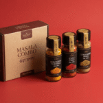 গুঁড়া মশলা কম্বো/Masala Combo১,৭৬০৳
- 🟡হলুদ গুঁড়া২০০ গ্রাম জিপ-লক
- 🌶️মরিচ গুঁড়া২০০ গ্রাম জিপ-লক
- 🌿ধনিয়া গুঁড়া২০০ গ্রাম জিপ-লক
- ফ্রি🫙শাহী গরম মশলা৫০ গ্রাম — উপহার
সব কিছু আসবে একটাই সিল করা প্যাকেটে — খুলে মিলিয়ে নিয়ে তারপর টাকা দিবেন।
DESIGN 14 / 16ListTopSquare
List Package List — Honey Sizes
Simple rows with images on top for jar sizes.
Best forHoney jar sizes (250g, 500g, 1kg).
Where to place itRight above the order form.
How to use: add the BD Package List (COD) block and choose list · top · square in its style settings
What you can customize in this widget
ColorsFree background, Free color, Heading color, Subheading color, Icon color, Frame background, Card background, Title color, Subtitle color, Footer color, Accent, Background, Box background, Box border color
Font & text sizeIcon size, Heading size, Subheading size, Title size, Line size, Footer size, Free size
Size & spacingColumns, Gap, Card radius, Free offset, Free radius, Radius, Box margin, Box background size, Box radius
Layout & styleDesign, Columns mode, Icon position, Header align, Text align, Footer align, Free position
Animation & effectsHover cards, Hover, Animation, Shadow
Show / hide optionsProduct item, Product price, Bangla digits, Stagger, On, Orig
Text, images & linksHeading, Heading icon, Heading tag, Subheading, Items, Free label, Footer, Card min, Card padding, Icon frame, Image radius, Stagger step, Free padding, Card border, Primary, Ink, Border, Padding, Box padding, Box background image, Box overlay, Box overlay o, Box border, Key, Product, W0
বক্সে যা থাকছে
সিল করা বক্স খুলে সবকিছু মিলিয়ে নিন — তারপর টাকা দিন।
- সুন্দরবনের খাঁটি মধু১ বোতল · ১ কেজি
- ফ্রিলিচু ফুলের মধু২৫০ গ্রাম — উপহার
- ফ্রিকাঠের মধু-চামচবোতলের সাথে
- ফ্রিল্যাব রিপোর্টের কপিব্যাচ নম্বরসহ
সব কিছু আসবে একটাই সিল করা প্যাকেটে — খুলে মিলিয়ে নিয়ে তারপর টাকা দিবেন।
DESIGN 15 / 16MinimalLeft
Minimal Package List — Clean Oil Options
Minimal rows with side images, no selectors.
Best forSimple product pages.
Where to place itInside the checkout area.
How to use: add the BD Package List (COD) block and choose minimal · left in its style settings
What you can customize in this widget
ColorsFree background, Free color, Heading color, Subheading color, Icon color, Frame background, Card background, Title color, Subtitle color, Footer color, Accent, Background, Box background, Box border color
Font & text sizeIcon size, Heading size, Subheading size, Title size, Line size, Footer size, Free size
Size & spacingColumns, Gap, Card radius, Free offset, Free radius, Radius, Box margin, Box background size, Box radius
Layout & styleDesign, Columns mode, Icon position, Header align, Text align, Footer align, Free position
Animation & effectsHover cards, Hover, Animation, Shadow
Show / hide optionsProduct item, Product price, Bangla digits, Stagger, On, Orig
Text, images & linksHeading, Heading icon, Heading tag, Subheading, Items, Free label, Footer, Card min, Card padding, Icon frame, Image radius, Stagger step, Free padding, Card border, Primary, Ink, Border, Padding, Box padding, Box background image, Box overlay, Box overlay o, Box border, Key, Product, W0
DESIGN 16 / 16CardsTopCircle
Card Package List — Best Value Highlight
Card packages with image on top and round selectors.
Best forPushing the best-value pack.
Where to place itThe main pricing section.
How to use: add the BD Package List (COD) block and choose cards · top · circle in its style settings
What you can customize in this widget
ColorsFree background, Free color, Heading color, Subheading color, Icon color, Frame background, Card background, Title color, Subtitle color, Footer color, Accent, Background, Box background, Box border color
Font & text sizeIcon size, Heading size, Subheading size, Title size, Line size, Footer size, Free size
Size & spacingColumns, Gap, Card radius, Free offset, Free radius, Radius, Box margin, Box background size, Box radius
Layout & styleDesign, Columns mode, Icon position, Header align, Text align, Footer align, Free position
Animation & effectsHover cards, Hover, Animation, Shadow
Show / hide optionsProduct item, Product price, Bangla digits, Stagger, On, Orig
Text, images & linksHeading, Heading icon, Heading tag, Subheading, Items, Free label, Footer, Card min, Card padding, Icon frame, Image radius, Stagger step, Free padding, Card border, Primary, Ink, Border, Padding, Box padding, Box background image, Box overlay, Box overlay o, Box border, Key, Product, W0
ডেলিভারি বক্সের ভেতর
সিল করা বক্স খুলে সবকিছু মিলিয়ে নিন — তারপর টাকা দিন।
- Honey Nuts/হানিনাট (৮০০গ্রাম)১,৪৭২৳
- 🥜হানিনাট১ বয়াম · ৮০০ গ্রাম
- ফ্রি🌰এ-গ্রেড কাঠবাদাম২৫০ গ্রাম জিপ-লক প্যাক
- ফ্রি🥄কাঠের চামচবয়ামের সাথে
- ফ্রি📄রেসিপি কার্ড৫টি নাস্তার আইডিয়া
সব কিছু আসবে একটাই সিল করা প্যাকেটে — খুলে মিলিয়ে নিয়ে তারপর টাকা দিবেন।