


Right Hero Showcase — Glow, Fan
Hero section with text on the left and an animated product showcase on the right. Background: glow; product animation: fan.
How to use: add the Hero Showcase block and choose right · glow · fan in its style settings
What you can customize in this widget
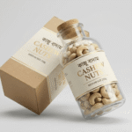
সকালের নাস্তায় পুষ্টির অভাব?প্রিমিয়াম বাদামেই পূর্ণ সমাধান
কাজু, কাঠবাদাম, পেস্তা ও আখরোট — প্রতিদিনের শক্তি ও পুষ্টির জন্য নিখুঁত মিশ্রণ, সরাসরি খামার থেকে বাছাই করা।
- ১০০% প্রাকৃতিক ও তাজা
- কোনো ভেজাল বা প্রিজারভেটিভ নেই
- এয়ারটাইট প্যাকেজিং


Left Hero Showcase — Light, Coverflow
Hero with the animated product showcase on the left and text on the right. Background: light; product animation: coverflow.
How to use: add the Hero Showcase block and choose left · light · coverflow in its style settings
What you can customize in this widget
বাজারের ভেজাল আচারে বিরক্ত?ঘরোয়া স্বাদের খাঁটি আচার
সরিষার তেলে জ্বাল দেওয়া, রোদে শুকানো — ঠিক মায়ের হাতের মতো স্বাদ, কোনো কৃত্রিম রং বা প্রিজারভেটিভ ছাড়া।
- ঘরোয়া রেসিপিতে তৈরি
- ভেজালমুক্ত উপকরণ
- কাচের জারে প্যাকেজিং


Center Hero Showcase — Soft, Deck
Centered text with the product showcase below it. Background: soft; product animation: deck.
How to use: add the Hero Showcase block and choose center · soft · deck in its style settings
What you can customize in this widget
রান্নায় আসল স্বাদ পাচ্ছেন না?খাঁটি মশলায় ফিরে পান পারফেক্ট স্বাদ
রোদে শুকানো ও পাথরে বাটা খাঁটি মশলা — ল্যাব টেস্টেড বিশুদ্ধতা, প্রতিটি রান্নায় আসল স্বাদ নিশ্চিত করে।
- ১০০% বিশুদ্ধ ও তাজা
- কোনো রং বা ভেজাল নেই
- সরাসরি চাষী থেকে সংগ্রহ


Panel Hero Showcase — Mesh, Slide
Hero inside a rounded panel with the product showcase. Background: mesh; product animation: slide.
How to use: add the Hero Showcase block and choose panel · mesh · slide in its style settings
What you can customize in this widget
ভেজাল মধুতে ঠকে যাচ্ছেন?সুন্দরবনের খাঁটি মধুই সমাধান
সুন্দরবনের গহীন থেকে সংগ্রহ করা খাঁটি মধু — ল্যাব টেস্টেড, কোনো চিনি বা ভেজাল মেশানো হয় না।
- ১০০% খাঁটি ও প্রাকৃতিক
- ল্যাব টেস্টেড রিপোর্ট সহ
- কাচের জারে প্যাকেজিং


Wide Hero Showcase — Grid, Fade
Full-width hero with a wide product showcase. Background: grid; product animation: fade.
How to use: add the Hero Showcase block and choose wide · grid · fade in its style settings
What you can customize in this widget
ভেজাল তেলে স্বাস্থ্যের ঝুঁকি?খাঁটি কোল্ড-প্রেসড তেলে নিশ্চিন্ত থাকুন
কাঠের ঘানিতে ঠান্ডা পদ্ধতিতে ভাঙানো খাঁটি সরিষার তেল — কোনো রাসায়নিক প্রক্রিয়া বা ভেজাল ছাড়া।
- কোল্ড-প্রেসড পদ্ধতি
- কোনো রাসায়নিক নেই
- কাচের বোতলে প্যাকেজিং


Right Hero Showcase — Dark, Flip
Hero section with text on the left and an animated product showcase on the right. Background: dark; product animation: flip.
How to use: add the Hero Showcase block and choose right · dark · flip in its style settings
What you can customize in this widget
সকালের নাস্তায় পুষ্টির অভাব?প্রিমিয়াম বাদামেই পূর্ণ সমাধান
কাজু, কাঠবাদাম, পেস্তা ও আখরোট — প্রতিদিনের শক্তি ও পুষ্টির জন্য নিখুঁত মিশ্রণ, সরাসরি খামার থেকে বাছাই করা।
- ১০০% প্রাকৃতিক ও তাজা
- কোনো ভেজাল বা প্রিজারভেটিভ নেই
- এয়ারটাইট প্যাকেজিং


Left Hero Showcase — Midnight, Orbit
Hero with the animated product showcase on the left and text on the right. Background: midnight; product animation: orbit.
How to use: add the Hero Showcase block and choose left · midnight · orbit in its style settings
What you can customize in this widget
বাজারের ভেজাল আচারে বিরক্ত?ঘরোয়া স্বাদের খাঁটি আচার
সরিষার তেলে জ্বাল দেওয়া, রোদে শুকানো — ঠিক মায়ের হাতের মতো স্বাদ, কোনো কৃত্রিম রং বা প্রিজারভেটিভ ছাড়া।
- ঘরোয়া রেসিপিতে তৈরি
- ভেজালমুক্ত উপকরণ
- কাচের জারে প্যাকেজিং


Center Hero Showcase — Gradient, Fan
Centered text with the product showcase below it. Background: gradient; product animation: fan.
How to use: add the Hero Showcase block and choose center · gradient · fan in its style settings
What you can customize in this widget
রান্নায় আসল স্বাদ পাচ্ছেন না?খাঁটি মশলায় ফিরে পান পারফেক্ট স্বাদ
রোদে শুকানো ও পাথরে বাটা খাঁটি মশলা — ল্যাব টেস্টেড বিশুদ্ধতা, প্রতিটি রান্নায় আসল স্বাদ নিশ্চিত করে।
- ১০০% বিশুদ্ধ ও তাজা
- কোনো রং বা ভেজাল নেই
- সরাসরি চাষী থেকে সংগ্রহ


Panel Hero Showcase — Coverflow
Hero inside a rounded panel with the product showcase. Product animation: coverflow.
How to use: add the Hero Showcase block and choose panel · coverflow in its style settings
What you can customize in this widget
ভেজাল মধুতে ঠকে যাচ্ছেন?সুন্দরবনের খাঁটি মধুই সমাধান
সুন্দরবনের গহীন থেকে সংগ্রহ করা খাঁটি মধু — ল্যাব টেস্টেড, কোনো চিনি বা ভেজাল মেশানো হয় না।
- ১০০% খাঁটি ও প্রাকৃতিক
- ল্যাব টেস্টেড রিপোর্ট সহ
- কাচের জারে প্যাকেজিং

Wide Hero Showcase — Glow, Deck
Full-width hero with a wide product showcase. Background: glow; product animation: deck.
How to use: add the Hero Showcase block and choose wide · glow · deck in its style settings
What you can customize in this widget
ভেজাল তেলে স্বাস্থ্যের ঝুঁকি?খাঁটি কোল্ড-প্রেসড তেলে নিশ্চিন্ত থাকুন
কাঠের ঘানিতে ঠান্ডা পদ্ধতিতে ভাঙানো খাঁটি সরিষার তেল — কোনো রাসায়নিক প্রক্রিয়া বা ভেজাল ছাড়া।
- কোল্ড-প্রেসড পদ্ধতি
- কোনো রাসায়নিক নেই
- কাচের বোতলে প্যাকেজিং


Right Hero Showcase — Light, Slide
Hero section with text on the left and an animated product showcase on the right. Background: light; product animation: slide.
How to use: add the Hero Showcase block and choose right · light · slide in its style settings
What you can customize in this widget
সকালের নাস্তায় পুষ্টির অভাব?প্রিমিয়াম বাদামেই পূর্ণ সমাধান
কাজু, কাঠবাদাম, পেস্তা ও আখরোট — প্রতিদিনের শক্তি ও পুষ্টির জন্য নিখুঁত মিশ্রণ, সরাসরি খামার থেকে বাছাই করা।
- ১০০% প্রাকৃতিক ও তাজা
- কোনো ভেজাল বা প্রিজারভেটিভ নেই
- এয়ারটাইট প্যাকেজিং


Left Hero Showcase — Soft, Fade
Hero with the animated product showcase on the left and text on the right. Background: soft; product animation: fade.
How to use: add the Hero Showcase block and choose left · soft · fade in its style settings
What you can customize in this widget
বাজারের ভেজাল আচারে বিরক্ত?ঘরোয়া স্বাদের খাঁটি আচার
সরিষার তেলে জ্বাল দেওয়া, রোদে শুকানো — ঠিক মায়ের হাতের মতো স্বাদ, কোনো কৃত্রিম রং বা প্রিজারভেটিভ ছাড়া।
- ঘরোয়া রেসিপিতে তৈরি
- ভেজালমুক্ত উপকরণ
- কাচের জারে প্যাকেজিং


Center Hero Showcase — Mesh, Flip
Centered text with the product showcase below it. Background: mesh; product animation: flip.
How to use: add the Hero Showcase block and choose center · mesh · flip in its style settings
What you can customize in this widget
রান্নায় আসল স্বাদ পাচ্ছেন না?খাঁটি মশলায় ফিরে পান পারফেক্ট স্বাদ
রোদে শুকানো ও পাথরে বাটা খাঁটি মশলা — ল্যাব টেস্টেড বিশুদ্ধতা, প্রতিটি রান্নায় আসল স্বাদ নিশ্চিত করে।
- ১০০% বিশুদ্ধ ও তাজা
- কোনো রং বা ভেজাল নেই
- সরাসরি চাষী থেকে সংগ্রহ


Panel Hero Showcase — Grid, Orbit
Hero inside a rounded panel with the product showcase. Background: grid; product animation: orbit.
How to use: add the Hero Showcase block and choose panel · grid · orbit in its style settings
What you can customize in this widget
ভেজাল মধুতে ঠকে যাচ্ছেন?সুন্দরবনের খাঁটি মধুই সমাধান
সুন্দরবনের গহীন থেকে সংগ্রহ করা খাঁটি মধু — ল্যাব টেস্টেড, কোনো চিনি বা ভেজাল মেশানো হয় না।
- ১০০% খাঁটি ও প্রাকৃতিক
- ল্যাব টেস্টেড রিপোর্ট সহ
- কাচের জারে প্যাকেজিং

Wide Hero Showcase — Dark, Fan
Full-width hero with a wide product showcase. Background: dark; product animation: fan.
How to use: add the Hero Showcase block and choose wide · dark · fan in its style settings
What you can customize in this widget
ভেজাল তেলে স্বাস্থ্যের ঝুঁকি?খাঁটি কোল্ড-প্রেসড তেলে নিশ্চিন্ত থাকুন
কাঠের ঘানিতে ঠান্ডা পদ্ধতিতে ভাঙানো খাঁটি সরিষার তেল — কোনো রাসায়নিক প্রক্রিয়া বা ভেজাল ছাড়া।
- কোল্ড-প্রেসড পদ্ধতি
- কোনো রাসায়নিক নেই
- কাচের বোতলে প্যাকেজিং


Right Hero Showcase — Midnight, Coverflow
Hero section with text on the left and an animated product showcase on the right. Background: midnight; product animation: coverflow.
How to use: add the Hero Showcase block and choose right · midnight · coverflow in its style settings
What you can customize in this widget
সকালের নাস্তায় পুষ্টির অভাব?প্রিমিয়াম বাদামেই পূর্ণ সমাধান
কাজু, কাঠবাদাম, পেস্তা ও আখরোট — প্রতিদিনের শক্তি ও পুষ্টির জন্য নিখুঁত মিশ্রণ, সরাসরি খামার থেকে বাছাই করা।
- ১০০% প্রাকৃতিক ও তাজা
- কোনো ভেজাল বা প্রিজারভেটিভ নেই
- এয়ারটাইট প্যাকেজিং


